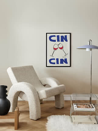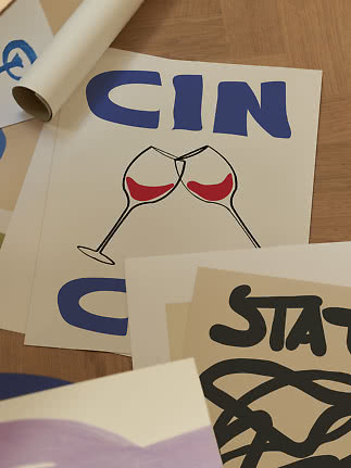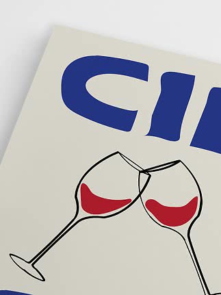
 (1).png)

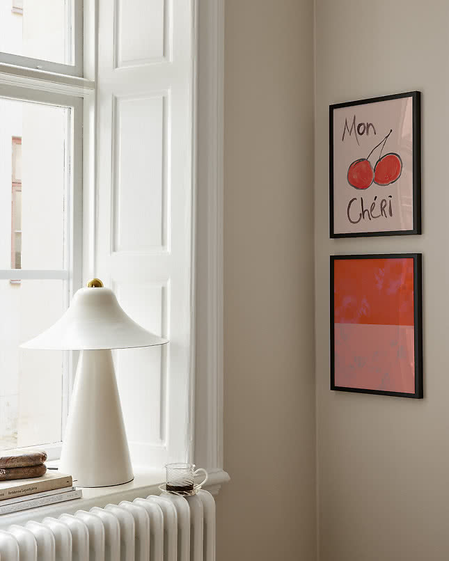
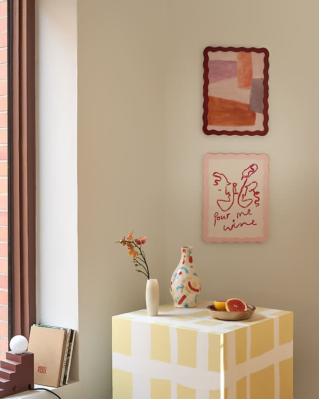
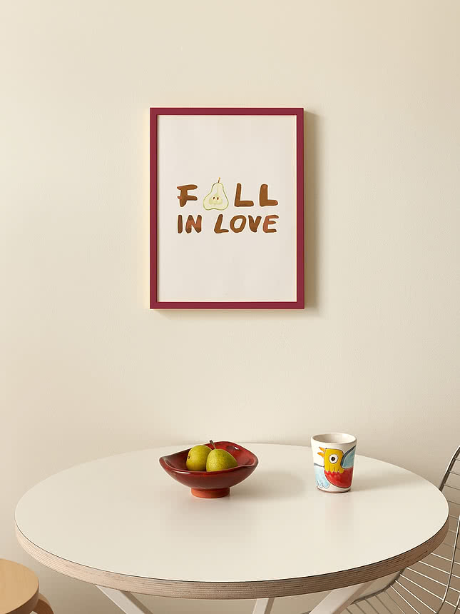
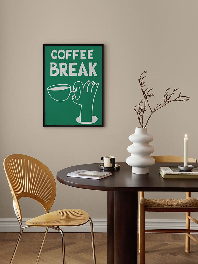
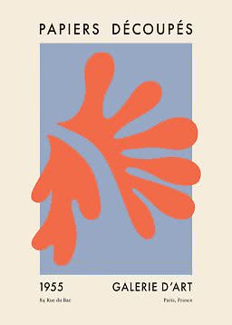
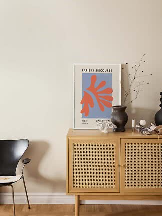
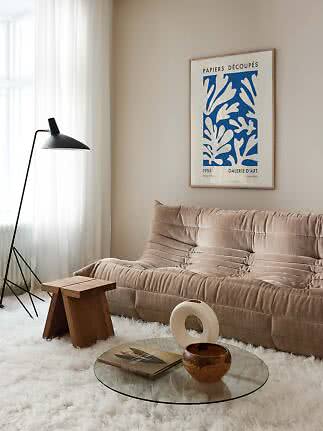
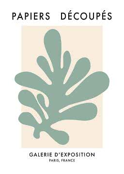
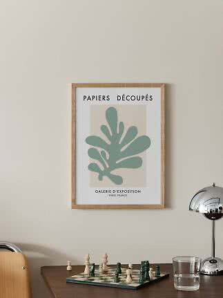
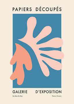
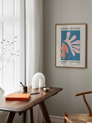
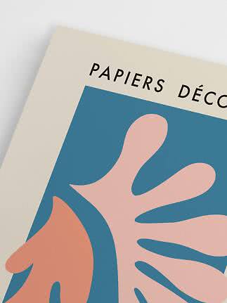
Papiers Découpés Orange
Postery
$17.99$36.99
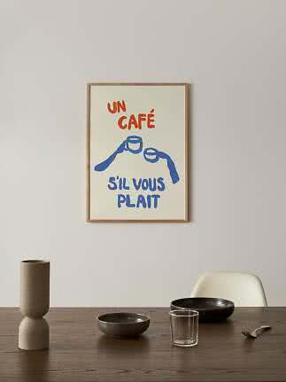
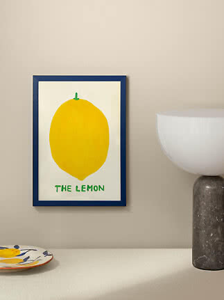
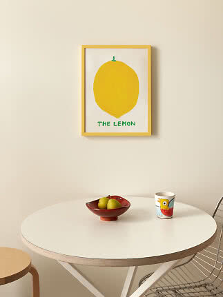
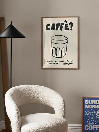
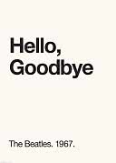
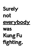
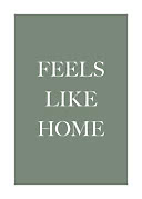
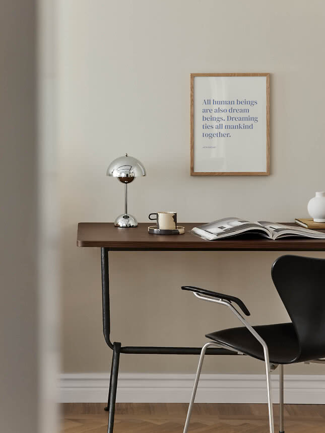
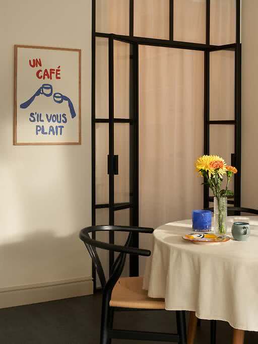
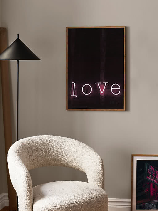
A text poster is the one piece of art you read rather than simply look at. A single word can make a hallway feel like a welcome, a line in French turns the kitchen into a corner café, and the right joke still raises a smile on the hundredth morning. That is also the catch: words are read every time you walk past, so they ask a little more of you than a landscape or an abstract. Here is how we think about quote posters and typography prints – how big the letters need to be, which typeface sets which tone, where words feel at home – and the moments when the wall is better off without them.
In short
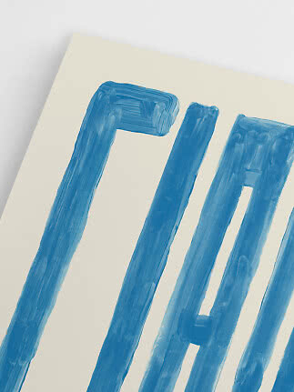
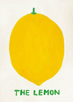
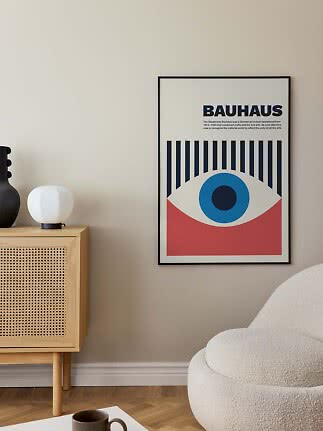
Letters are graphic. Strong type works like a shape. Black on white is as crisp as a photograph, a painted word as warm as a brushstroke, and many typography prints are chosen for how they look before anyone reads them.
They give a room a voice. A greeting in the hall, a café order in the kitchen, a line of poetry above the desk. Words say what a room is for, and a little about the person who lives there.
They are read, every time. You take in a landscape at a glance; words you read again and again. That is what gives text its pull, and why it deserves a minute more thought than any other print.
A landscape you glance at. Words you read every time you walk past – so choose ones you’ll still want to hear a year from now.
The most common mistake with text posters is letters that are too small for the distance. Before you choose, think about where you’ll usually be when you look at it.
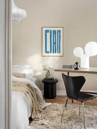
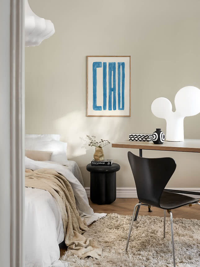
Across the room, keep it short. Above a sofa or a bed you are often several feet away. One to three words in large letters read easily from there, while a whole sentence in small type turns into gray lines.
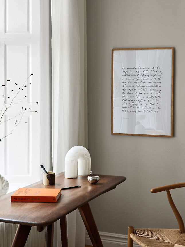
Up close, you can say more. Above a desk, beside the coffee machine or in a narrow hallway you stand within reach of the wall. That is where a full quote, a recipe or an entire poem comes into its own.
Contrast does half the work. Dark letters on a light background, or the other way round, carry much further than pastel on pastel. Soft tones are lovely, but give them a spot you see up close.
Test it first. Write the words on a sheet of paper in roughly the size they’ll have, tape it to the wall and sit down where you usually sit. If you have to squint, choose bigger letters or fewer words.
Before anyone reads a single word, the letters have already said something. The same phrase feels quite different in a clean sans-serif, an elegant serif or a hand-painted brush script, so let the type suit the room as well as the message.
Look around first. Clean lines and black details take a sans-serif naturally. Books, linen and old wood suit a serif. Warm colors, ceramics and a lived-in kitchen welcome handwriting. Here are four directions to start from.
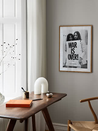
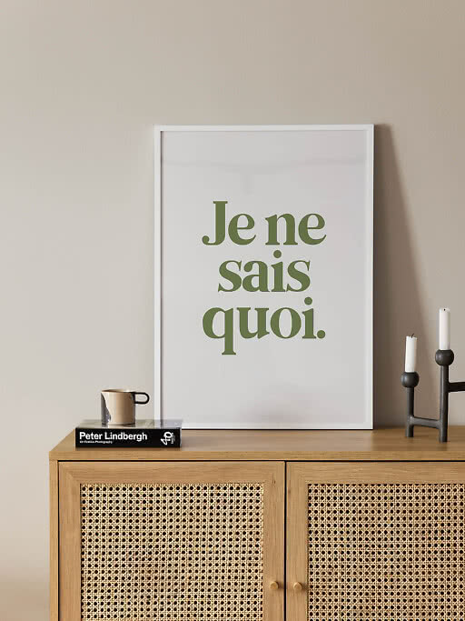
Sans-serif type is direct, calm and easy to read from a distance. It loves black frames, photography and a pared-back Scandinavian room.
Serifs feel literary and unhurried, like the cover of a good book. A natural fit for bedrooms, reading corners and rooms with wood and linen.
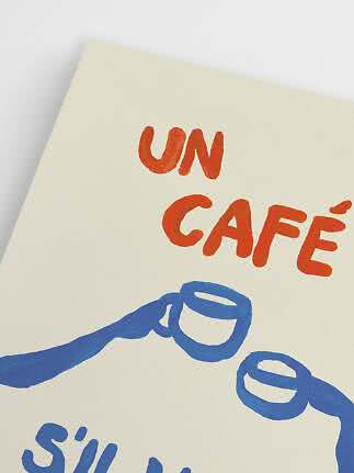
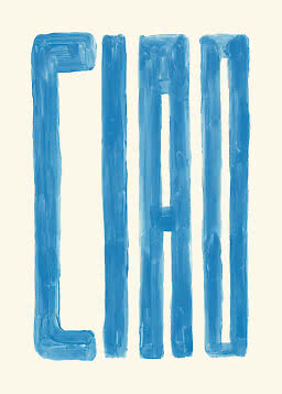
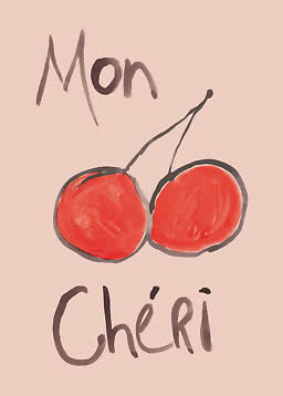
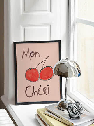
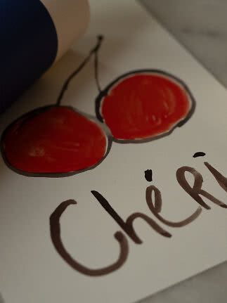
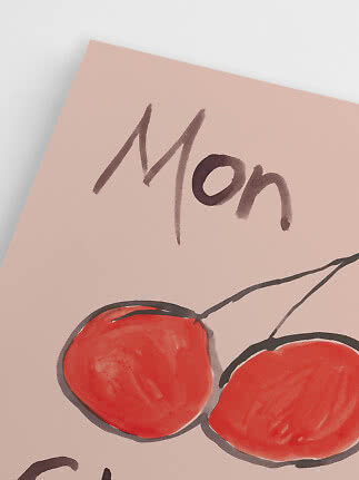
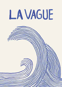
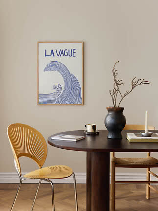
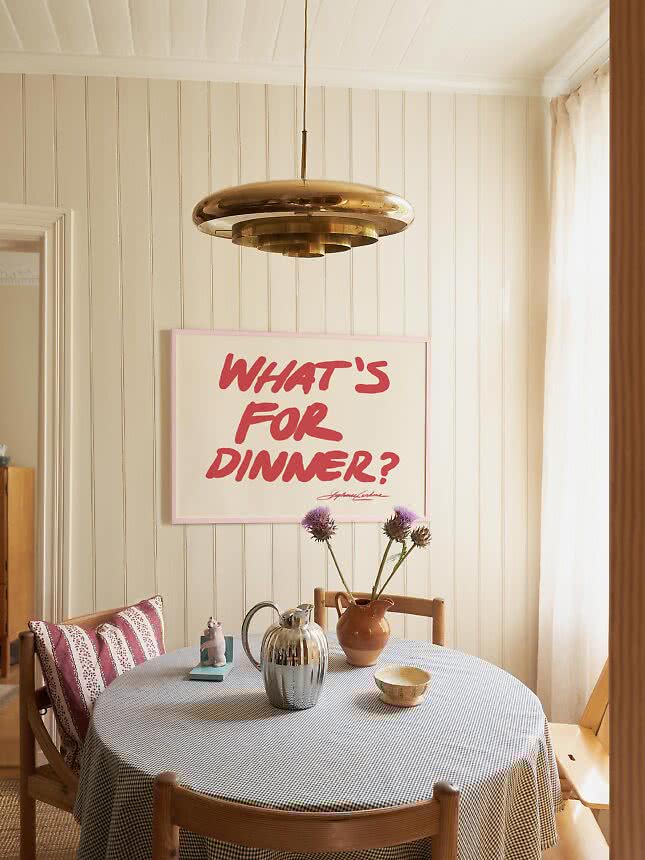
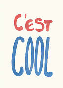
Brushstrokes and handwriting feel personal, as if someone wrote the words just for you. They bring warmth to kitchens and dining rooms.
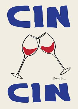
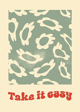
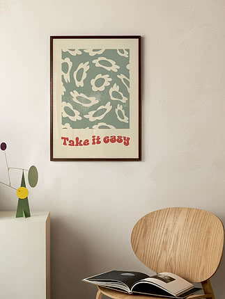
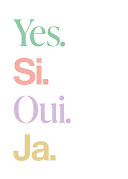
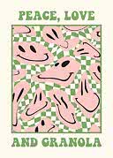
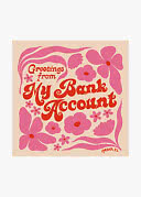
Rounded, swirly display type smiles before you’ve read a word. Let it bring color to a hallway, a kitchen or the powder room. More in our vintage and retro guide.
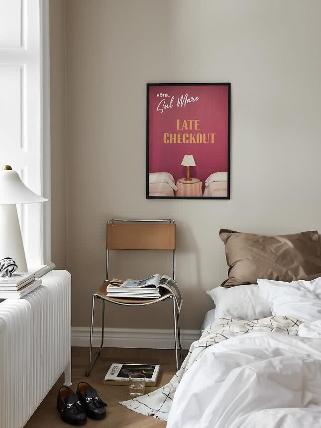
Make it about the room. The jokes that last are the ones that belong where they hang, like Late Checkout above the bed or a dinner question above the table. A punchline you could tell anywhere wears out faster.
Keep it gentle. A wink ages better than a shout. If it still makes you smile on a gray Monday morning, it’s a keeper.
Give it a quiet spot. A line of poetry, a thought or a single soft word belongs where you linger: by the desk, the bed or the reading chair.
Let it breathe. Choose a lighter typeface, plenty of space around the letters and a frame in oak or white. Calm words shouldn’t have to compete for attention.
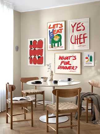
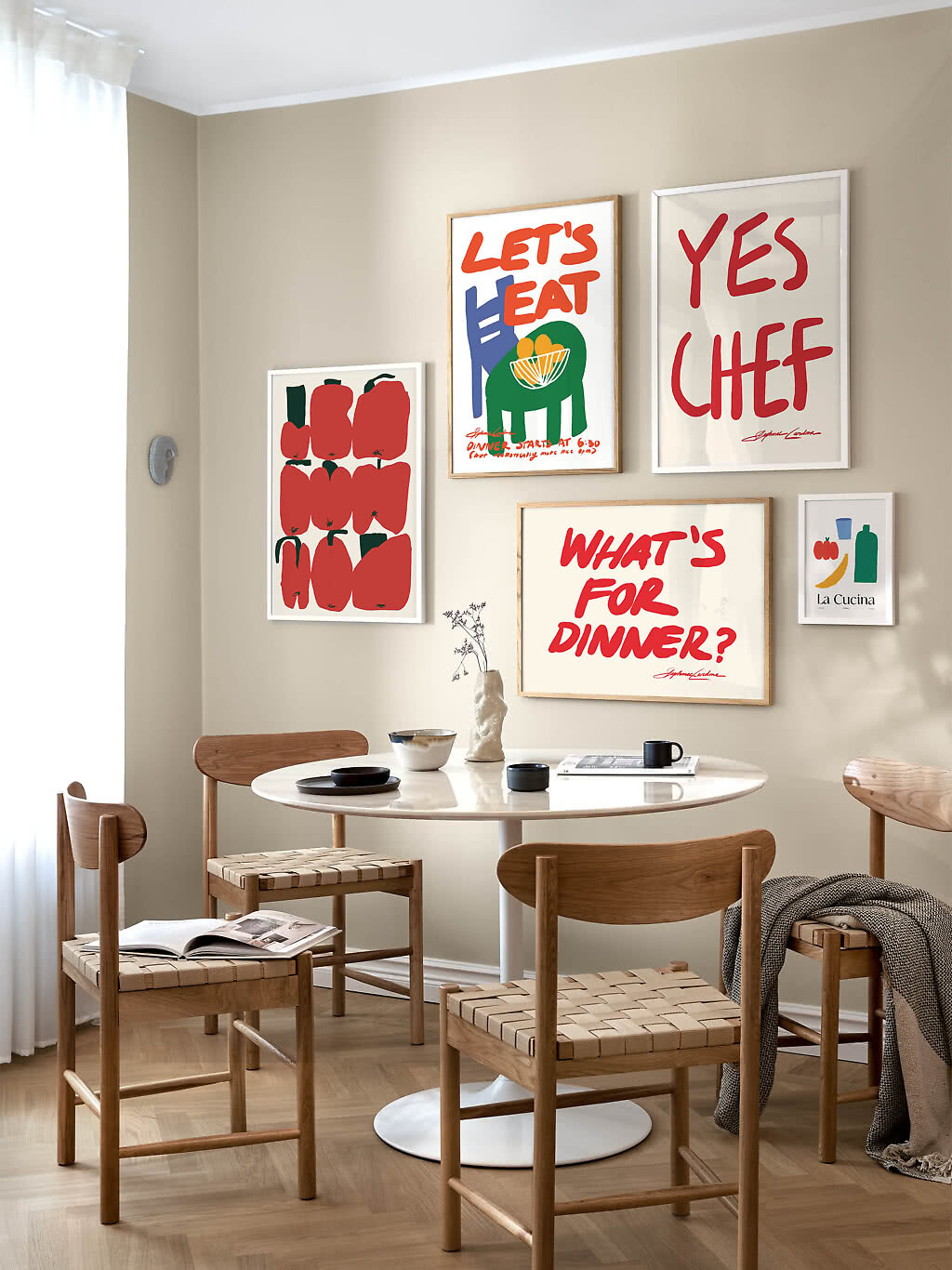
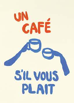
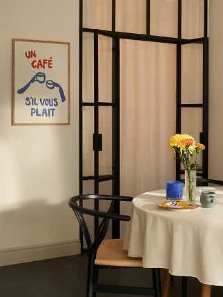
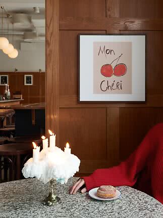
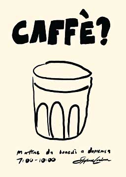
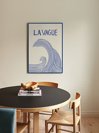
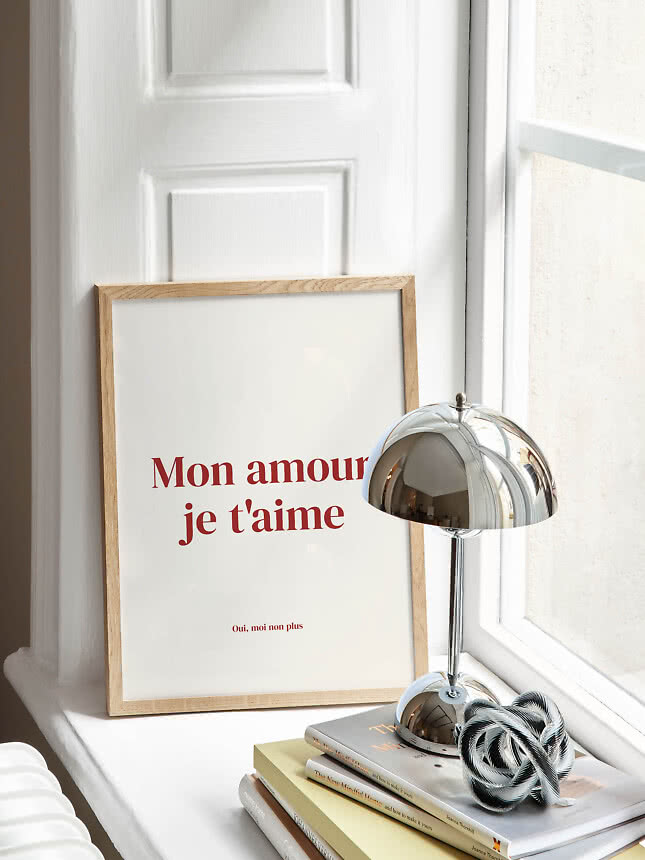
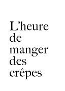
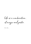
Kitchen and dining. The easiest room for words: menus, French café phrases and odes to pasta make sense where food is cooked and shared. There are more ideas in our guide to kitchen wall art.
Hallway. The first and last thing you see. A greeting, a single word or a wink works here because you pass by quickly, so keep it short and bold. More in our hallway guide.
Home office. It’s tempting to hang a pep talk, but slogans tend to go quiet after a week. A line that makes you think or smile lasts longer than one telling you to work harder. See also home office wall art.
Bedroom. The calmest room asks for the calmest words, or none at all. If you want text here, choose something soft, with few words and a gentle typeface. More bedroom ideas.
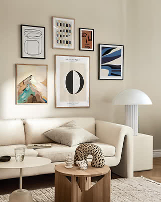
Living room. Here words usually work best as part of a group, where they give the eye a pause between images – more on that below. See also living room wall art.
Bathroom and powder room. The one place where a cheeky joke is almost expected. A small format is plenty, as you’re always close.
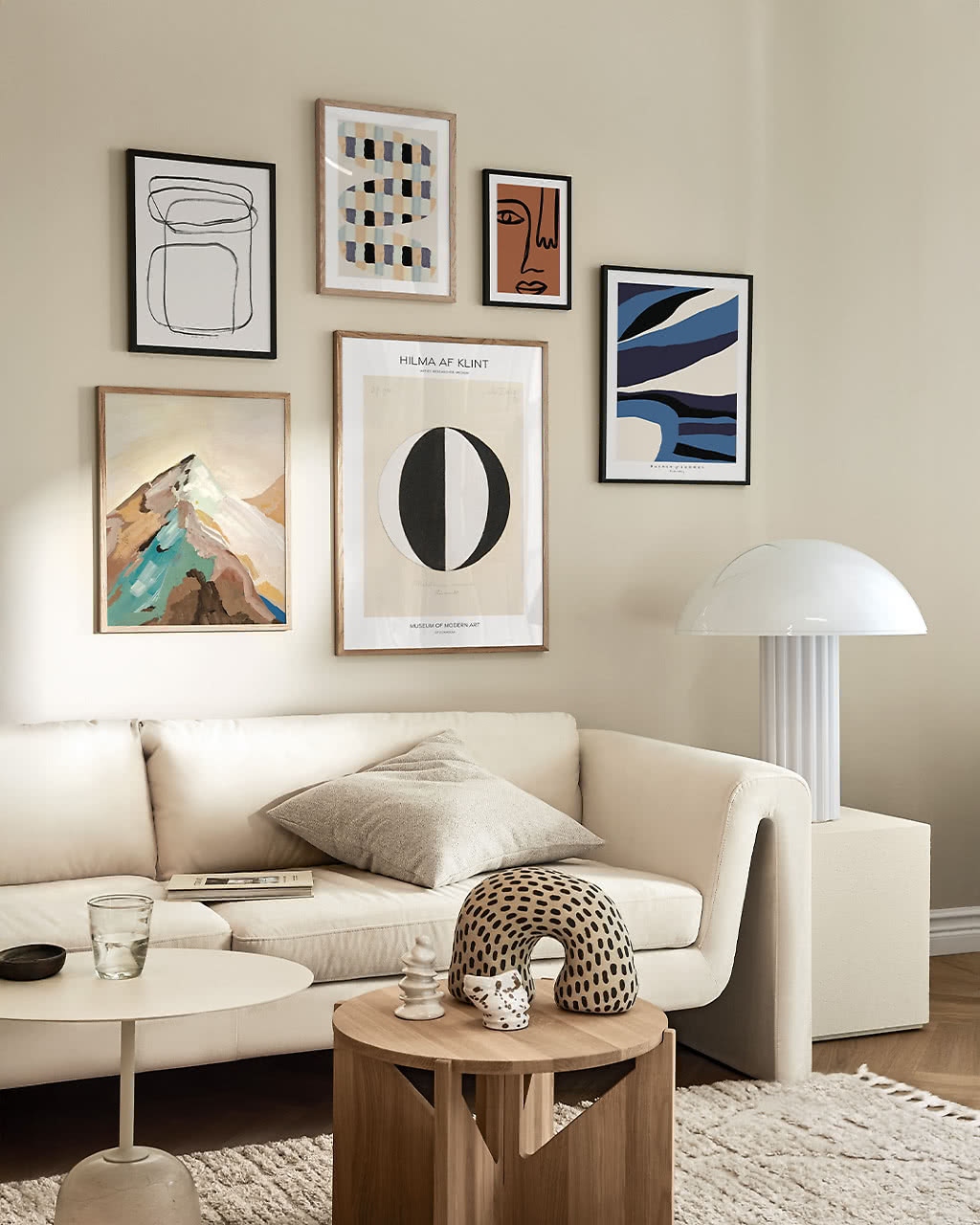
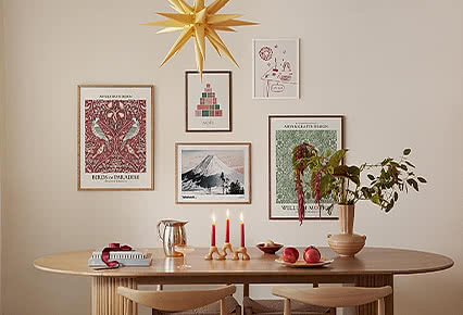
In a gallery wall, a text poster does something no other print can: it gives the eye a breather. Between photographs, paintings and abstracts, a few calm letters create a pause, much like the white space on a page.
One voice per wall. One text poster among four or five images is usually enough. Two quotes in the same view start talking over each other.
Let color tie it together. Choose letters in a color taken from the images beside them: red type next to a red abstract, blue beside the sea.
Balance the weight. A bold word is visually heavy. Hang it where a dark photograph would go rather than next to the heaviest piece, and keep the same frame color across the group.
Our gallery wall ideas show layouts that always work, and poster pairs is a good place to start if two is enough.
It says too much. More than a sentence or two and the poster becomes reading matter. Unless it hangs where you stand close, keep it short.
The tone clashes with the room. A pep talk above the bed or a party slogan in a quiet bedroom sets a mood you didn’t ask for. Words color a room whether you want them to or not.
It’s too personal for the room. Inside jokes and private dates mean everything to you and little to your guests. They’re often happier in a bedroom or a hallway than where everyone gathers.
It’s this year’s catchphrase. Phrases from social media date faster than any color trend. If it’s everywhere right now, it will feel tired soon.
You’re not sure what it says. French and Italian look effortlessly chic, but check the meaning before the words go up.
The words are yours. A phrase you actually say, a place you love, a line that has followed you for years.
The room has a clear purpose. In the kitchen, the hallway or by the bar cart, words that match what happens there always make sense.
A group of images needs a pause. One calm word among several pictures steadies the whole wall.
You want to smile every day. A gentle joke where you pass by is one of the simplest ways to make a home feel like yours.
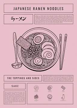
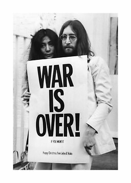
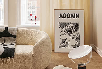
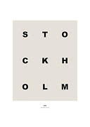
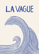
Prints where the letters are the motif: a quote, a single word, a place name or type used as pure graphic shape. You’ll find ours under typography and quotes.
Where you’ll actually read it: in the kitchen, in the hallway, above a desk or as the pause in a gallery wall. Keep long texts for spots you stand close to, and short, bold words for walls you see from across the room.
It depends on the distance. 8.3x11.8 in and 11.8x15.7 in suit shelves, ledges and close-up spots, 19.7x27.6 in works on most walls, and a single word in 27.6x39.4 in can carry a large wall. Our poster size guide shows every size to scale.
Generic slogans date quickly. Words that mean something to you, set in a good typeface and a calm frame, have a much longer life on the wall.
One text poster per wall is usually enough. Let it pick up a color from the images around it, keep the same frame color across the group and place it where it gives the eye a pause. Our gallery wall ideas show how.
It can be, if you know their sense of humor and the room it’s for. If you don’t, a single word or a calm line is the safer choice. There are more tips in giving art as a gift.
Typography and quotes
New
More from the magazine
All articles →