Autumn Sale · 4 d 19 h left
Up to 25% off
Selecting art for your home is a personal journey, whether it was love at first sight or a considered search for the right colours and scale. It represents an investment of time and vision, and deserves to be shown with equal care. The right piece in the wrong spot can lose half its impact. Get the placement right, and it feels like it was always meant to live there. Our guide walks through the placement principles, room by room, so you can hang with confidence instead of guesswork.
Before choosing a size, read the room. Three things decide how a piece will sit on the wall:
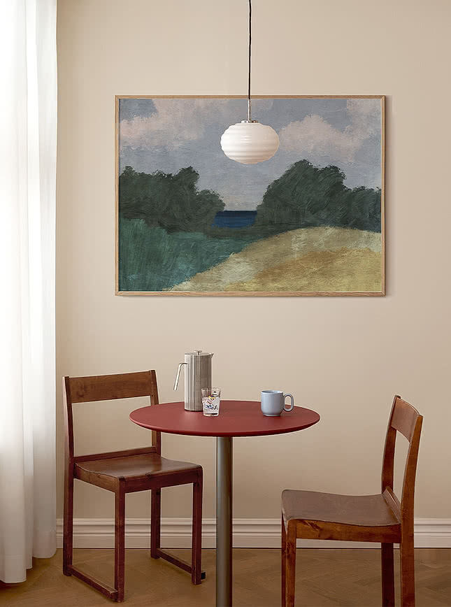
As a starting point, artwork should span roughly two-thirds to three-quarters of the wall segment or furniture piece beneath it. Much narrower, and it reads as an afterthought; much wider, and it can overwhelm.
The gallery standard is to hang the centre of the artwork at 145–150cm from the floor, roughly eye level for most adults, and it's the rule to fall back on whenever there's no furniture to anchor to. For very tall ceilings, the centreline can shift upward, closer to 150–160cm so the piece doesn't feel dwarfed by the space above it. In rooms with lower ceilings, staying close to 145cm keeps the art from feeling cramped against the top of the wall.
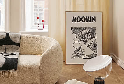
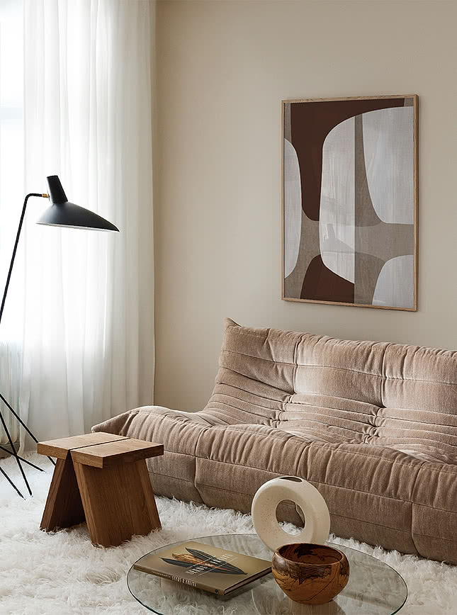
Above your sofa or armchair, measure from the top of the backrest rather than the arm, cushions and pillows shift more than the frame does. Seating height varies, roughly 70-80cm for an armchair, a touch higher for a sofa, so your centre point should land around 140-145cm, with a 15-20cm gap above the backrest. If a lamp or side table sits alongside, keep the art within your seating's own footprint, so it reads as anchored rather than competing with what's beside it.
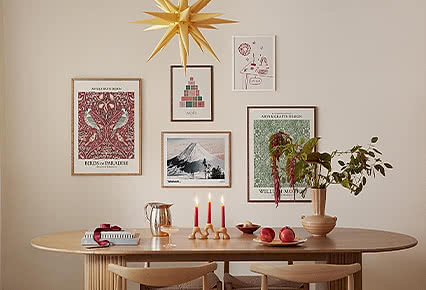
A gallery wall is really one large piece made up of several frames, and it should be treated that way. The same two-thirds to three-quarters width rule and eye-level centring apply to the grouping as a whole, not to each individual frame.
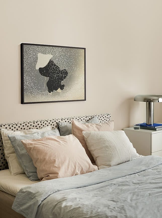
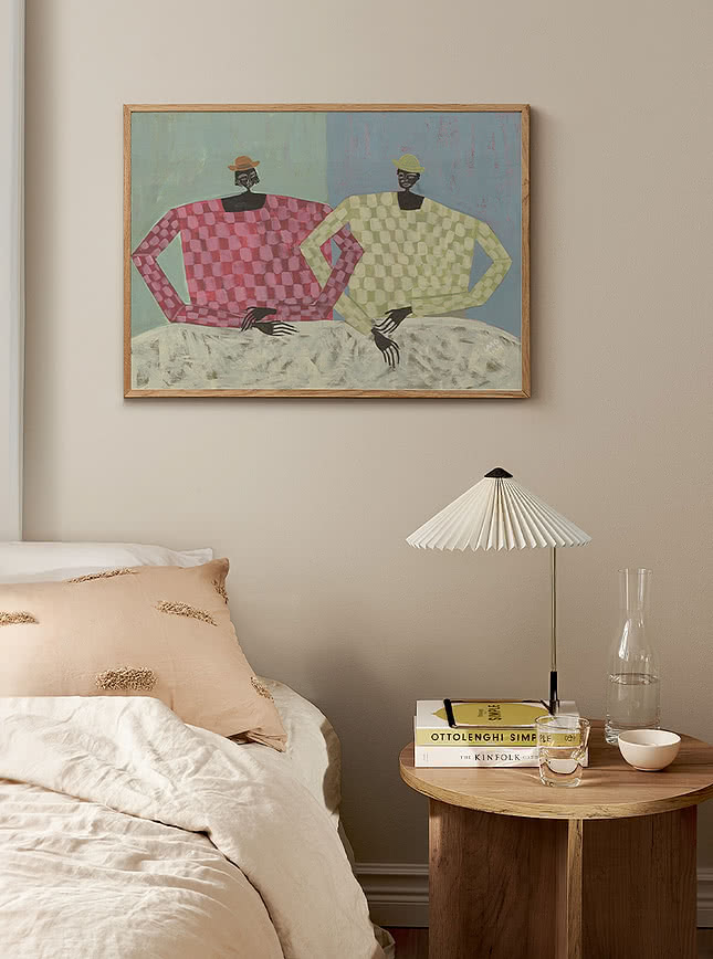
The bedroom has two natural anchor points, the headboard and the nightstands, each at a different scale.
The same two-thirds to three-quarters width rule applies here, with one addition, pay attention to symmetry with nightstands and lamps on either side, since the eye reads the whole wall as one composition. Leave 15-25cm between the top of the headboard and the bottom of the frames.
This is a seated or lying sightline, so it sits lower than the standard eye-level rule, and the frame itself should be smaller in scale.
A headboard piece and nightstand pieces should feel like they belong together without matching exactly, a shared tone or theme works better than an identical frame or style.
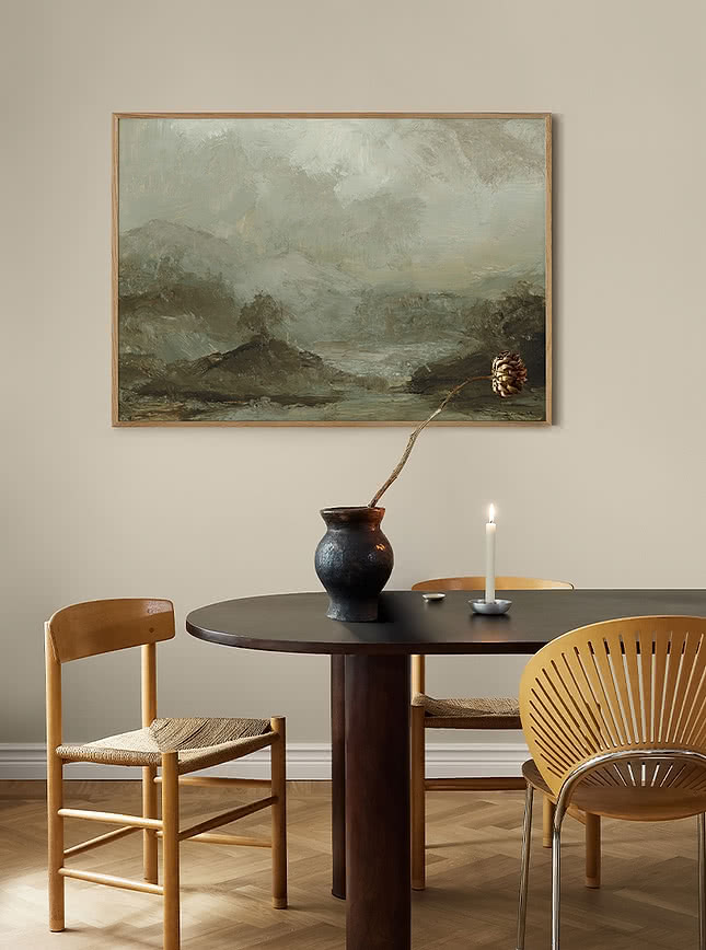
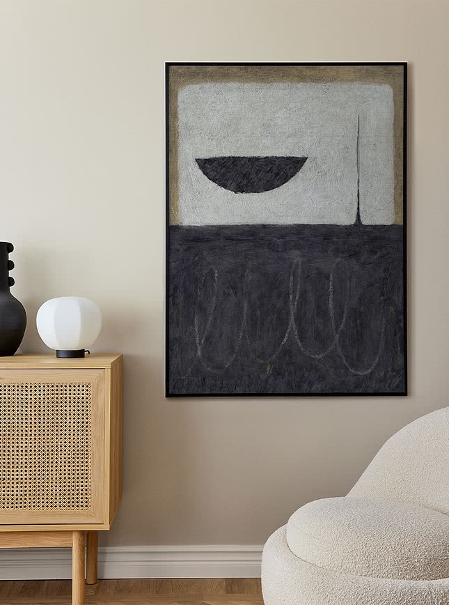
XL pieces call for a different approach depending on what's below them, a furniture anchor changes the usual proportions, an open wall doesn't.
This is the one case where the usual two-thirds to three-quarters rule flips, a single XL piece can extend beyond a low anchor like a stool, so long as the overhang reads as deliberate rather than accidental. Centre the piece and keep the overhang even on both sides. A stool sits lower than standard furniture height, so measure the 15-20cm gap from its actual styling line, around 60-65cm, not the usual 85cm.
Ceiling height affects how much room this leaves above, roughly 35-40cm on a standard ceiling, 80-100cm or more on a taller one, and it also guides orientation. Keep it vertical above a narrow anchor like a stool, where width is tight either way. Above a sofa, where width is already generous, horizontal makes better use of the space. On a taller ceiling, that constraint eases, so orientation becomes more of a style choice.
Stairwells, tall hallway walls, double-height spaces, anywhere with nothing beneath to anchor to. The centre point shifts upward from standard eye level here, typically 155-165cm as ceiling height increases, scaled to the wall itself rather than a fixed number. This is where XL art gets to be the room's one statement. Whether it's anchored to furniture below or standing alone on an open wall, the principle stays the same, let the piece take up the space it's earned, and trust that scale is what makes it feel considered.
Take your time with this. You've put thought, and often quite a bit of both time and money, into the art you've chosen, it deserves a placement that does it justice. If you're still deciding on framing, our guide to choosing a frame is a good next step, it covers not just how a frame looks, but how it protects the piece for years to come.
 (1).png)