 (1).png)


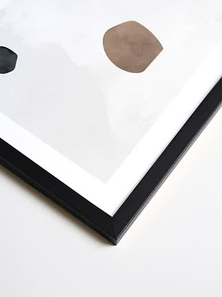
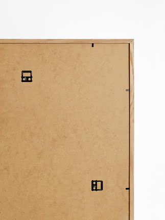
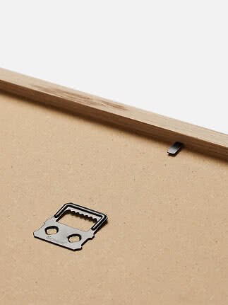
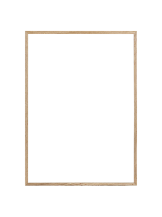
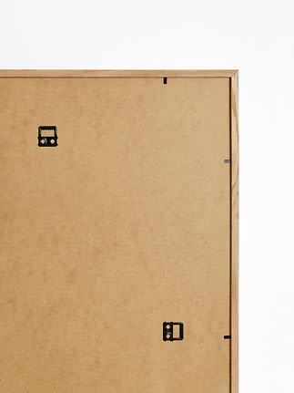
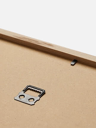
Picture Frame Wood Black
Postery
$27.99$32.99
Choosing the artwork is only half the job, the frame you put it in matters just as much. A good frame doesn't just show your piece off, it protects it for years to come, and it should feel like it belongs in the room, not just around the print. There's no single right answer here, it depends on your art, your space, and the mood you're going for. This guide walks through each, so you can find the frame that fits all three.
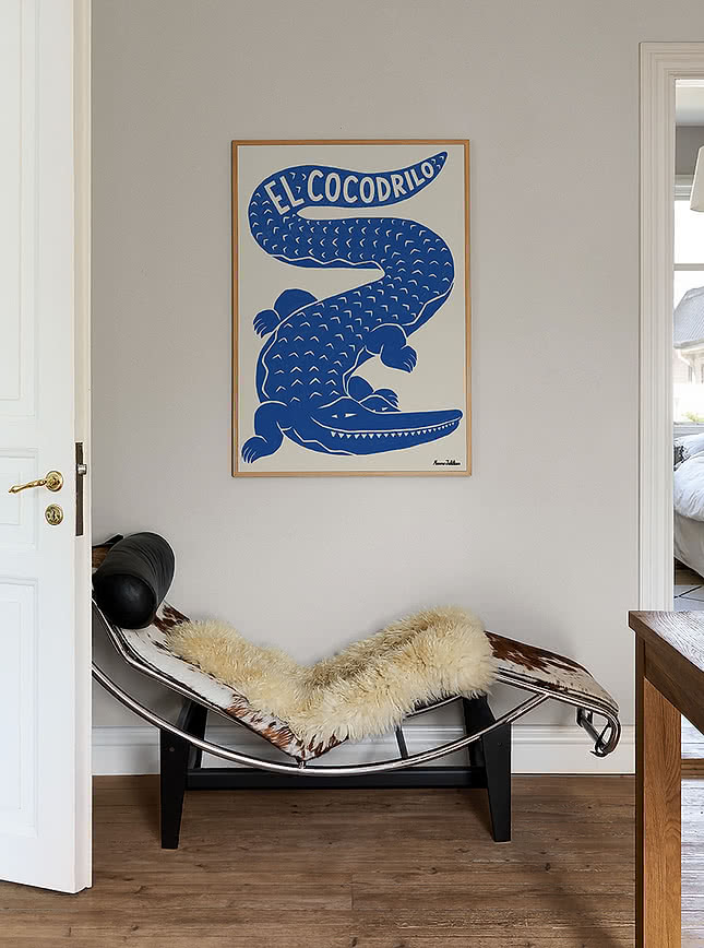
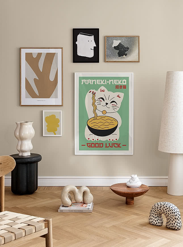
Before you pick a frame, take a look at the room it's going into. Is it warm and natural, minimal, maximalist, classic, or eclectic? The frame is what connects the art to the room, so it's worth thinking about early rather than picking it last. The calmer the room, the more restraint the frame should show, and the more character the space already has, the bolder the frame can be.
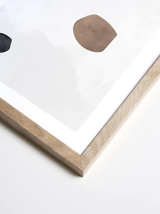
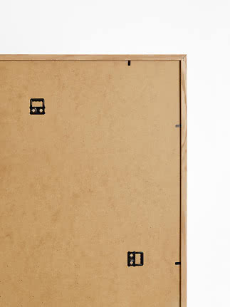
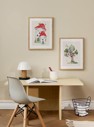
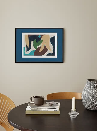
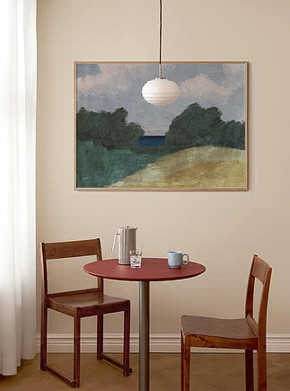
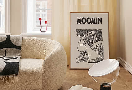
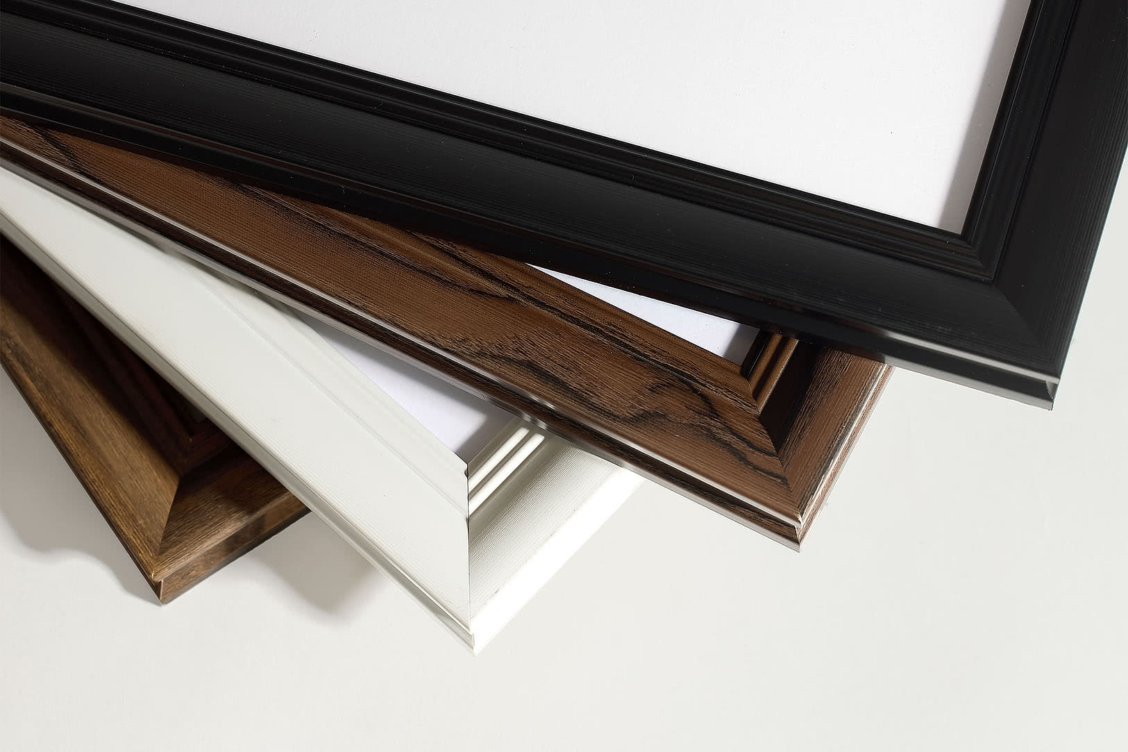
Wood is our most loved family in the range, and the finish makes the difference. Oak brings a warm, natural tone that suits modernist and Scandinavian rooms, softening graphic or high-contrast pieces without fighting them. Dark oak carries the same warmth in a deeper, richer tone, a good middle ground for something moodier without going as stark as black. Black wood brings more contrast, right for contemporary or gallery-style spaces where bold typography or photography can stand out. While white wood keeps things airy, ideal for minimalistic style rooms, and it's the easiest tone to build a room around later, since it won't clash as your palette or decor changes over time.
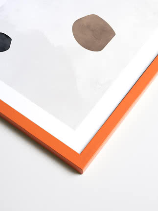
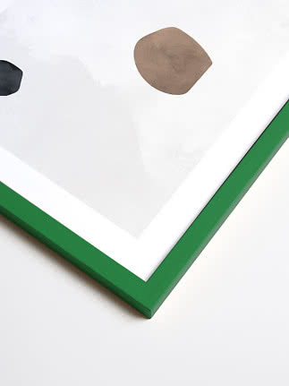
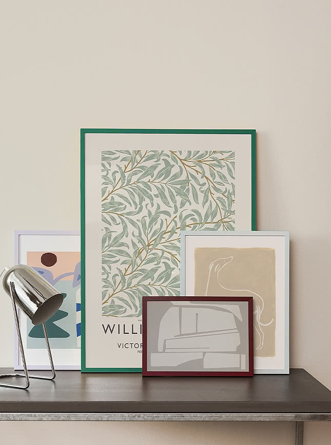
If your room feels a little flat or neutral, a coloured frame can be the lift it needs. It works well with simpler or graphic pieces, and busier prints too if the room can take it, the main thing to watch is whether the colour fights with what's already there. Done right, it acts almost like a piece of furniture in its own right, becoming the accent moment for the whole room rather than blending into the wall. Just don't overdo it, one confident colour choice reads as intentional, several competing ones start to feel chaotic.
Aluminium brings a cooler, more neutral option into the mix, precise rather than plain. It works especially well with photography and architectural pieces, and suits modern or industrial spaces where a warmer material would feel out of place. A quieter choice than a bold colour, but one that still stands its own on the wall.
There's a practical side too, aluminium holds its shape regardless of humidity or temperature shifts, which is why it's the frame of choice in offices, galleries, and anywhere those conditions come into play, a bathroom or a sunnier room included. Available in five tones, all with that same clean, precise edge.
This one’s ours through and through. Our signature frame is made for spaces that want a bit of personality. It's at its best on a statement wall, in a maximalist or eclectic space. Simpler or bolder art tends to suit it best, but really it comes down to whether the piece shares the frame's playful energy. This isn't just a frame around the art, it's part of it. Available in ten shades, eight distinct colours plus classic black and white, all carrying that same playful spirit.
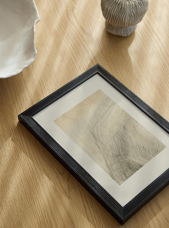
Ribbed frames add texture instead of colour, a good pick for minimal or neutral rooms that want more depth without another colour in the mix. They suit any medium, photography, illustration, painting, as long as the piece itself stays fairly simple. Put a busy print in a ribbed frame and the texture just gets lost. Comes in four finishes, oak, dark oak, white, and black, the same range as our wooden frames, just with that added texture.
If your space leans traditional or already has some period detail, classic frames are the natural fit. They work beautifully with fine art reproductions, portraits, botanical illustration, and oil paintings, anything with a bit of history or story behind it. Here the detailing isn't just decoration, it's part of what tells that story.
Within the range, tone is what sets them apart. Go bolder with Rococo Gold or Versailles, or choose Madeleine for that same oak and dark oak warmth in a fuller gallery profile. Rivoli brings the two together, that same detail in black or white.
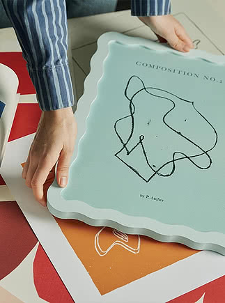
Wavy, ribbed, and classic frames all belong to our Atelier collection, the pieces we've put the most craft into. The wavy frame is entirely our own, you won't find it anywhere else, and it's there for the days you want your walls to feel a little bolder.
Available in the EU only.
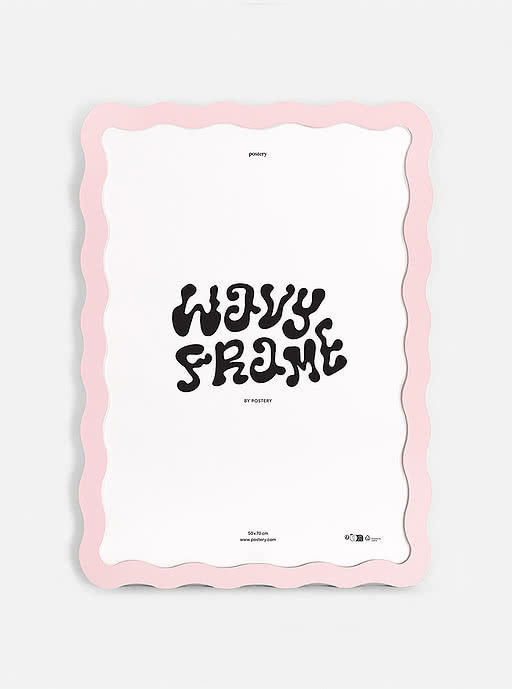
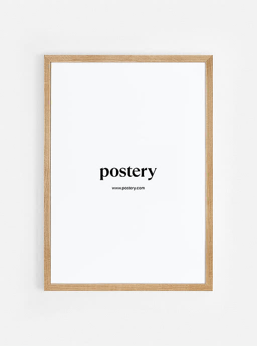
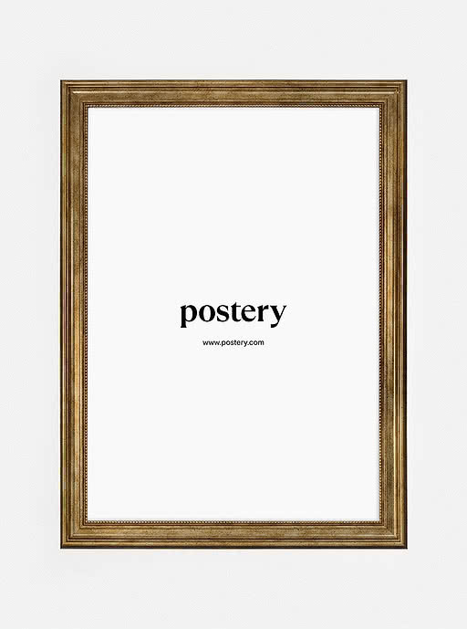
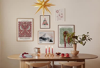
You don't have to stick to one frame throughout your home, or even on the same wall. Start with the piece you feel most strongly about and let its frame set the tone, then bring in a second material for contrast, oak alongside black, white next to a coloured moment. The trick is choosing one thing to keep consistent, whether that's colour, tone, or spacing, so the mix reads as put together rather than random. This works especially well on a gallery wall built around a theme that isn't purely visual. Say your art leans traditional, but you want the wall to feel current rather than period, keep most of the pieces in classic frames, then break the pattern with one or two in black or aluminium. The contrast reads as intentional rather than accidental, more like a collection built up over time than a single matched set.
Still not sure which frame is right? Browse the full range, or get in touch and we'll help you find the one.
Our frames