 (1).png)
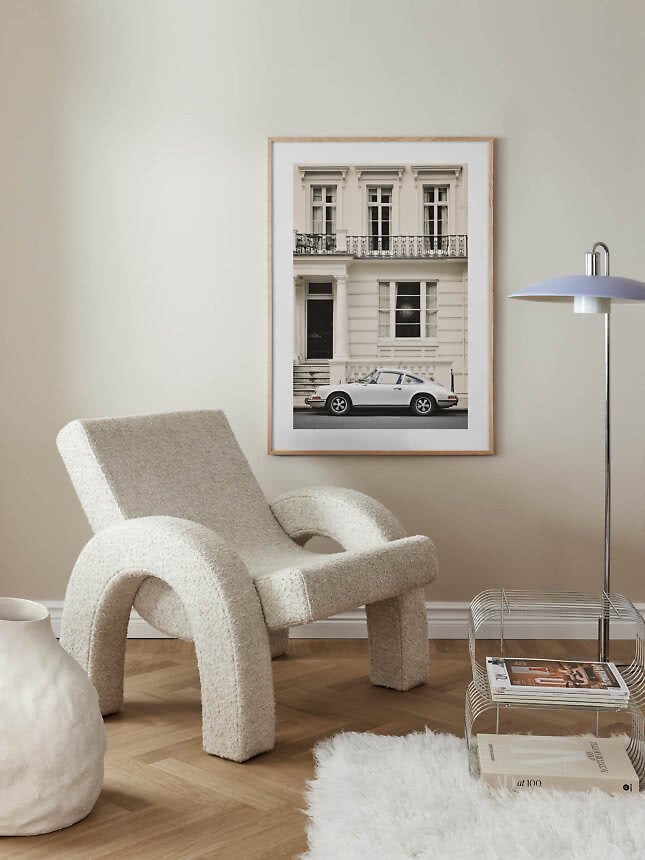





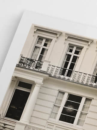
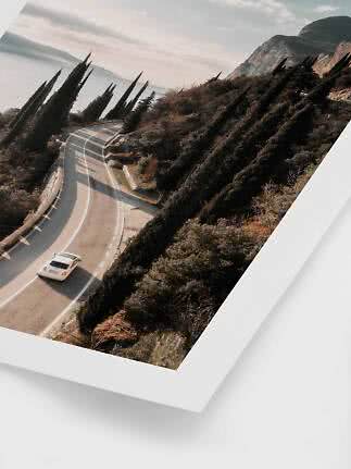
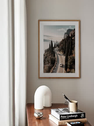
Porsche in the City
Postery
$24.99$36.99
A good photograph on the wall works like a window. It takes you to a winding lakeside road, a cobbled side street or a sunny hotel staircase without leaving the sofa. To choose one you’ll still love in five years, start with a subject that suits the room, then decide between color and black and white, pick a size big enough for the detail, and choose between a printed border and a mat board. Here’s how to get each step right.
In short
A painting shows how someone imagined the world. A photograph tells you it was really there: the evening light on a lake, a tram straining up a hill, four nuns sharing a light. That sense of a real moment is what makes photos feel so personal on a wall – and why they’re worth choosing a little more slowly.
So before you scroll, ask yourself two things. Where will the picture hang, and how do you want that room to feel? Calm and open, lively and sociable, or somewhere in between? The answer usually points you straight to a subject.
Most photography falls into four families, and each one does something different for a room.
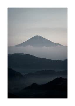
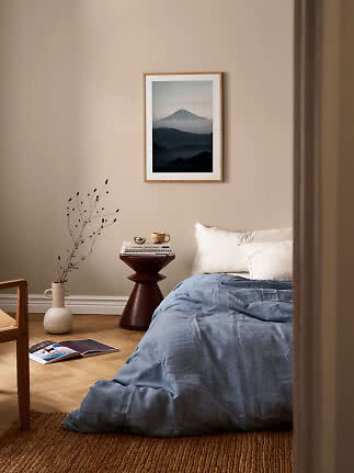
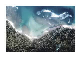
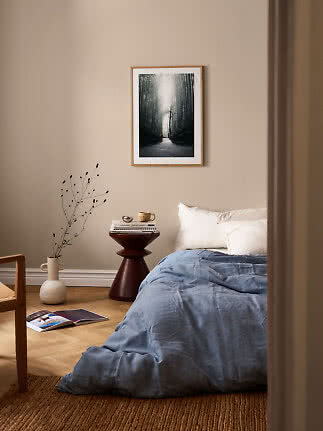
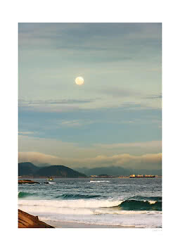
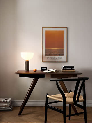
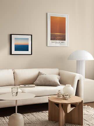
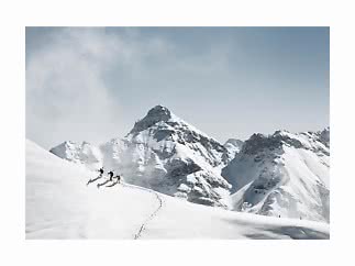
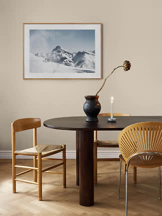
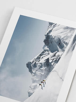
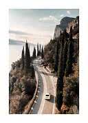
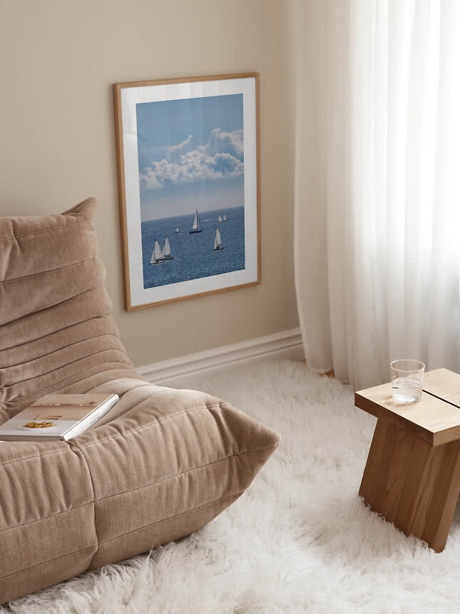
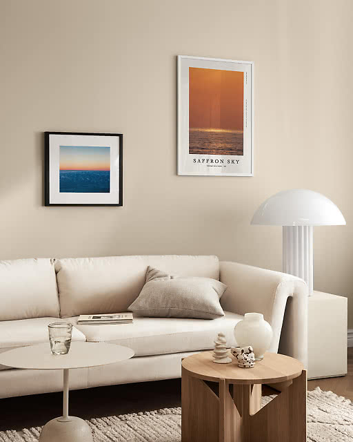
Landscapes and the sea. Mountains, coastlines and big skies open up a wall and slow the pace. They’re at their best above a bed or a sofa, where the eye has time to wander. See all our landscape and nature photos.
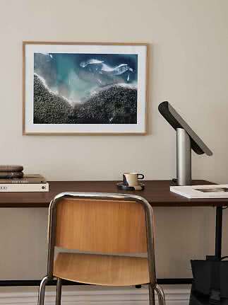
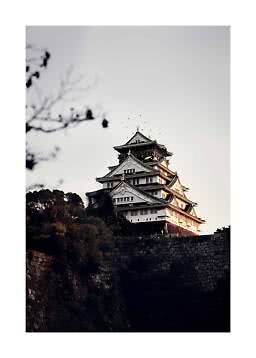
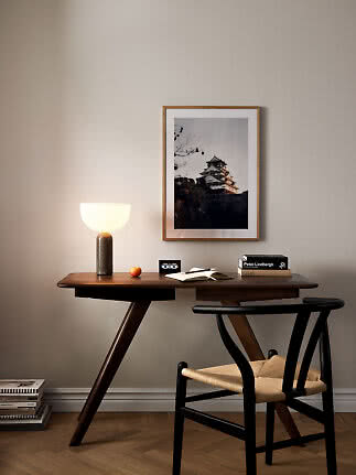
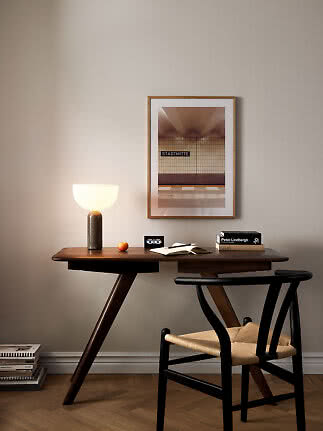
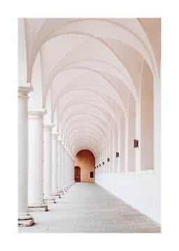
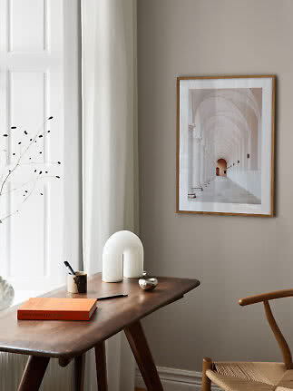
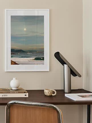
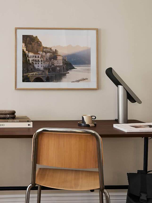
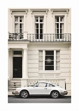
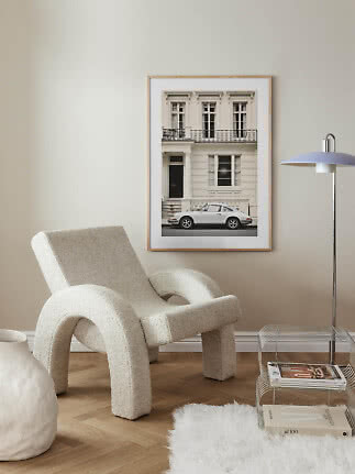
Cities and architecture. Streets, façades and towers bring a touch of travel and plenty of structure. A natural fit for hallways, home offices and rooms with clean lines.
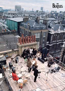
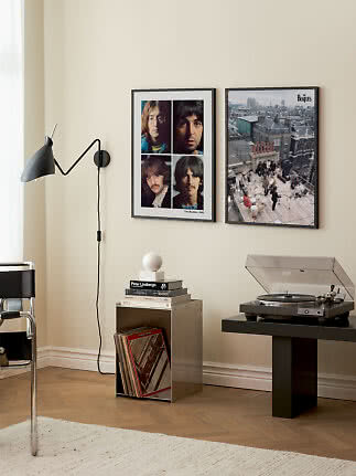
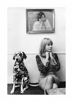
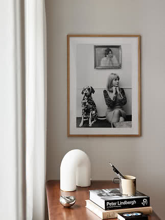
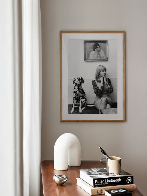
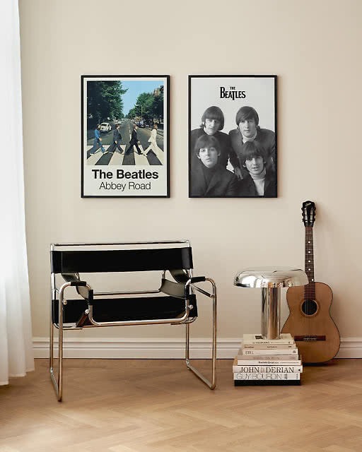
People. Portraits and candid scenes give a room a pulse – somebody is laughing, splashing or looking right back at you. Our iconic photos are a good place to begin.
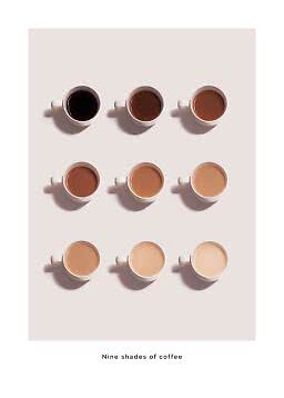
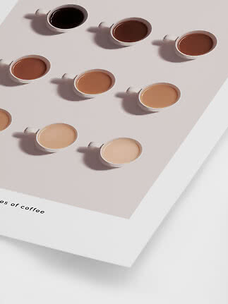
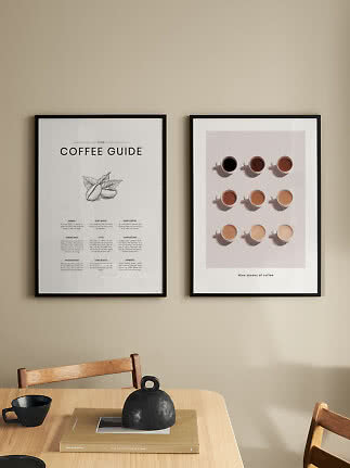
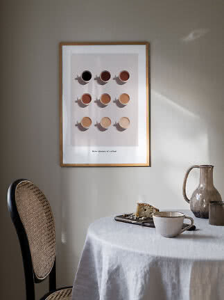
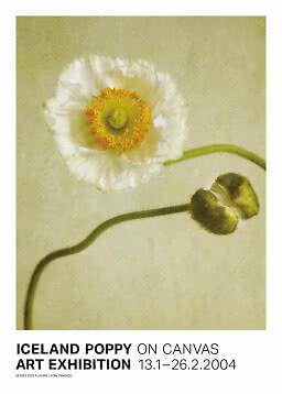
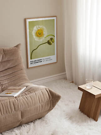
Still life. Coffee, fruit, a record player: ordinary things shot up close. Friendly and unfussy, and just right for kitchens, dining areas and shelves.
Four places to start:
Wide views with room to breathe. Give them the biggest wall you have.
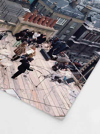
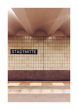
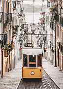
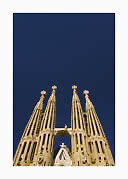
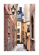
Trams, towers and cobbled alleys – a city break that stays on the wall.
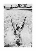
Candid, joyful and a little bit cheeky. A face makes any wall feel lived in.
Everyday things up close. Simple enough to look sharp in smaller sizes.
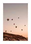
Same subject, two very different moods. A color photo brings the warmth of the place with it: turquoise water, sun-baked stone, a pink evening sky. It’s also the easiest way to echo a cushion, a rug or a painted wall in the room.
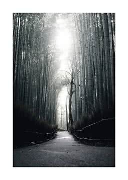
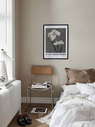
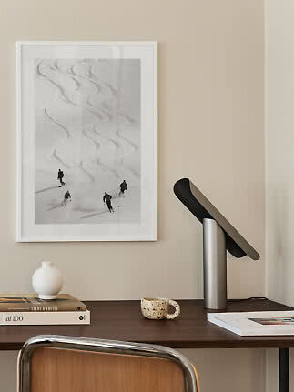
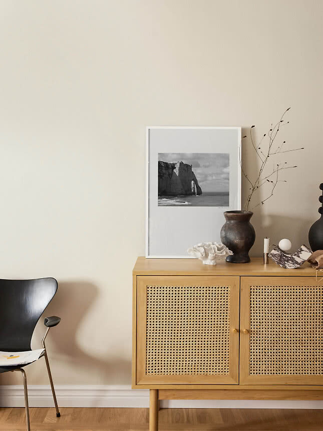
Black and white takes the color away and leaves the drama – shadows, outlines and expressions. It feels calmer and more graphic, and it happily shares a wall with color photos. More in our guide to black-and-white wall art.
A simple test: if the color is what made you stop scrolling, go for color. If it was the light, the shapes or a face, black and white will probably make it even stronger.
A photo needs to be big enough for its details to read from where you’ll actually stand. The busier the picture, the bigger it wants to be.
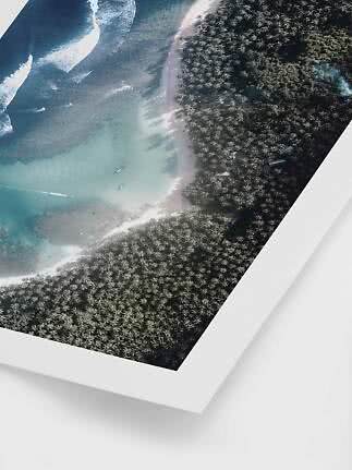
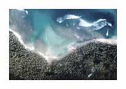
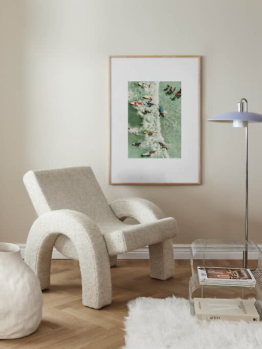
Aerial shots, crowds and wide views: 27.6x39.4 in, or 19.7x27.6 in at the very least. On a small print, tiny surfers and distant sailboats shrink to specks.
Portraits and single subjects: 19.7x27.6 in is the sweet spot – big enough to meet someone’s eyes from across the room.
Close-ups, still life and quiet details: 11.8x15.7 in or even 8.3x11.8 in. Simple pictures stay clear when they’re small, and they’re lovely in pairs or propped on a shelf.
Above a sofa or a bed, aim for roughly two thirds of the furniture’s width. Our poster size guide has the measurements for every size.
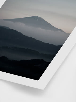
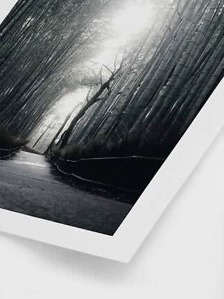
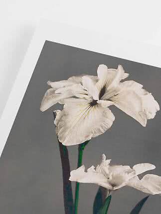
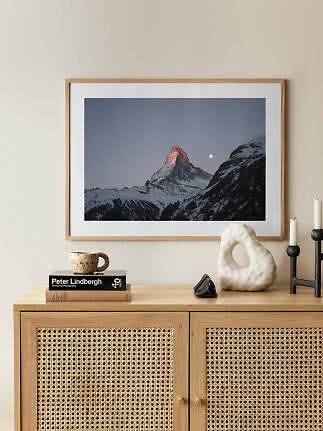
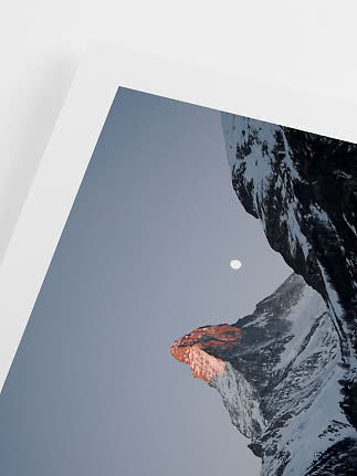
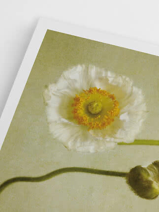
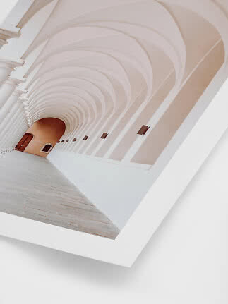
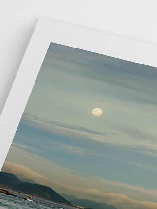
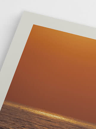
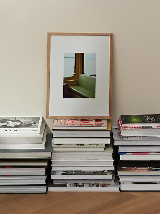
Most of our photographs – 86% of them – come with a printed border. It gives the picture a little breathing space inside the frame, so the poster looks finished as soon as you frame it in its own size.
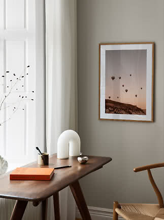
A mat board takes it one step further. It’s a separate card with a cut-out window that sits in front of the print, adding depth and a clean edge around the picture. You pair it with a frame one size up – a 19.7x27.6 in print in a 27.6x39.4 in frame, for example. That’s the classic gallery look, and it makes a single photo feel twice as important. Window sizes and combinations are all in our guide to mat boards.
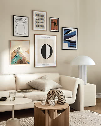
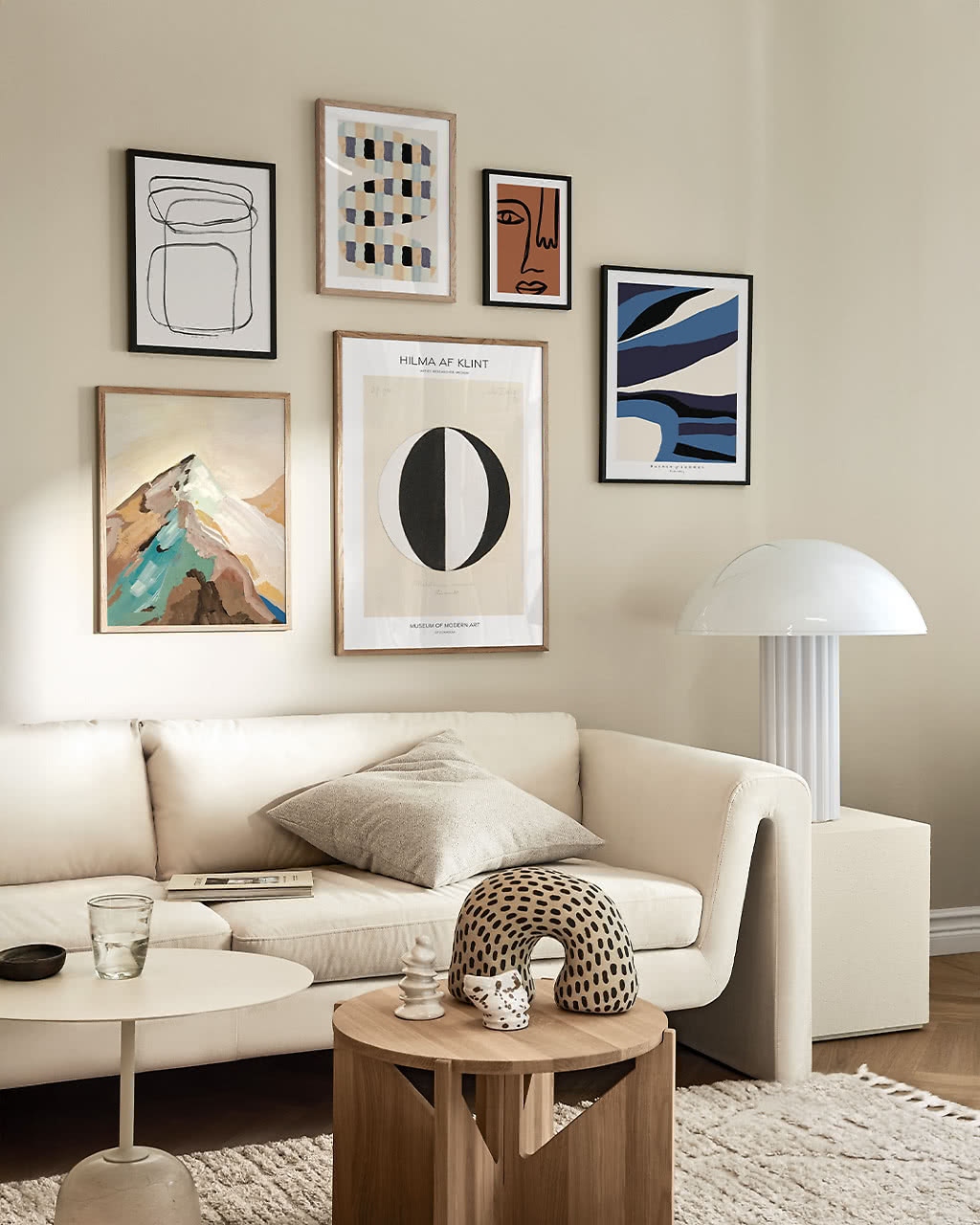
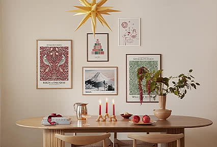
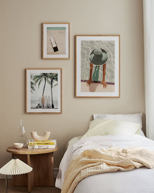
Photos love company. Three shots from the same trip – or in the same few colors – hung in a row read like a short story. Keep the frames identical and the gaps even, and the wall looks planned rather than collected.
Mixing sizes works too. Let the most detailed photo be the biggest, and gather smaller, simpler pictures around it. For more layouts, see our gallery wall ideas, and for heights and spacing, the guide to hanging wall art.
Or start from a ready-made photo wall from our inspiration pages, with every print, size and frame already picked:
It depends on how much detail the photo has and where it hangs. Wide landscapes, aerial shots and busy street scenes look best in 19.7x27.6 in or 27.6x39.4 in, portraits work well in 19.7x27.6 in, and close-ups or still life hold up in 11.8x15.7 in or 8.3x11.8 in. Above a sofa or a bed, aim for about two thirds of its width.
Choose color when the colors are the point – a turquoise sea, a warm evening sky – and you want to pick up shades from the room. Choose black and white for a calmer, more graphic look that suits any interior. You can also mix the two on the same wall.
No. Most of our photography posters already have a printed border, so they look finished in a frame of the same size. A mat board is a lovely extra if you want a gallery look: put the print in a frame one size larger, such as a 19.7x27.6 in print in a 27.6x39.4 in frame.
Oak suits warm, sunlit and colorful photos, black sharpens contrast and suits black and white, and white keeps a light, airy feel. On a wall with several photos, one frame color throughout looks calmest.
Anywhere you’d like a view. Landscapes and seascapes calm a bedroom or a living room, city and architecture photos suit hallways and home offices, and still life is made for the kitchen. Find more ideas for the living room and the bedroom.
Photography posters
More from the magazine
All articles →