 (1).png)

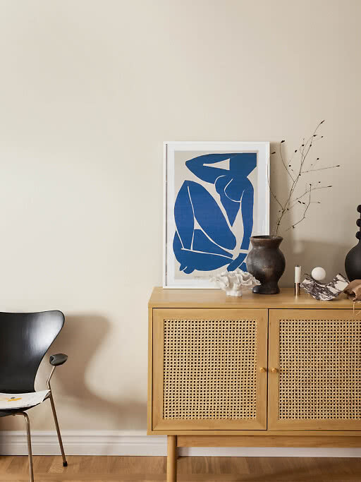
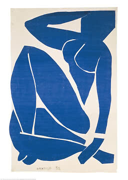
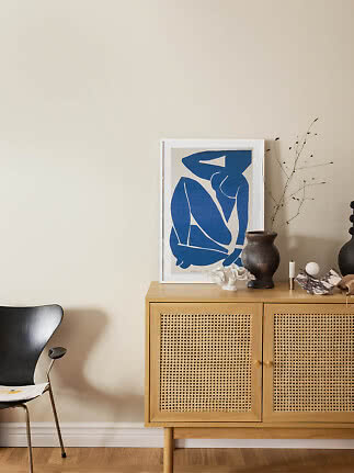
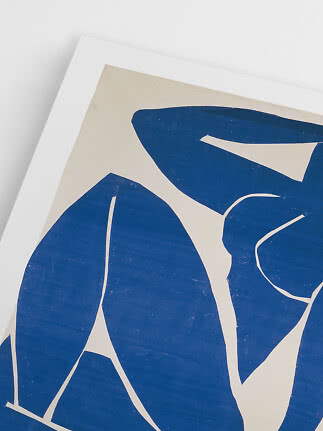
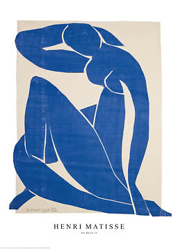
Nu Bleu III
Henri Matisse
$24.99$36.99
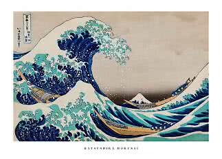
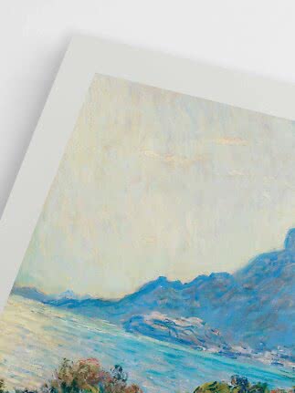
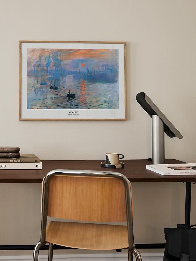
Famous art prints let you live with the paintings you love: Monet’s sunrise above the desk, a Matisse cut-out by the reading chair, Hilma af Klint in the hallway. The recipe is simple. Pick a painting that means something to you, decide between the picture on its own or an exhibition-style poster with type, go big enough for the brushwork to show, and choose a frame that suits your room rather than the museum. Here’s how to get each step right.
In short
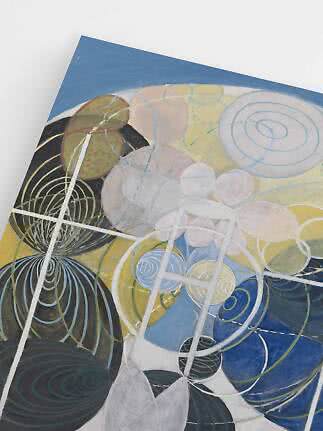
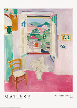
A painting that people have loved for generations has already passed the hardest test there is: nobody got tired of it. That is exactly what you want from something you will see every morning. A famous painting also brings a story into the room – a summer window in Collioure, a starry night in Provence, a Swedish painter who asked for her abstract work to stay hidden for twenty years after her death.
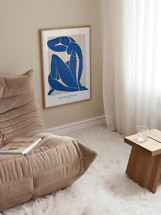
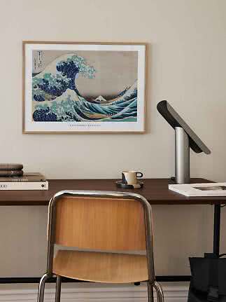
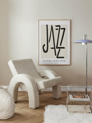
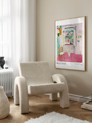
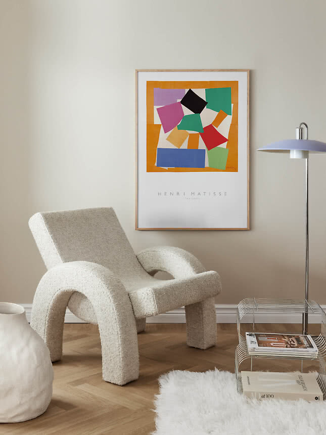
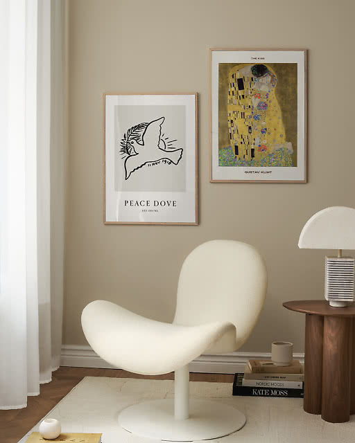
It is also easier to style than you might think. An old master looks fresh in a pared-back modern room, because the contrast makes both more interesting. A Monet above a sleek desk or a Matisse beside a bouclé chair doesn’t feel like a museum shop. It feels personal.
Start with what you love rather than what you think you ought to hang. Then narrow it down in three steps.
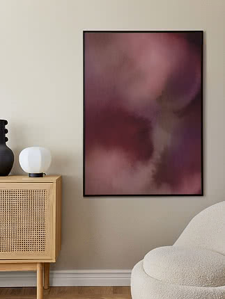
Color first. Pick a painting that shares one or two colors with the room – the sofa, a rug, the wooden floor. Monet’s blues and greens calm a bedroom, while Matisse’s pinks and oranges wake up a kitchen.
Then mood. Impressionist landscapes are soft and quiet, modernist cut-outs are playful, and Klimt’s gold is pure drama. Think about how you want to feel in the room, not just how it should look.
Then the wall. Large, busy paintings need a calm wall with space around them. Line drawings and small studies are happy above a desk, in a hallway or on a shelf.
Four places to start:
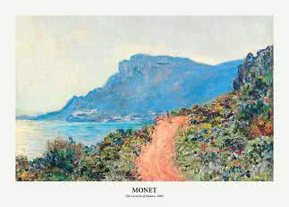
Water lilies, irises, starry skies and the Mediterranean in dabs of color. Soft, bright and easy to live with.
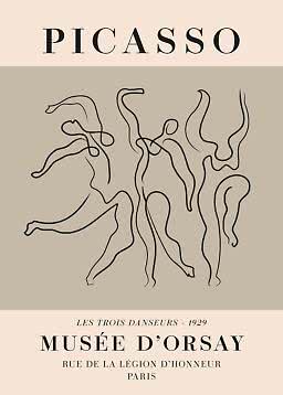
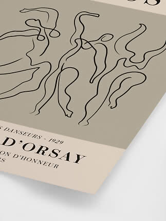
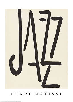
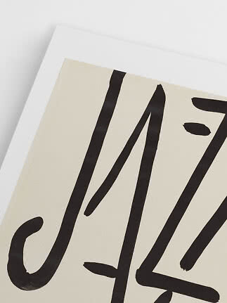
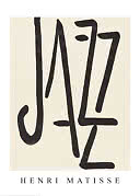
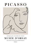
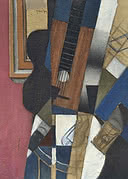
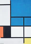
Matisse, Picasso and Juan Gris boiled painting down to the essentials. Graphic enough for the most modern room.
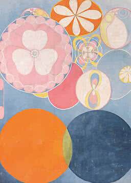
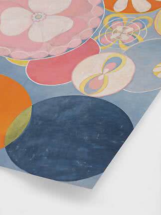
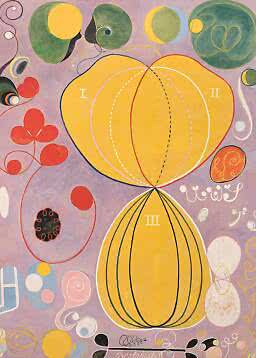
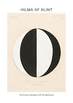
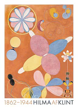
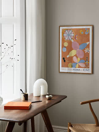
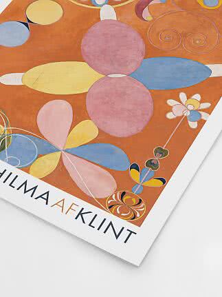
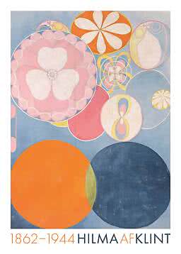
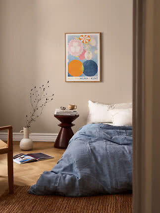
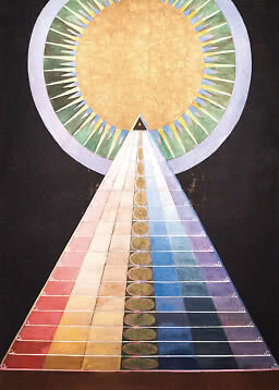
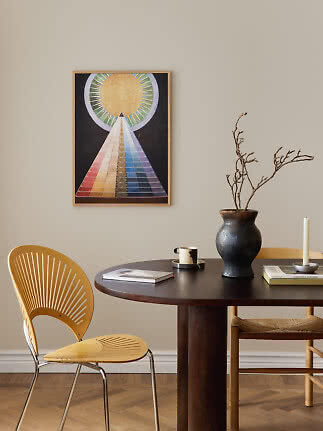
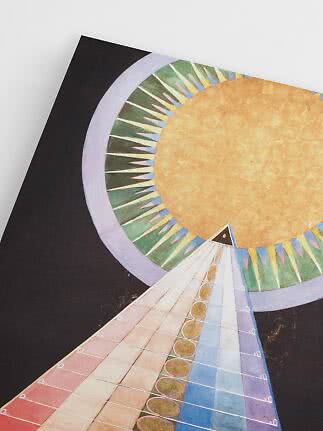
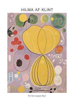
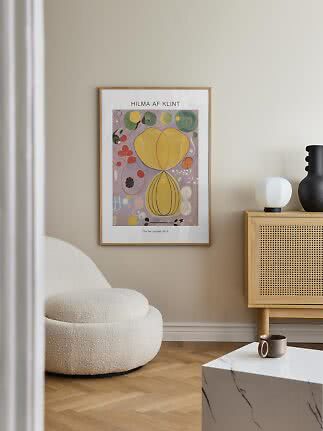
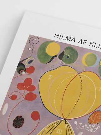
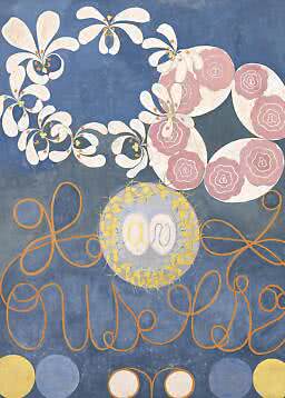
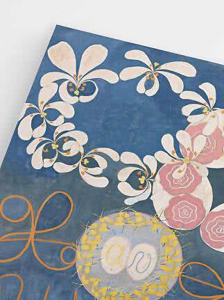
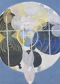
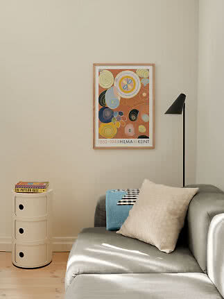
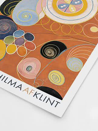
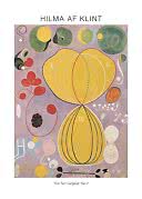
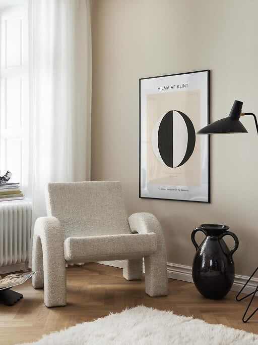
Hilma af Klint painted her first abstract works in 1906, before Kandinsky and Mondrian made abstraction famous.
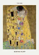
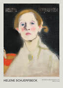
Faces that hold your gaze, from Leonardo’s lady with an ermine to Klimt’s golden embrace.
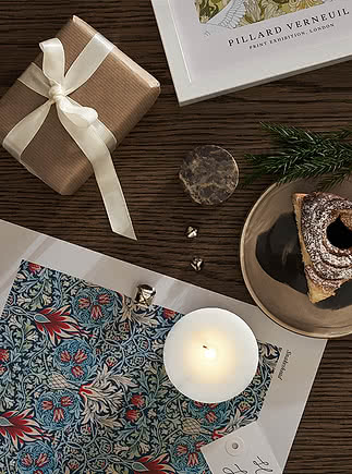
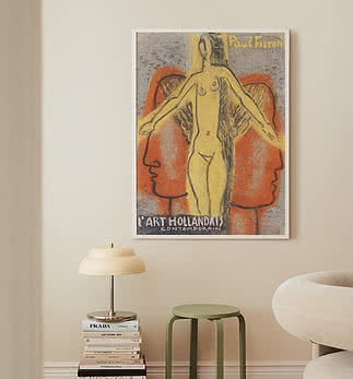
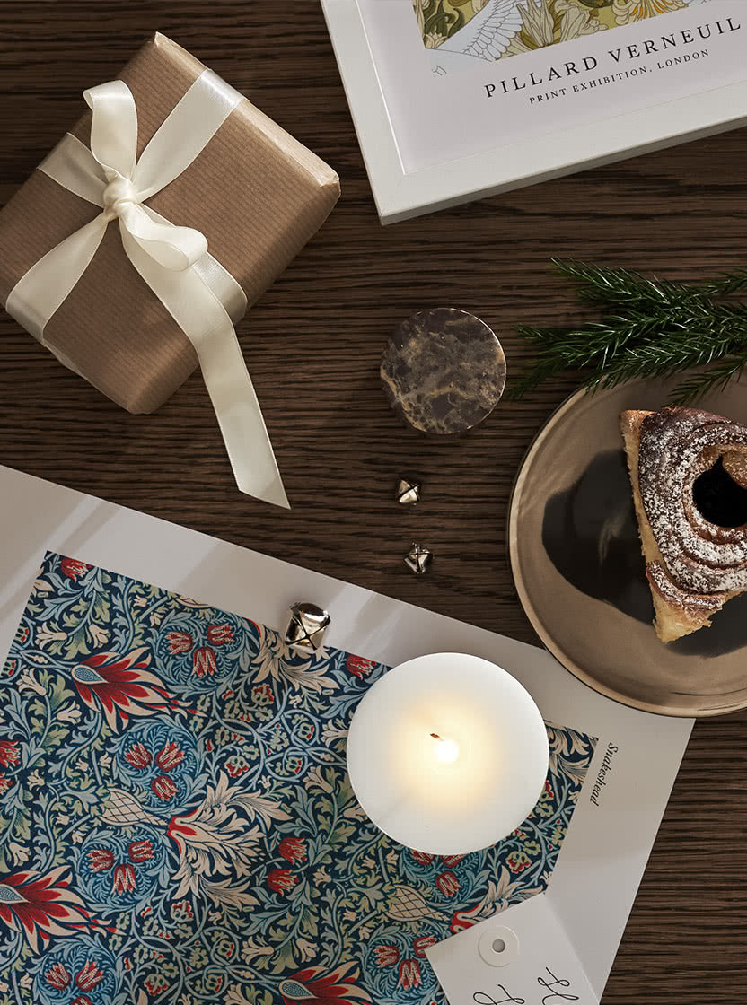
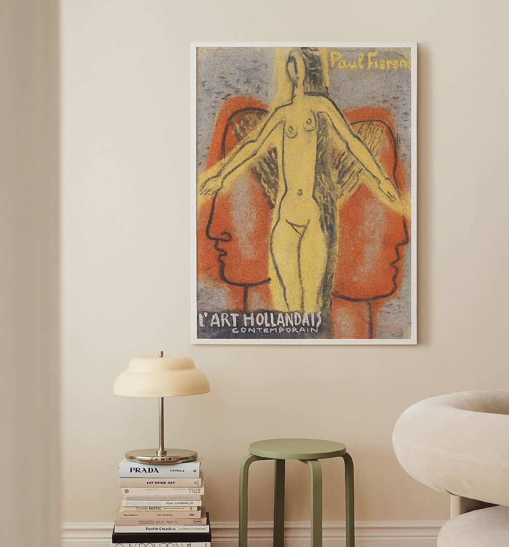
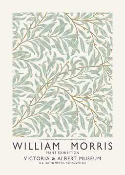
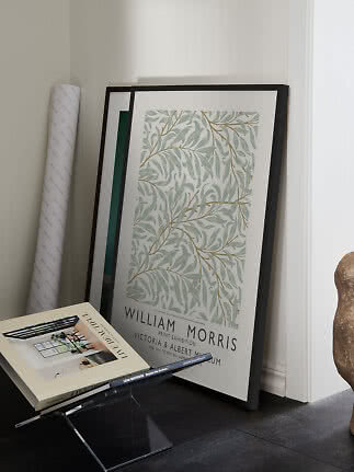
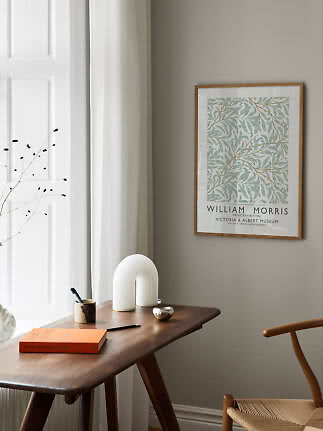
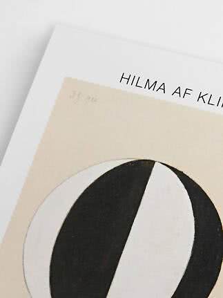
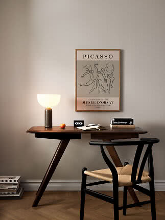
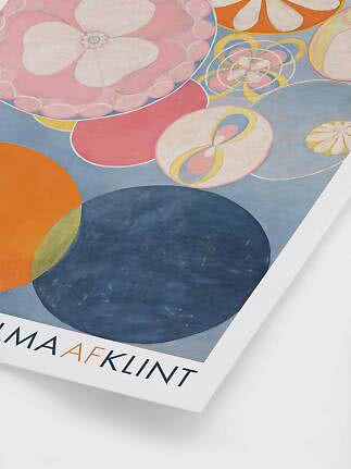
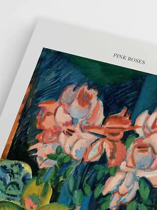
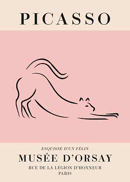
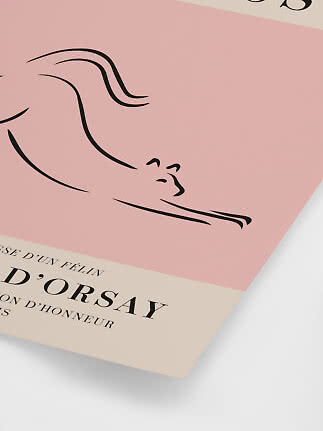
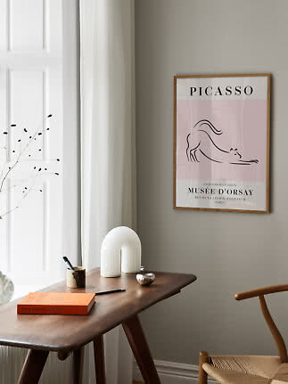
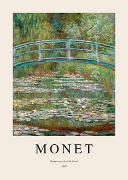
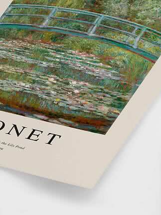
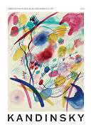
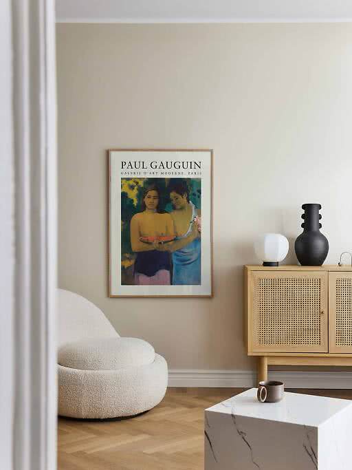
Many of our famous art prints are designed like the posters you bring home from a big exhibition: the painting, a generous border and the artist’s name in clean type, sometimes with the title, a museum or a year.
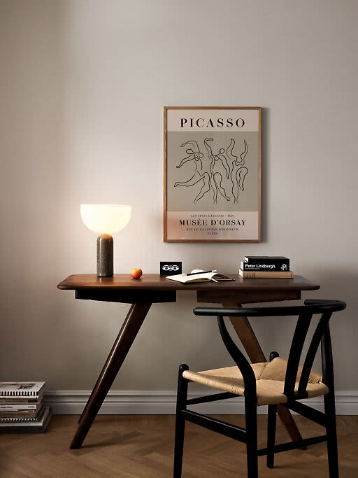
The type does more than you’d think. It turns an old painting into a graphic object, links it to the books and lamps around it, and gives a modern room something to hold on to. It also makes the print easier to mix: an exhibition poster sits as happily next to a photograph as it does next to another painting.
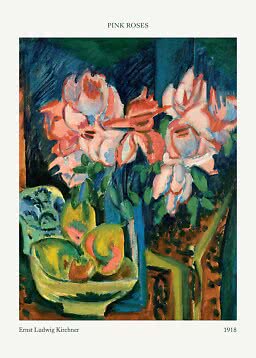
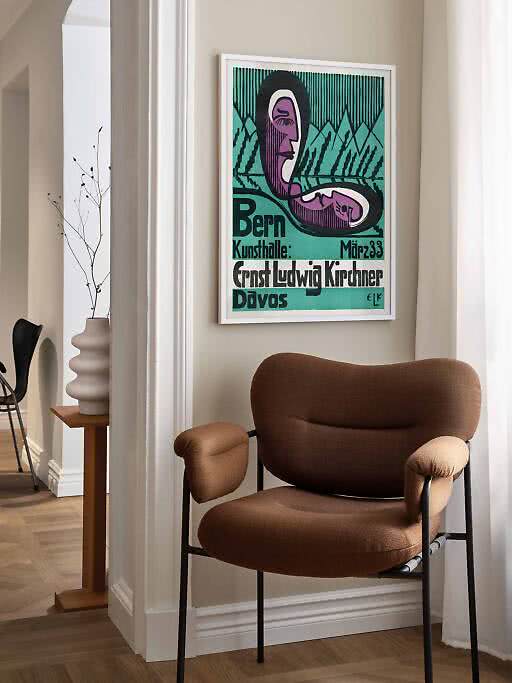
Some of them are the real thing. Ernst Ludwig Kirchner designed the poster below himself, for his 1933 exhibition at the Kunsthalle Bern.
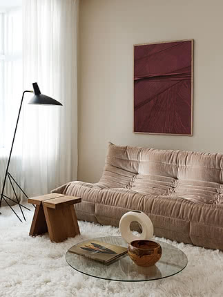
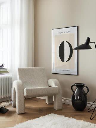
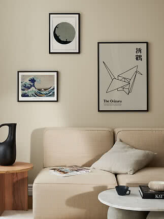
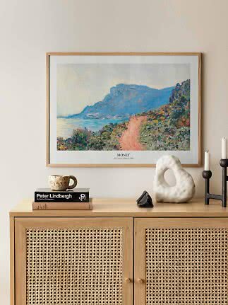
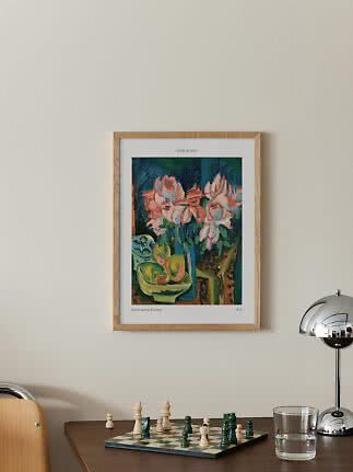
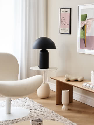
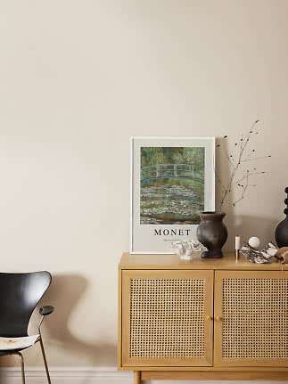
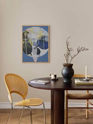
The trick to making a famous painting feel at home is contrast. Let the art be the old thing in the room and keep everything around it simple: a pale wall, clean-lined furniture and natural materials.
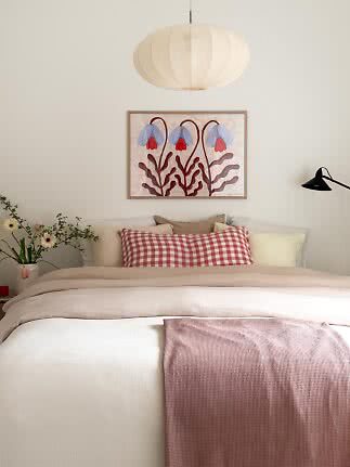
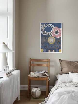
Repeat one color. Pull a single shade from the painting into a cushion, a vase or a throw. It ties the art to the room without turning it into a theme.
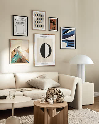
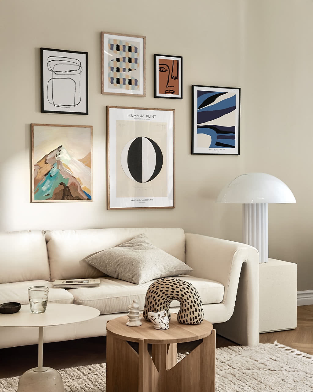
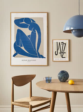
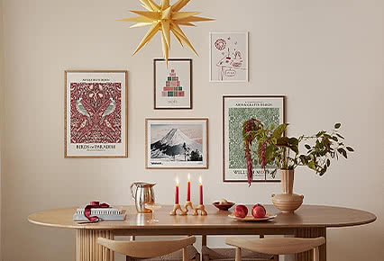
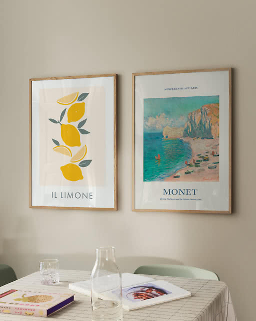
Mix the centuries. Hang a Monet next to a modern graphic print, or a Klimt next to a line drawing. The pair looks curated rather than bought as a set.
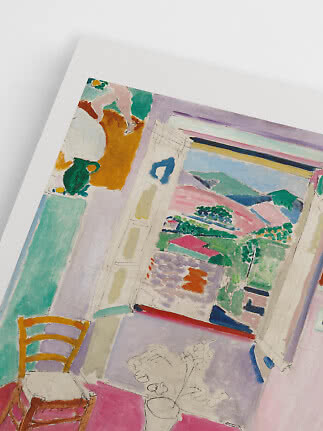
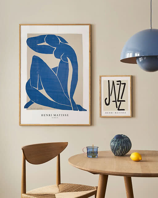
Or stay with one artist. Two prints by the same painter always belong together, even in different sizes. One large and one small is the easiest way to do it. More in our Henri Matisse collection.
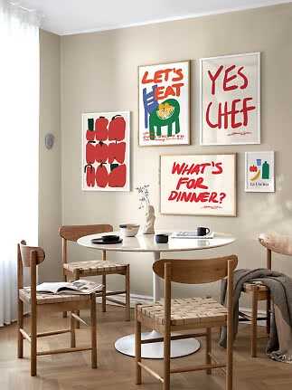
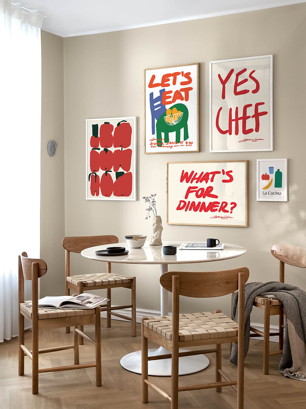
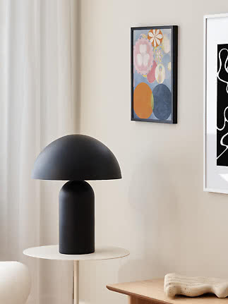
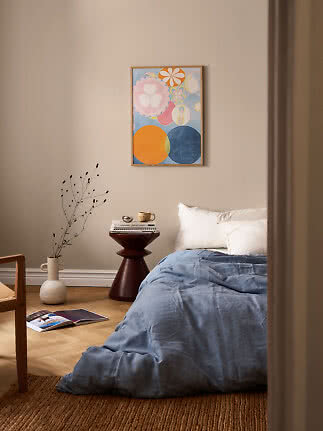
Three ready-made walls from our inspiration pages, with every print, size and frame picked for you:
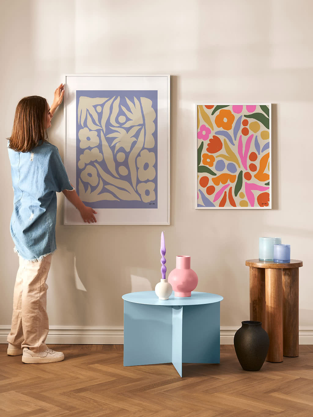
Forget the idea that a masterpiece needs a heavy gilded frame. At home, the frame should suit the room as much as the painting.
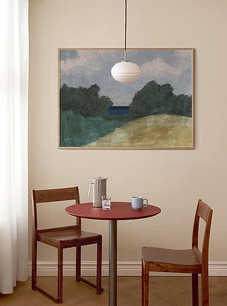
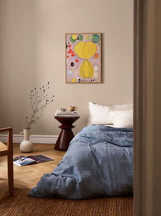
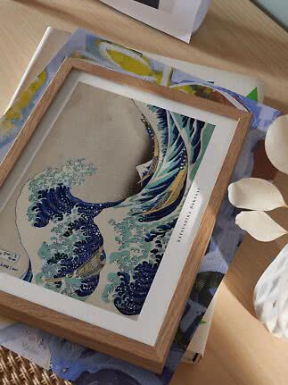
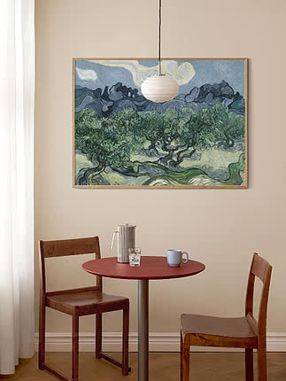
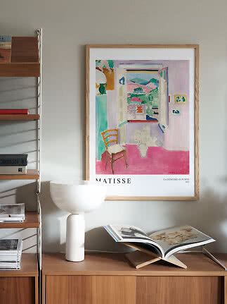
Oak. Warm and natural. It softens strong colors and suits impressionist landscapes, Matisse interiors and anything near wooden furniture.
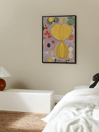
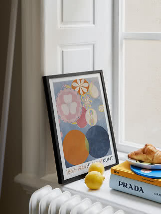
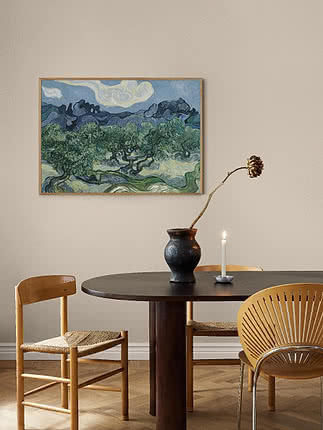
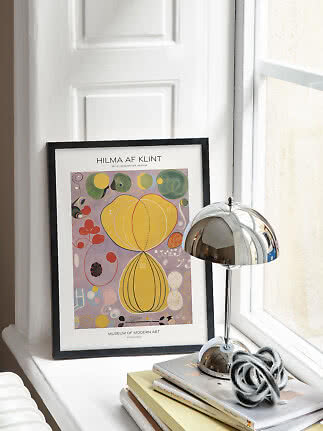
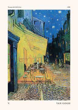
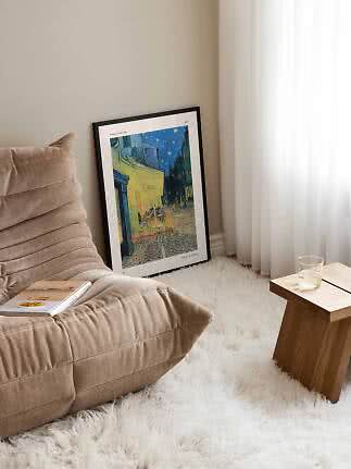
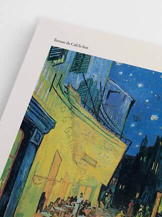
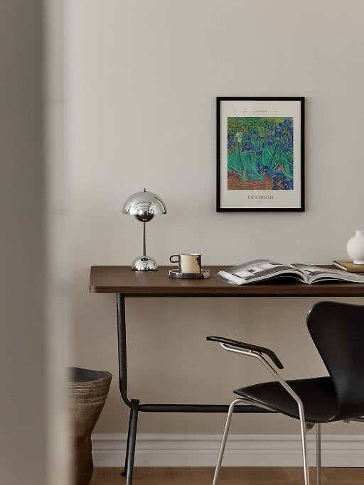
Black. Crisp and graphic. It sharpens deep colors – Van Gogh’s blues, Klimt’s gold – and makes an exhibition poster look as if it came straight from the gallery.
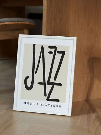
White. Light and modern. Around a bold cut-out or a poster with a wide border, white lets the artwork float on the wall.
Classical. Want the full museum feeling? An ornate, vintage-style frame in gold, silver or walnut does it. More in our guide to choosing the right frame.
The ones that suit your room and your mood. Monet’s water lilies and Van Gogh’s irises are calm and easy to place, Matisse’s cut-outs bring color and play, Klimt’s The Kiss adds warmth and gold, and Hilma af Klint’s Ten Largest series makes a bold, modern statement.
Choose for the room rather than the century. Oak gives warmth, black gives crisp contrast and white keeps things light and modern. For a classic museum look, go for an ornate classical frame in gold, silver or walnut.
Above a sofa, a bed or a sideboard, aim for about two thirds of the furniture’s width. A pair of 19.7x27.6 in or one landscape 27.6x39.4 in covers about 3 feet, just right above a 63 in bed or sideboard; above a big sofa, try a pair of 27.6x39.4 in. Above a desk or in a hallway, an 11.8x15.7 in or a 19.7x27.6 in is plenty. Almost all of our famous art prints come in both 11.8x15.7 in and 19.7x27.6 in. More in our poster size guide.
A print that pairs a painting with typography – the artist’s name, the title, a museum or a date – in the style of the posters made for art exhibitions. The type gives a classic painting a graphic, modern edge.
Yes, and it often looks better than a wall of old masters. Repeat one color between the prints, keep the frames calm, and let the old and the new take turns. Our gallery wall ideas show five layouts that always work.
Famous art prints
More from the magazine
All articles →