 (1).png)
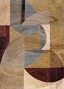
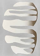
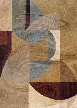
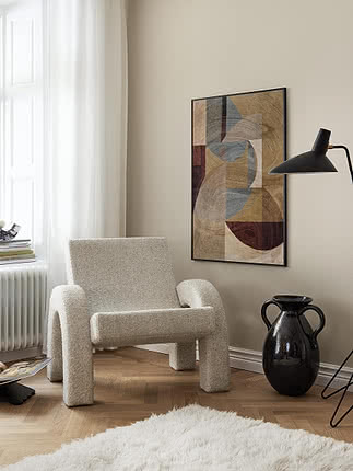
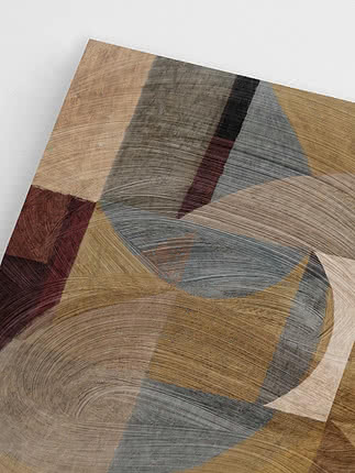
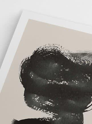
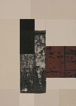
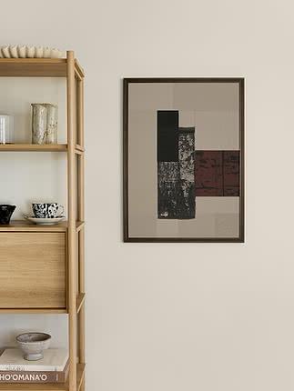
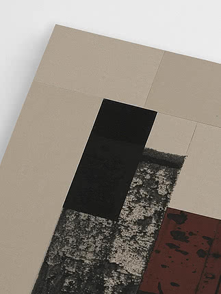
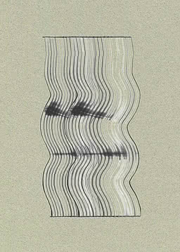
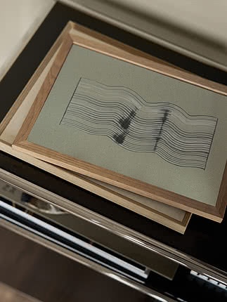
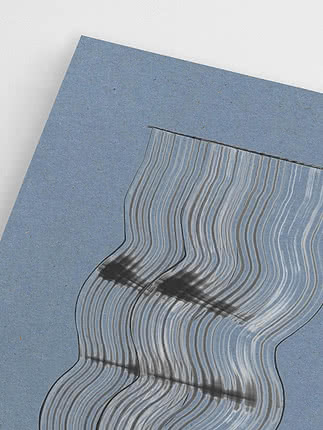
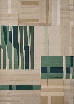
Abstract Movement
Dan Hobday
New
$37.99$47.99
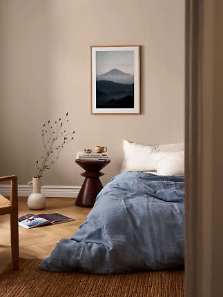
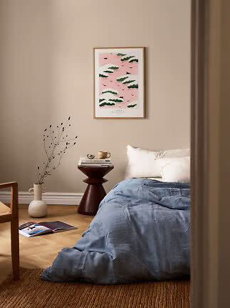
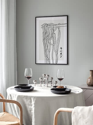
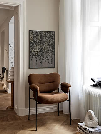
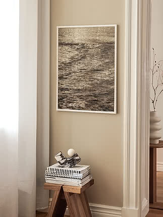
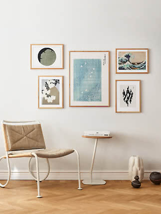
Japandi wall art is where Japanese calm meets Scandinavian warmth: muted earth tones, simple lines, natural textures and plenty of empty wall around every piece. Think a Hokusai wave in an oak frame, an ink brushstroke above a linen sofa, or one big misty landscape instead of five small prints. Here’s how to pick motifs and colours, how big to go, which frames to choose and how to hang it all so the room can breathe.
Japandi borrows the stillness of a Japanese room and the cosiness of a Scandinavian one. On the wall, it comes down to four things.
Earthy colours. Sand, clay, moss, stone and a touch of ink black – colours that look borrowed from nature rather than from a paint chart. One accent, like an indigo wave or a small red sun, is plenty.
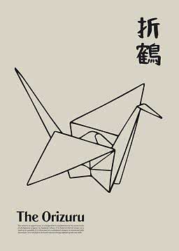
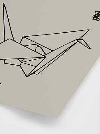
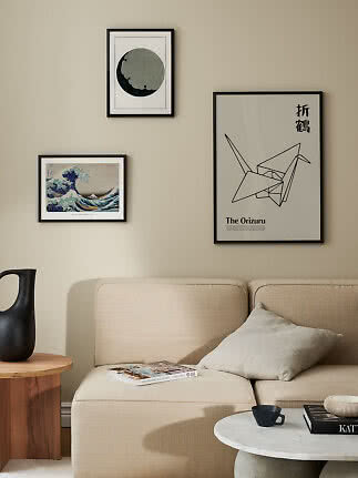
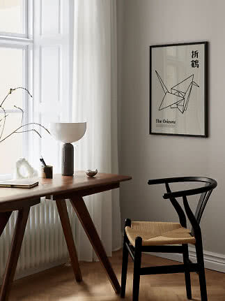
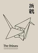
Line and brushstroke. A folded paper crane, an ink circle, a few pine needles. Simple shapes drawn with a steady (or happily unsteady) hand.
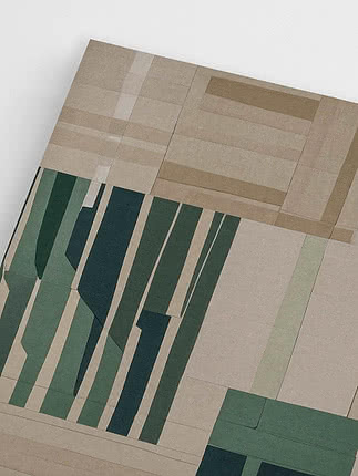
Texture. The grain of a woodblock print, the softness of mist over water, layers of sandy colour. Art that rewards a closer look.
Space. The empty wall around a picture is part of the picture. Leave it bare on purpose.
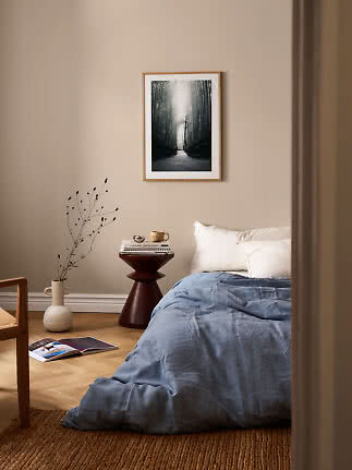
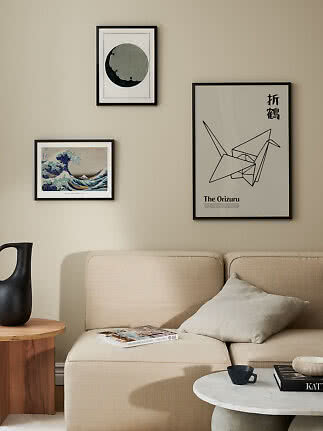
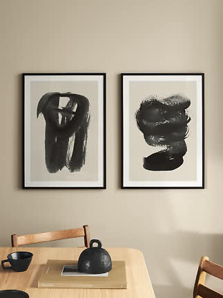
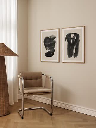
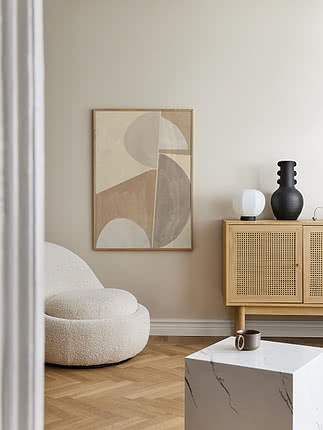
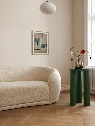
A Japandi wall rarely holds more than one or two pieces. Rather than a busy gallery wall, choose one print you really love and give it room to breathe: a 50x70 above a sideboard, a large print above the sofa or two prints side by side with a generous gap. Each motif counts for more, and the whole room feels quieter.
How big? The classic rule says art should cover about two thirds of the furniture’s width. Above a 200 cm sofa, a 100x140 on its side does exactly that; a single 70x100 covers less and feels even airier – very Japandi. How high? Leave 20–25 cm between the furniture and the bottom of the frame. Japandi furniture is often low, so your art may end up lower than you’re used to. That’s the point: it keeps everything at sitting height, close to the ground. Enter the width of your sofa and see what fits.
Size calculator
Choose the furniture, enter its width and see what fits – with the size, the gap and the height to hang it.
100x140 cm · landscape
One large print that sets the tone – the wall does the talking. Covers about 70% of the sofa’s width.
Shop 100x140 postersFive gallery wall layouts →Based on our hanging guide: 20–25 cm above the furniture, 6 cm between frames and the top edge no higher than 210 cm. Standard furniture heights and a 240 cm ceiling.
Nothing says Japandi faster than a Japanese print, and many classics already come in the right palette: faded indigo, rice-paper beige, soft green and a single dot of red.
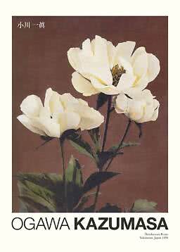
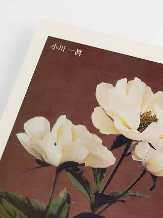
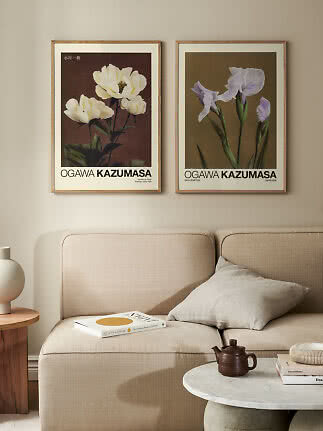
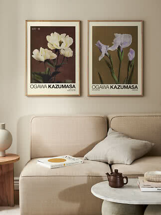
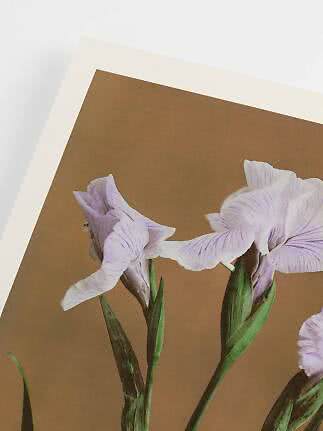
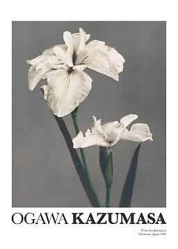
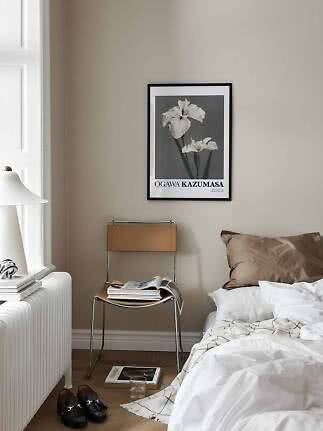
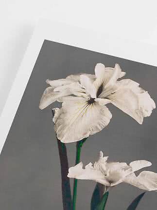
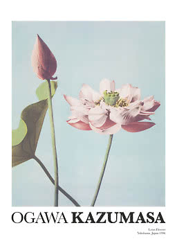
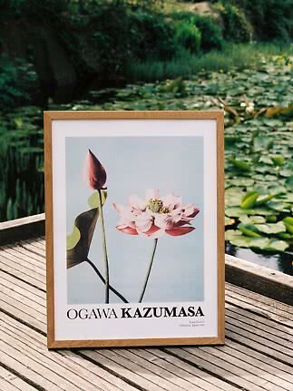
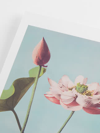
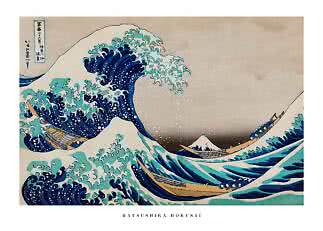
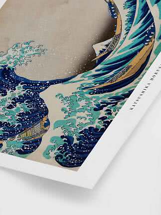
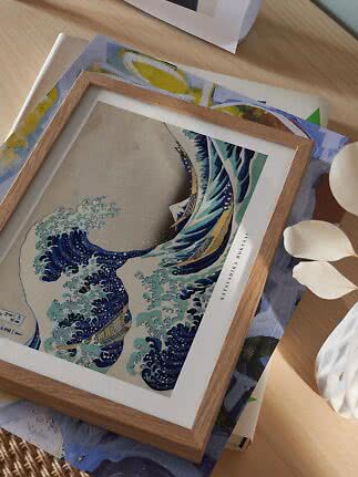
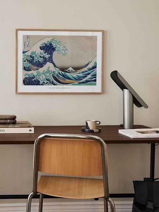
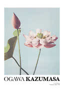
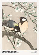
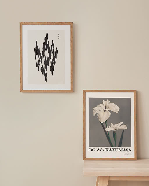
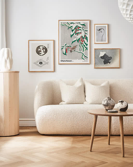
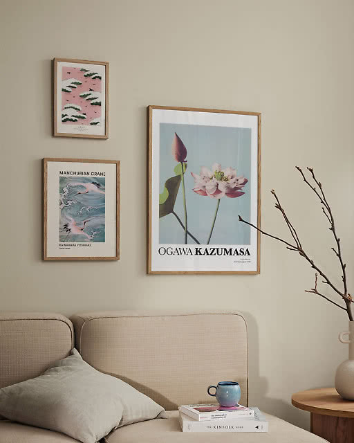
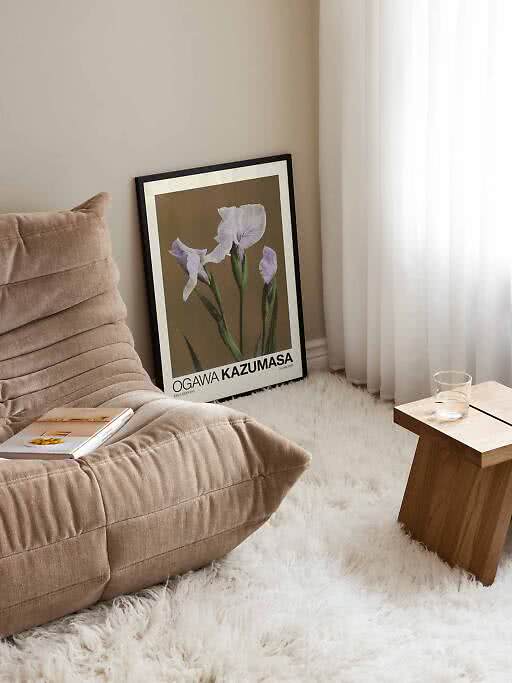
Katsushika Hokusai made The Great Wave around 1831 for his series Thirty-six Views of Mount Fuji; Fine Wind, Clear Morning – the famous red Fuji – is from the same series. Kamisaka Sekka published Momoyogusa, a woodblock-printed book of cranes, waves, hills and flowers, in 1909–1910, and the designs still look startlingly modern. Ohara Koson is a master of small birds on blossoming branches, and Ogawa Kazumasa photographed flowers more than a century ago and had the pictures coloured by hand.
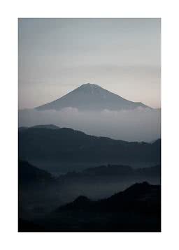
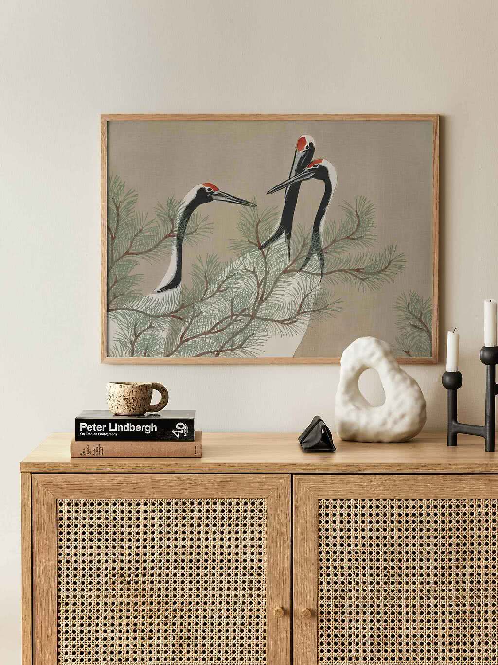
Choosing one: pale backgrounds sit best on light walls, while a dark print turns a beige wall into a gallery. A landscape-format print, like the cranes at the top of this page, is made for a long, low sideboard. Browse all our Japandi posters.
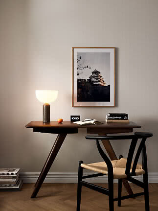
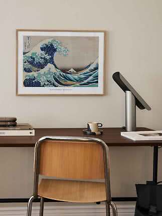
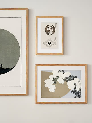
Let the wood do the talking. Oak is the natural Japandi frame: light, warm and the same family as the furniture. Black suits ink drawings and darker woodblock prints, and dark oak adds depth to a room with walnut or smoked wood. Many of our Japanese prints have a pale border printed around the motif, so they look mounted even without a mat board – but if you want one, here’s everything you need to know about mat boards.
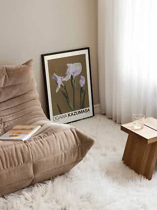
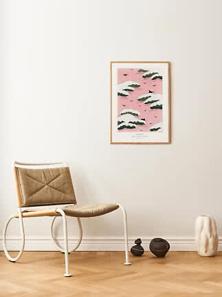
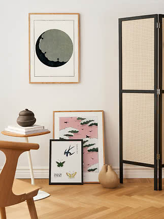
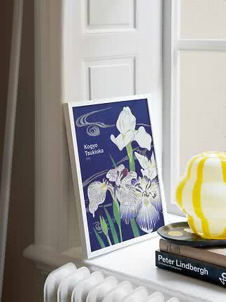
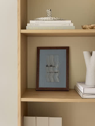
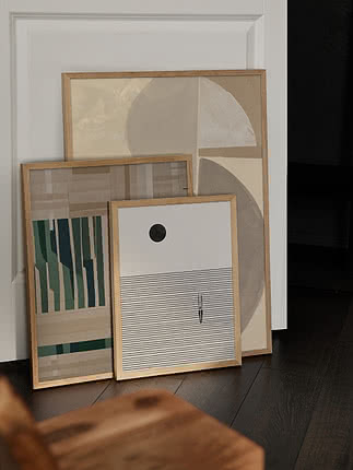
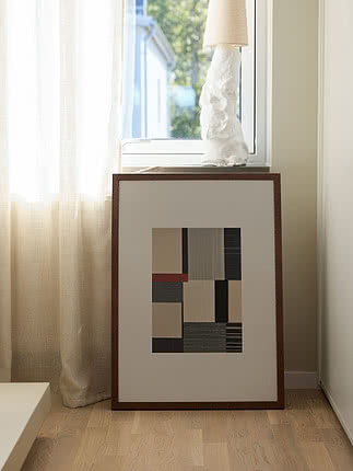
Lean it. Low furniture practically asks for it. A frame resting on the floor beside a lounge chair, on a bench or on a deep windowsill looks unforced, and it’s easy to swap when the season changes.
Go off-centre. Japanese design loves balance without symmetry. Hang a print to one side of the sideboard and let a lamp or a tall vase hold the other side, or pair a big frame with a small one and line up their bottom edges. Four layouts, drawn to scale above a 160 cm sideboard:
A single 70x100 in the middle, with plenty of bare wall on both sides and nothing competing for attention.
One 50x70 hung right of centre. Put a lamp or a tall vase on the empty side to balance it.
A 50x70 and a 30x40 with their bottom edges in line and 6 cm between them. Relaxed, but not random.
Two 30x40 at different heights, like stepping stones. Or hang one and lean the other below it.
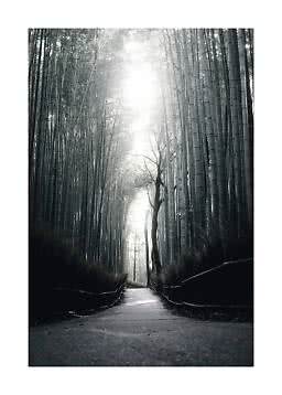
Japanese classics, flowers and birds, ink and line, or earthy abstracts: four directions with the same quiet mood. Mixing two of them is very Japandi – a woodblock print next to a textured abstract, for instance – as long as the colours stay in the same family.
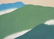
Hokusai’s red Fuji, a parade of cranes and Sekka’s soft green hills. Old masters with the calm already built in.
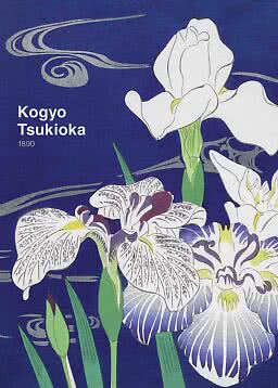
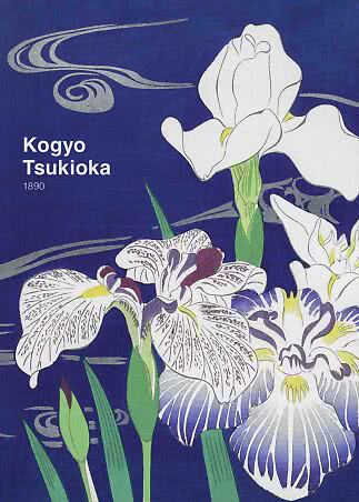
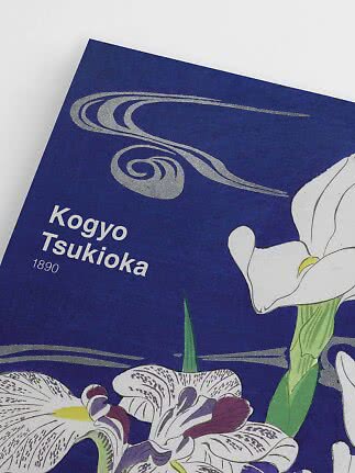
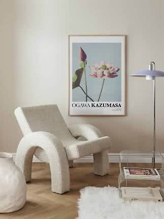
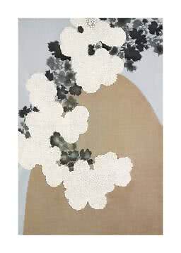
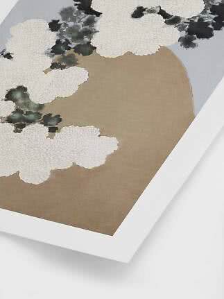
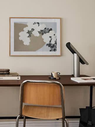
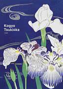
Lotus, cherry blossom and irises: nature brought indoors one branch at a time.
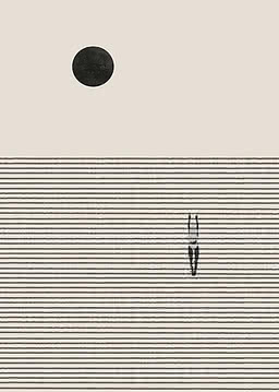
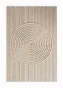
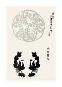
A paper crane, a raked sand garden and a stamped crest. Simple shapes that do a lot with very little.
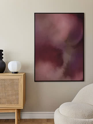
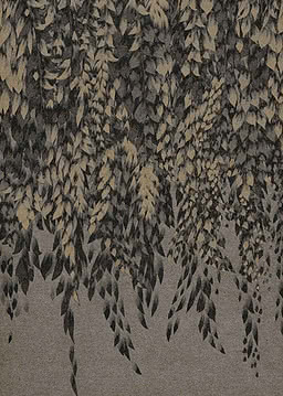
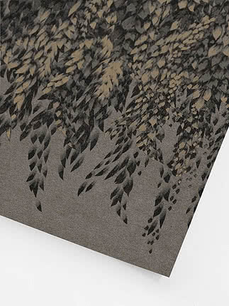
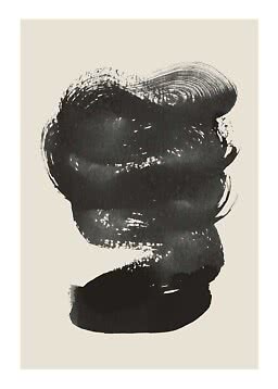
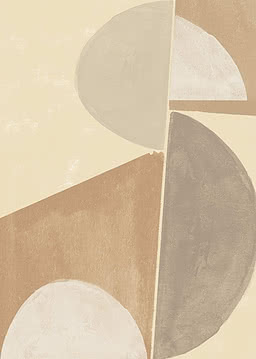
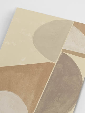
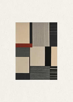
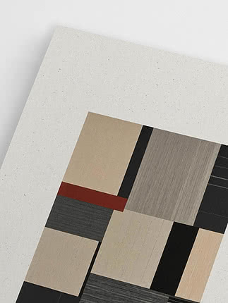
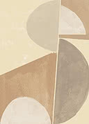
Sand, clay and stone in soft layers – the Scandinavian side of Japandi, and lovely next to a Japanese print.
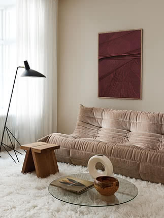
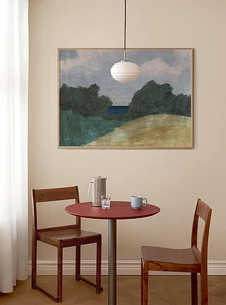
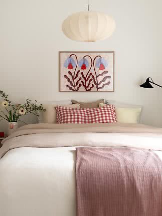
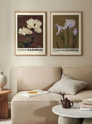
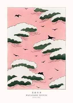
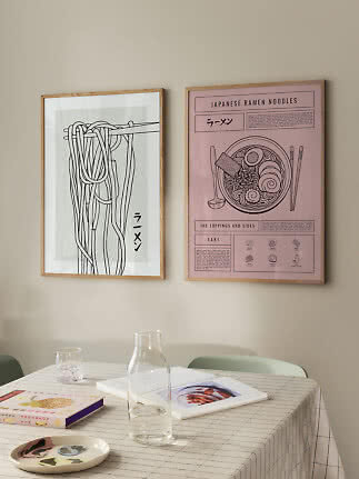
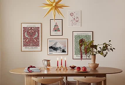
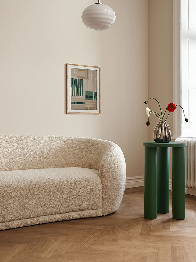
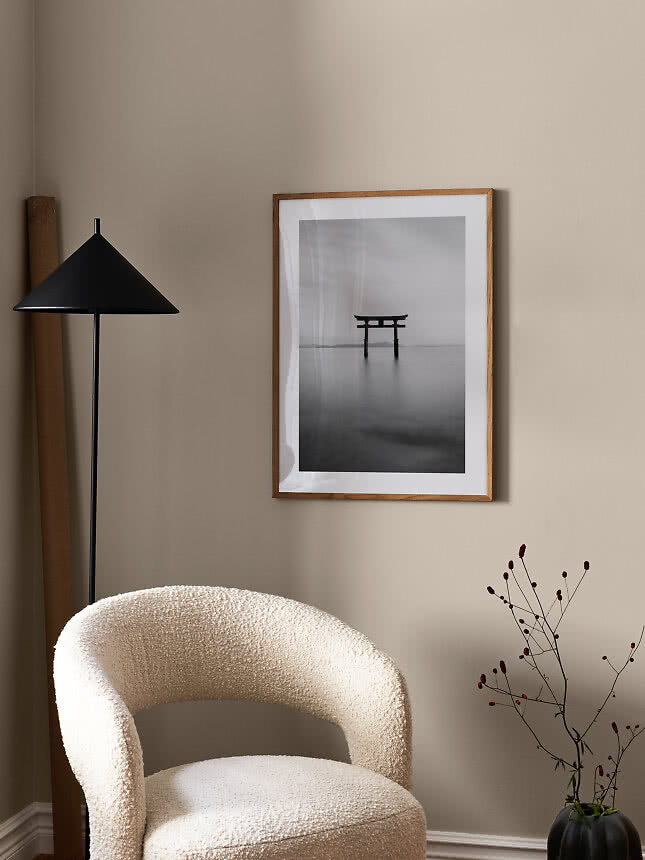
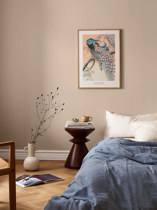
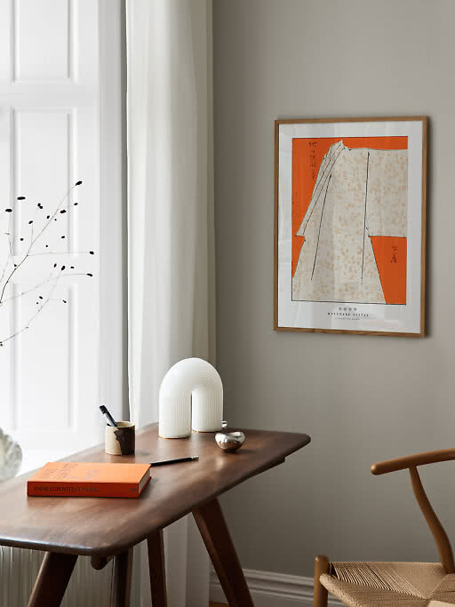
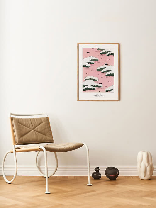
Rather have the pairing done for you? These walls from our inspiration pages were made for this look – one to hang and lean, a group of four above a sofa and a soft pink trio – with every print and size in one place.
Wall art that combines Japanese calm with Scandinavian warmth: muted earth tones, simple lines, natural textures and nature motifs. Japanese woodblock prints, ink-style abstracts and quiet landscape photos are typical, usually as one or two larger pieces with plenty of empty wall around them, in oak or black frames.
Muted, earthy colours: sand, beige, clay, moss green, stone grey and ink black, with at most one stronger accent such as indigo or a small red sun. Take your cue from the wood, linen and ceramics already in the room and the art will look as if it belongs there.
Oak is the classic choice because it matches light wood furniture. Black works for ink drawings and darker prints, and dark oak suits rooms with walnut or smoked wood. Keep the frames slim and stick to one or two frame colours per room.
Fewer than you think. One large print or a pair is usually enough above a sofa or sideboard. If you want more, lean a smaller frame on a bench or shelf rather than filling the wall.
Yes – that’s the whole idea of Japandi. Pair a woodblock print with an earthy abstract or a black-and-white photo, and keep the colours in the same family so the two pieces feel related.
Japandi posters
New
New
New
New
New
New
New
New
New
New
More from the magazine
All articles →