Autumn Sale · 4 d 21 h left
Up to 25% off
A mat board does more than most people expect from a plain border. It creates breathing room around the art, keeps the print from touching the glass, and gives the whole piece that finished, gallery-standard look. Let's walk through when to use one, and how to get it right.
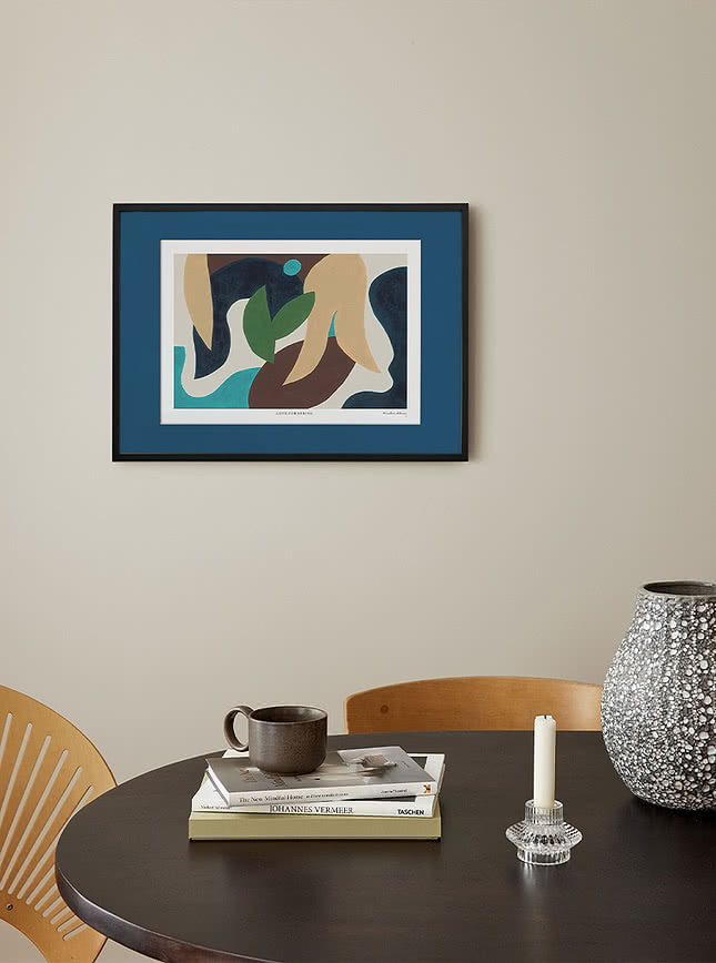
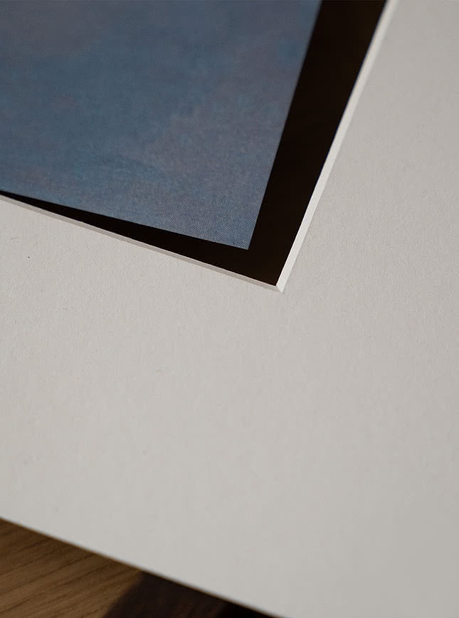
It started as a practical fix, a gap to keep the art from touching the glass, where condensation could damage the print over time. That's no longer really the concern it once was, but the look stuck around and became the mark of considered framing. Today it's less about necessity and more about the effect it still gives, breathing room around the piece, a gallery-standard finish that says the artwork was framed with real thought. This guide walks through when to use it, when to skip it, and how to choose the right width and colour for your piece.
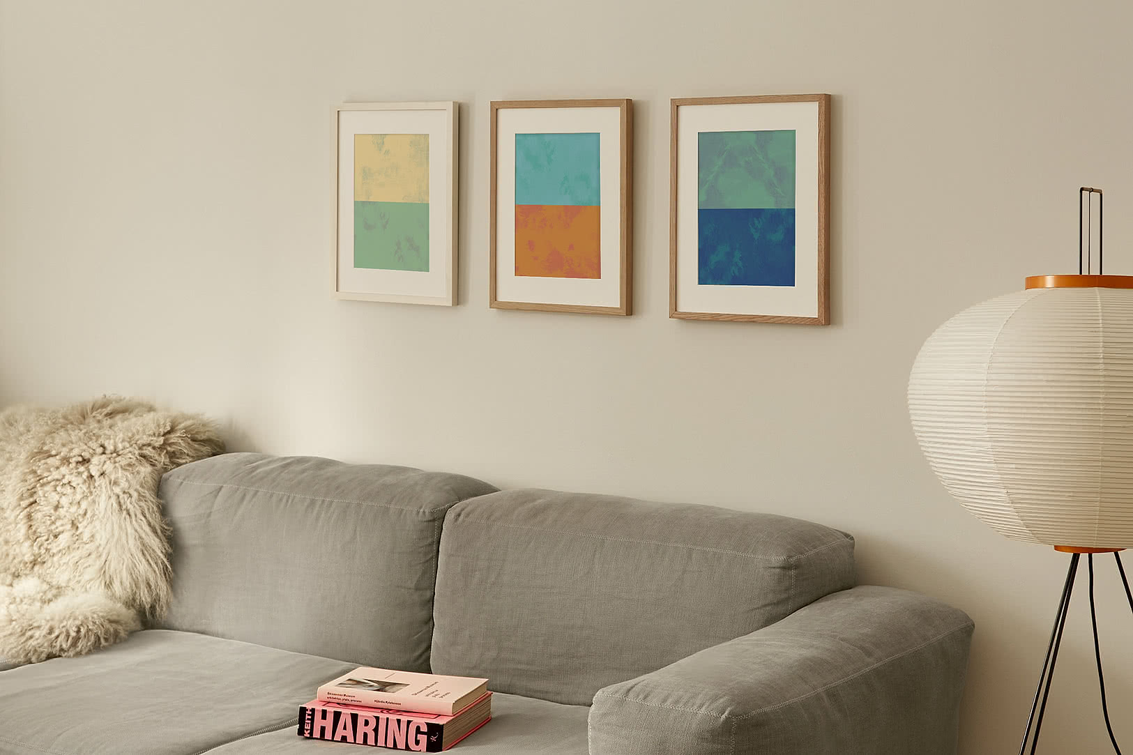
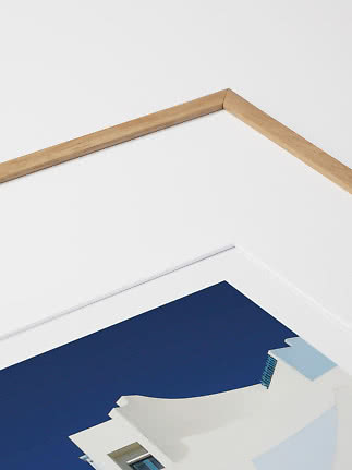
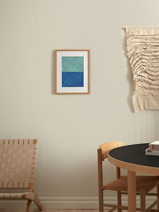
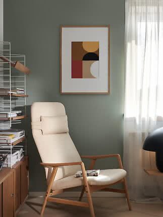
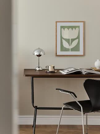
A white mat board is crisp and neutral, and works especially well with high-contrast or colourful art, it's the most versatile choice for a gallery wall. Beige or off-white is warmer and softer, and sits better in a warm modernist or natural-material interior, it pairs particularly well with oak frames. Whichever you choose, consistency matters more than the choice itself. Once you've picked one, stay with it across the whole gallery wall grouping.
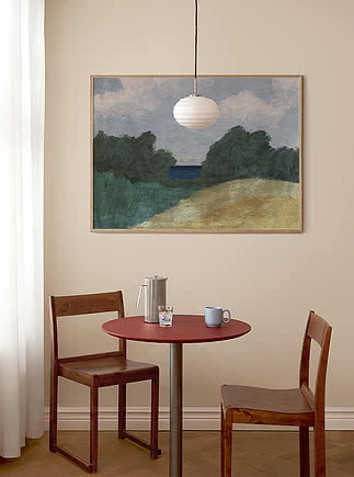
A coloured mat works best as a deliberate accent, echoing a colour already in the art or the room. It's not just for simple or graphic pieces either, colour can add real depth to paintings and richer artwork too, so long as the palette and theme are considered alongside the room.
It works especially well in a playful interior, an accent wall, or as the one bold move in an otherwise restrained space. The art type isn't really the deciding factor here, it's whether the combination feels intentional against the room around it. This is a good place to take a bit of a risk rather than default to safe neutrals.


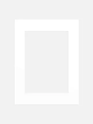
When you're browsing, you'll see two different numbers, the outer frame size and the window size. The window is the part your art actually shows through, the outer size is the full frame including its mat board border. Two options can share the same 30x40cm window but come in different outer sizes, say 40x50cm or 50x70cm, and the difference between them is entirely in the width of the mat.
As the outer size grows while the window stays the same, you get a wider mat board border and more presence on the wall, without changing the size of the printed art itself. Go bigger on the outer size if you have a larger wall to fill, want more visual weight, or want the piece to feel more gallery-considered. Keep it tighter if your wall is smaller and you want the print itself to stay the focus.
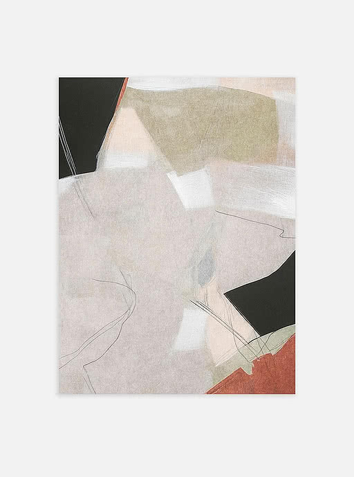
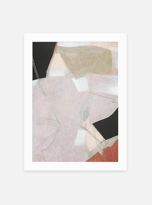
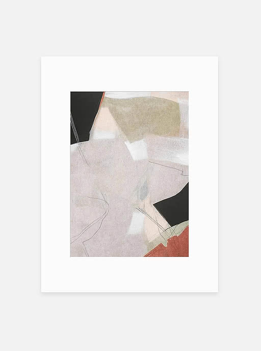
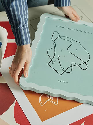
It's worth knowing that some prints come with their own printed border built in, separate from any mat board added afterward. Either way works, a full-bleed print looks just as intentional without a mat as one with its own border does, more mat simply adds another layer on top rather than fixing something missing. The window versus frame size logic stays the same regardless, a wider mat means more presence on the wall, not a change to the print itself.
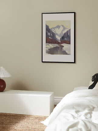
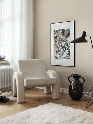
Mat width sets the mood, but it also expands the total frame size. Wide mats bring formal, gallery-like scale to high ceilings, spacious rooms, and distant sight lines such as over a sofa, while narrow mats stay casual and compact for tight walls, low ceilings, and close viewing in hallways. Match your frame too, slim frames suit a wide mat, ornamental ones need one just as generous so the detailing doesn't crowd the print.
Ready to find the right fit? Explore our framing and mat board options, or ask us, we're happy to help!
Mat boards
 (1).png)