 (1).png)






53% off
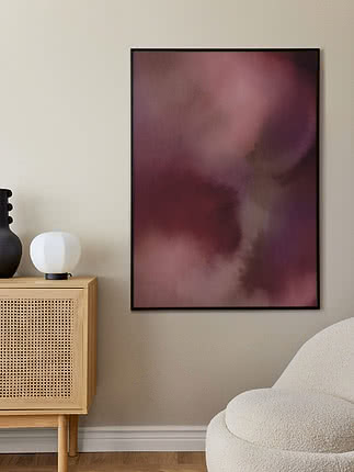
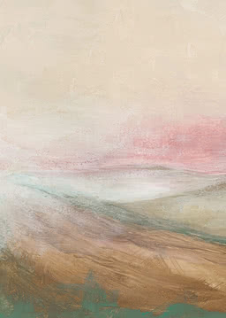
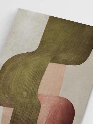
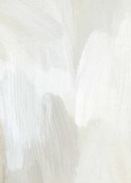
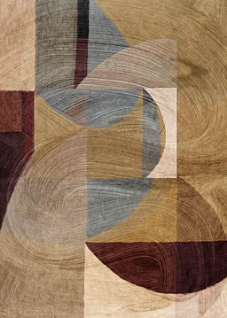
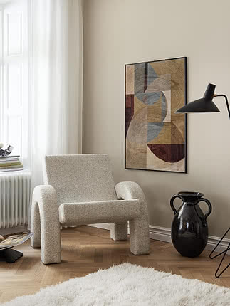
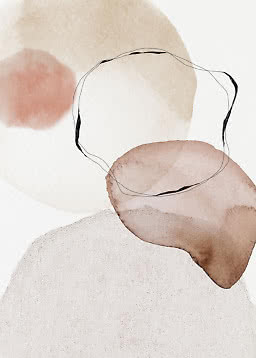
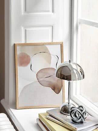
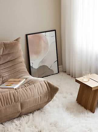
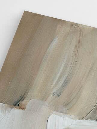
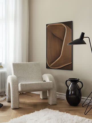
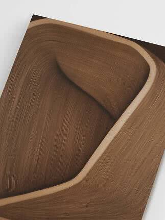
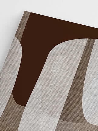
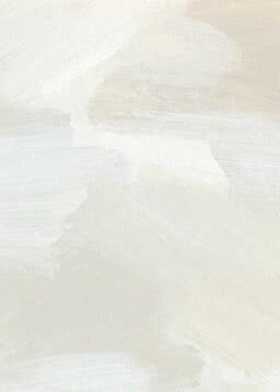
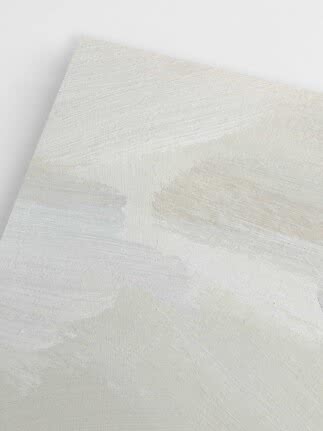
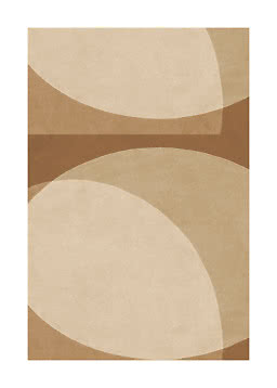
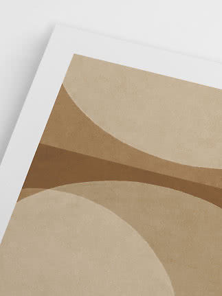
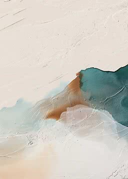
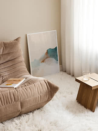
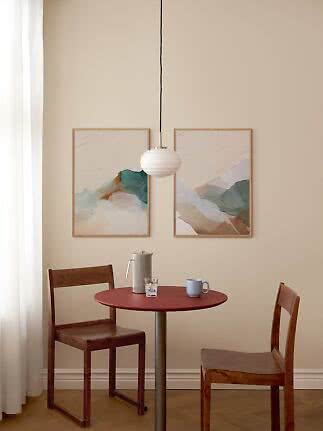
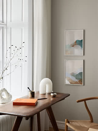
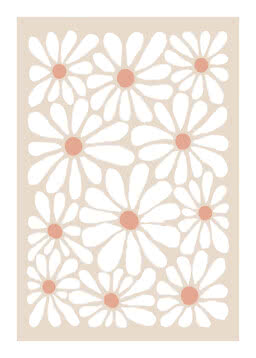
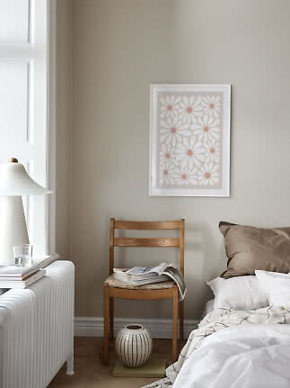
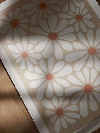
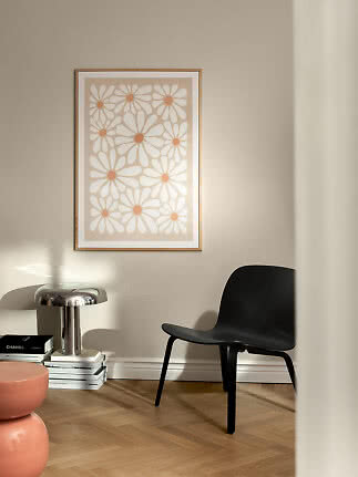
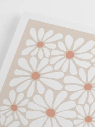
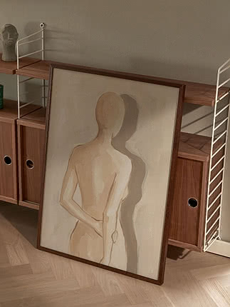
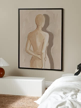
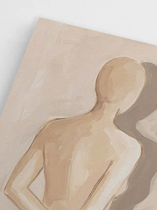
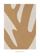
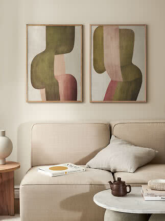
Muted Organic Flow I
Alma
$25.99$54.99
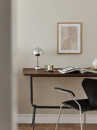
Some colours ask you to plan a room around them. Neutrals do the opposite: sand, cream, stone and soft clay settle into whatever is already there – the oak floor, the grey sofa, the white walls you never got round to repainting. That is why neutral wall art is the choice we come back to most often when someone isn’t sure where to begin. It works in every room, in every style and next to almost anything you own. The one thing it doesn’t forgive is being chosen on autopilot, so here is how to find the right neutral for your room, how to keep the wall alive – and the moment a single colour is worth the risk.
In short
It suits every room. A calm palette never argues with what a room is for, so the same print feels as right above the sofa as it does in the bedroom, the hallway or by the dining table.
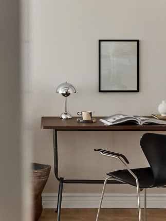
It goes with any style. Next to oak it looks warmer, with black details it turns graphic, on a white wall it feels light. Few motifs give you that much freedom.
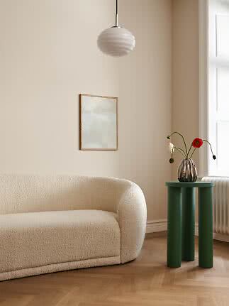
It gets along with everything. Sand and stone sit easily next to wood, linen, ceramics and plants – and they let a favourite chair or a beautiful rug take the lead.
It lasts. Trend colours come and go. A print in sand and clay is just as easy to live with in five years, and it moves house with you without a fuss.
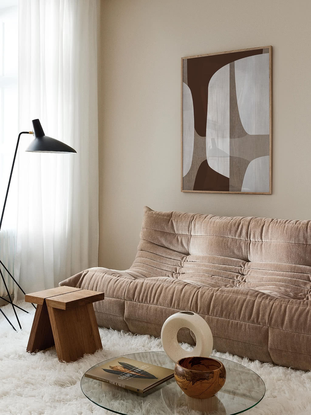
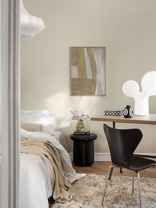
Think sand, caramel, cream, clay and taupe – tones with a hint of yellow, red or brown.
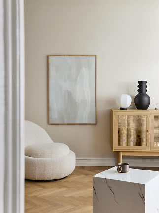
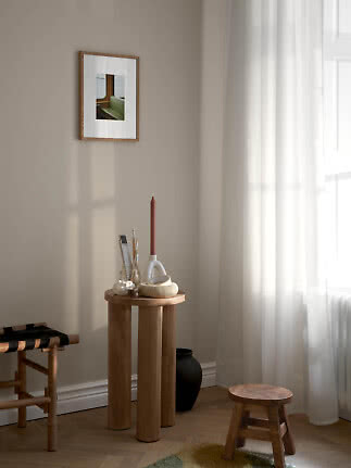
They love oak and walnut, wooden floors, rattan and linen, and north-facing rooms, where they add the warmth the daylight lacks.
How to spot them. Hold the print up against a sheet of white paper. If it leans yellow, pink or brown, it’s warm.
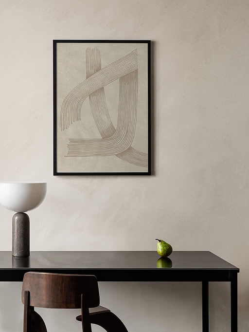
Think stone, chalk, greige, pale grey and off-white – tones with a hint of grey, green or blue.
They love black details, white walls, marble and concrete, and sunny south-facing rooms, where they keep things fresh.
How to choose. Not sure which you have? Match the print to your floor or sofa rather than the walls – that’s where the undertone shows. Four directions to start from follow below.
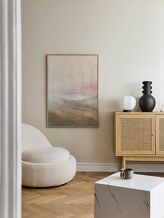
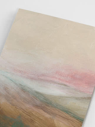
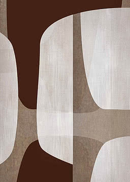
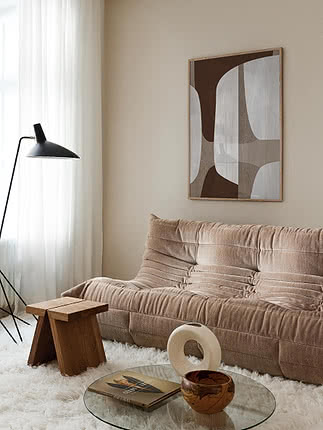
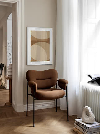
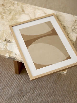
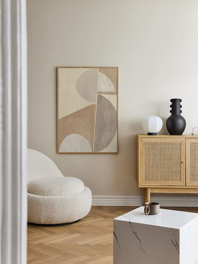
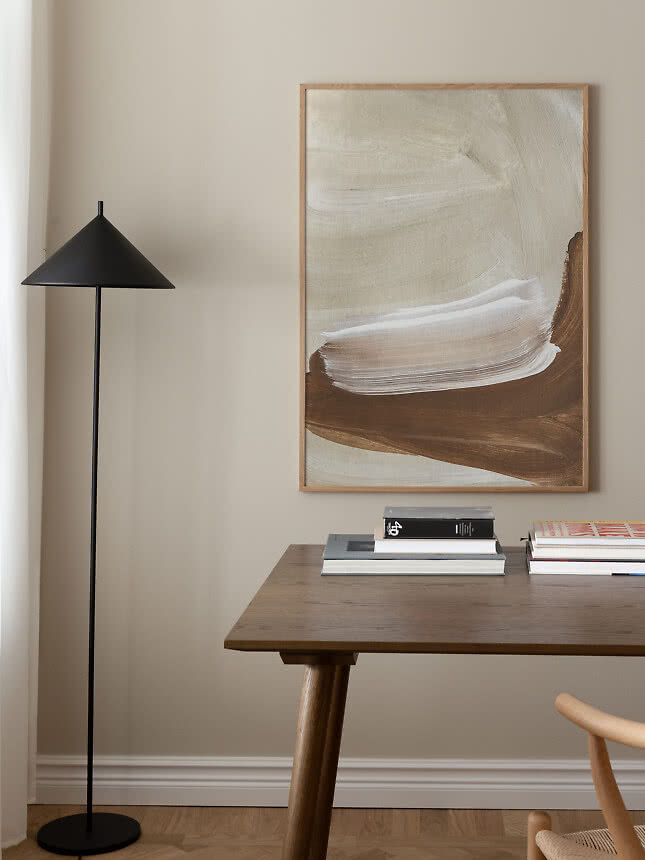
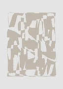
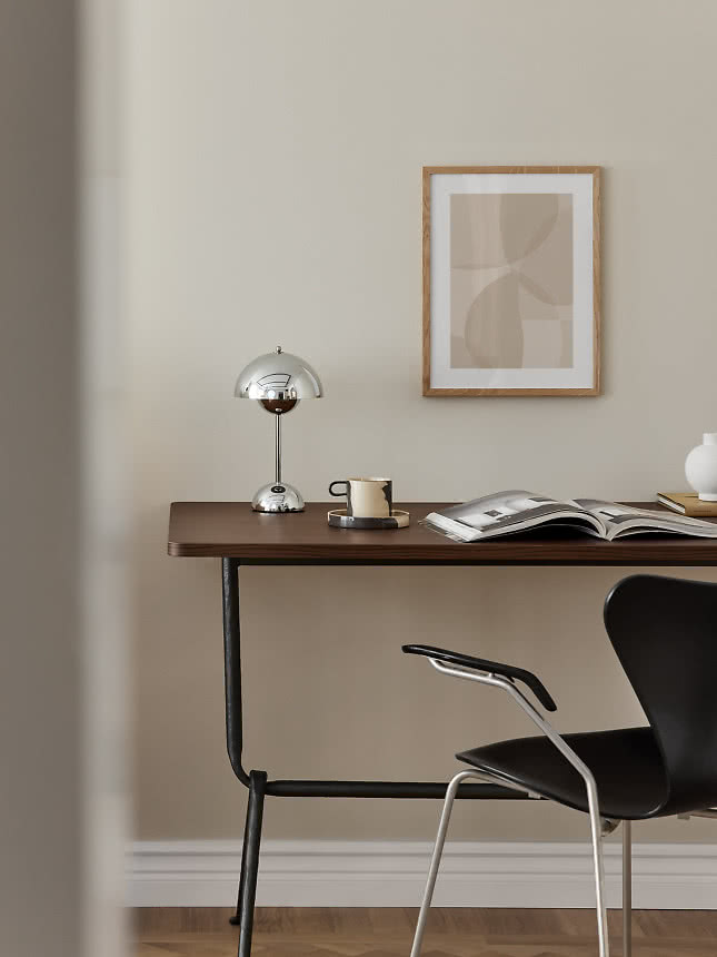
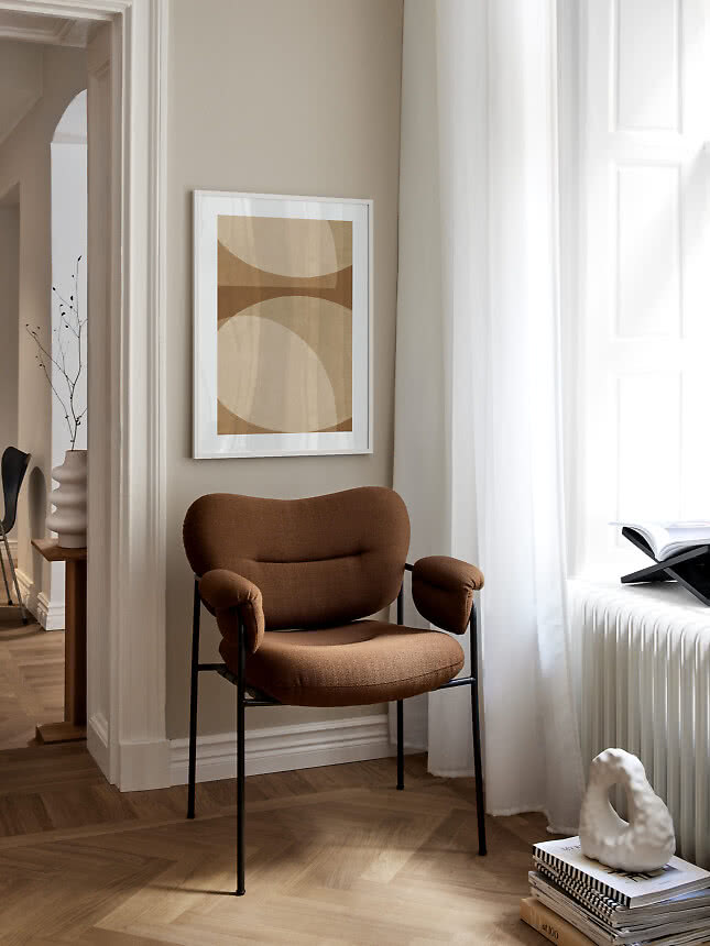
Caramel, sand and soft brown on cream. The warmest way into neutral, made for wooden floors and warm light.
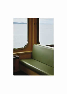
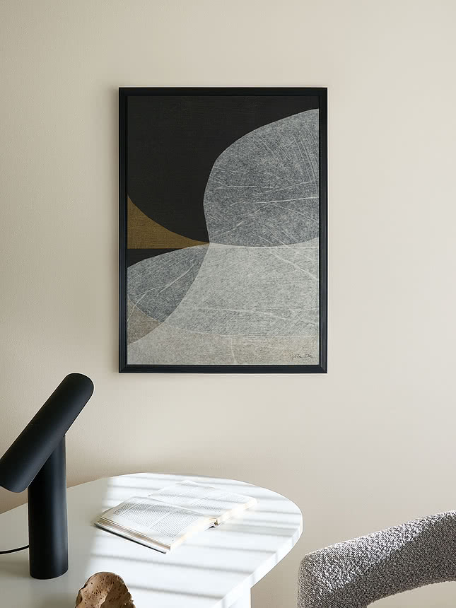
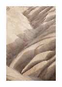
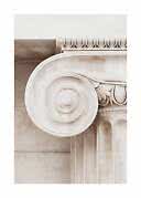
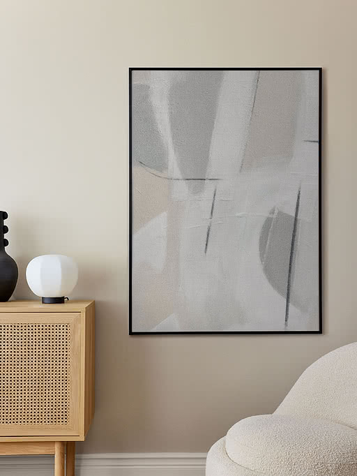
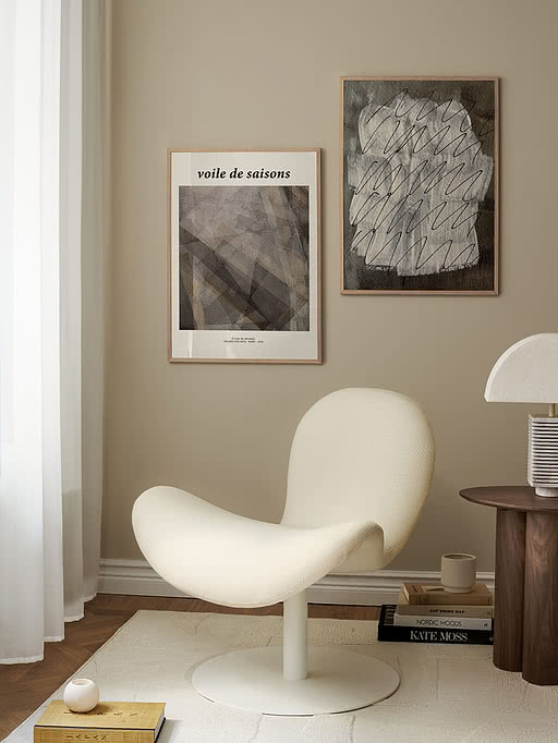
Grey, greige and off-white, from quiet shapes to a photograph of pale stone. Fresh next to white walls and black details.
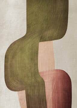
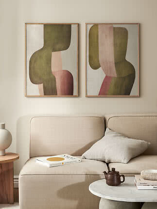
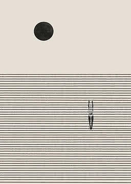
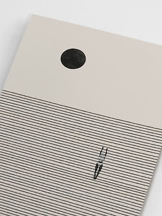
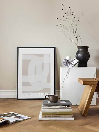
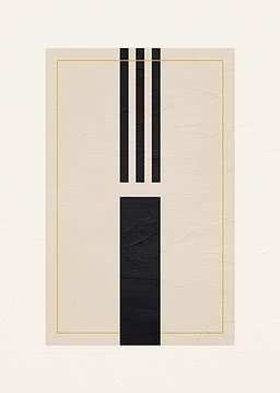
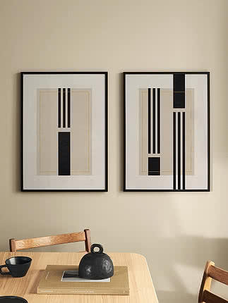
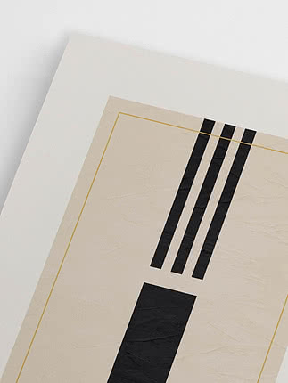
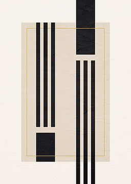
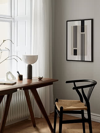
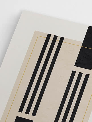
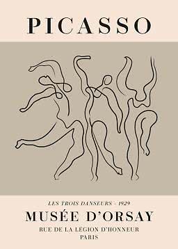
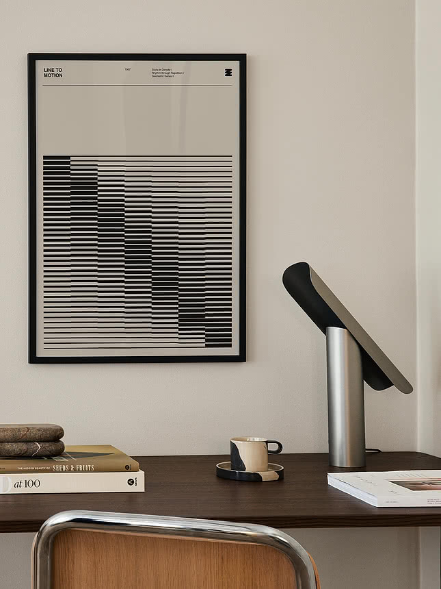
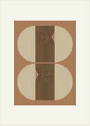
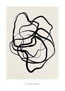
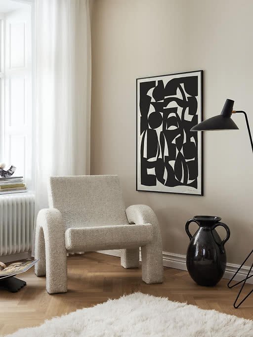
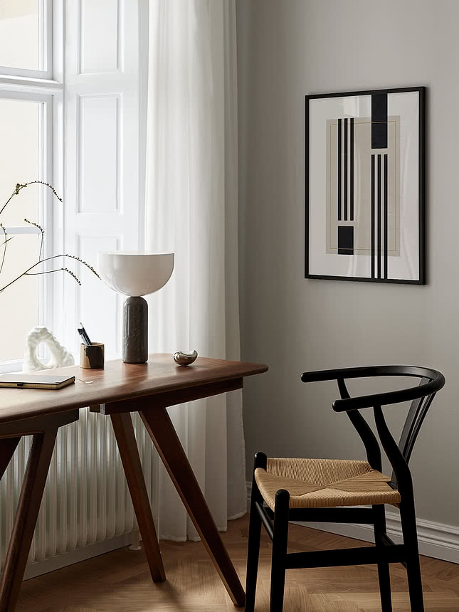
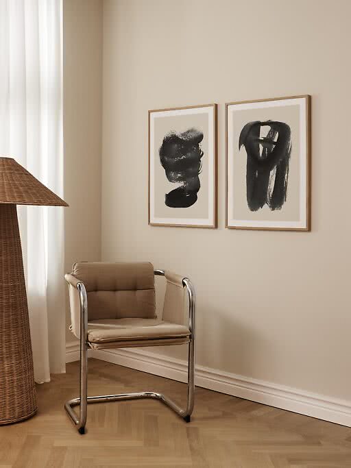
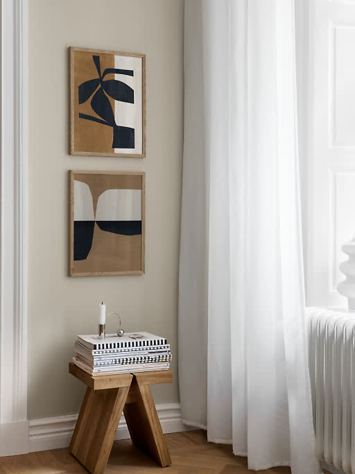
A few black lines or shapes give a soft palette a backbone. Graphic and calm at the same time.
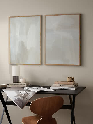
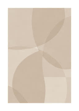
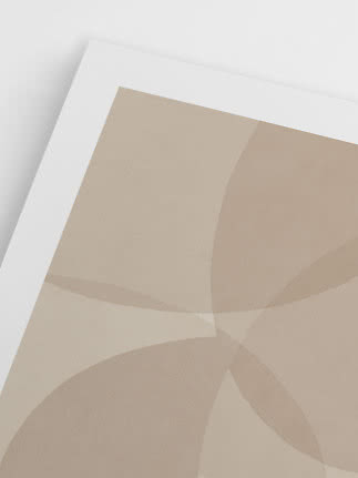
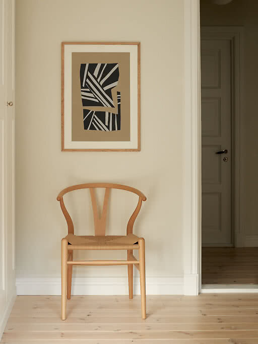
Cream on cream, white on sand: brushwork, torn paper and soft circles do the work that colour usually does. The quietest choice of all.
Beige on beige can fade into the wall, which is lovely in a bedroom and a little sleepy everywhere else. These five tools bring a neutral wall to life, and one or two at a time is plenty.
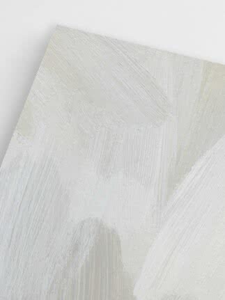
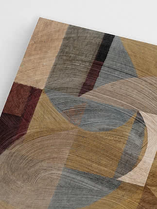
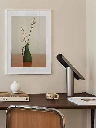
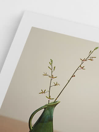
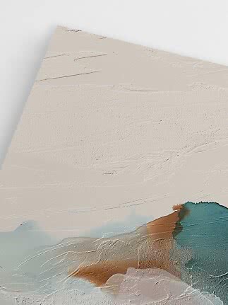
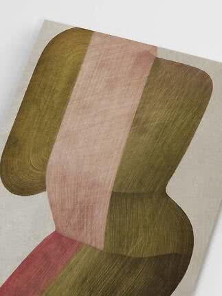
Texture. Visible brushwork, paper grain, fine lines and soft photographs give the eye something to explore up close. Look for motifs you almost want to touch.
Contrast. Put a deep tone next to a pale one – espresso against cream, charcoal against sand. A little darkness makes the light tones glow.
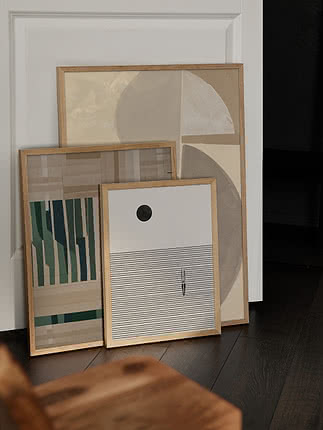
Scale. One large print feels calmer and more confident than several small ones. In 70x100 – or 100x140 if the wall allows – a soft motif reads as a statement rather than a gap on the wall, and our XL guide shows how far you can take it.
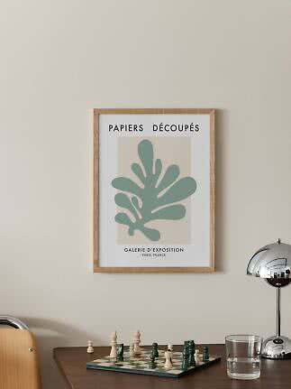
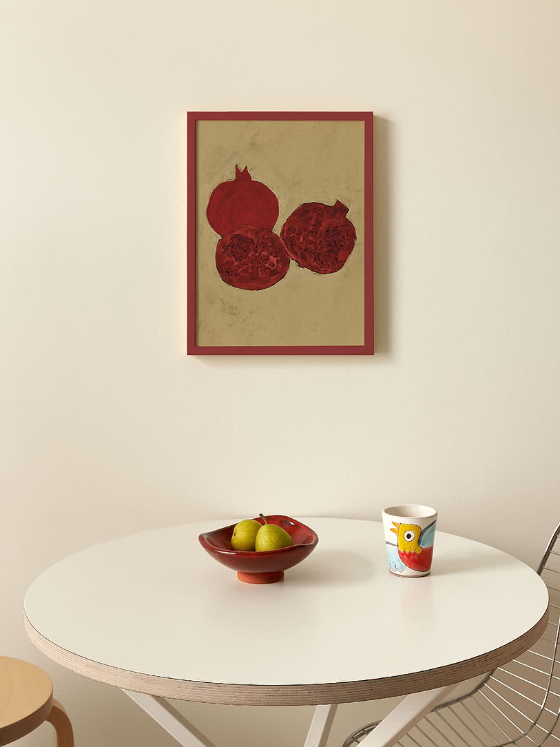
One accent colour. A touch of red, rust, sage or blue gives the eye somewhere to land. Keep it to one colour per wall and let it echo something in the room: a cushion, a vase, a book spine.
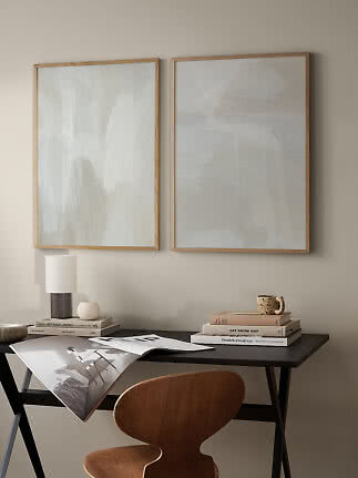
Wood. A wooden sideboard, shelf or chair close by adds warmth and grain of its own, and gives a beige motif a richer edge.
Black and white are the two easiest partners for a neutral wall, and they do very different jobs.
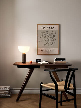
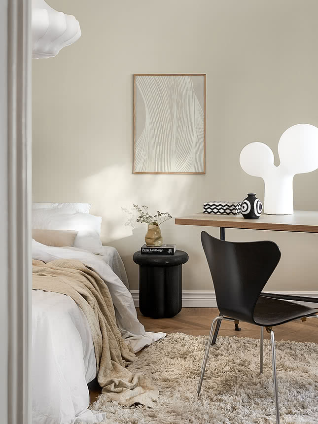
Black sharpens. A few black lines or shapes turn a soft motif graphic and give a calm room a little backbone. It’s the quickest way to make beige feel modern, and it works especially well with black lamps, chairs and metal details. If you love strong contrast, our guide to black and white wall art goes further.
White lightens. A pale motif with a white margin seems to float on the wall and keeps a small or dark room airy. It’s lovely with cool neutrals and white woodwork.
Mix them on purpose. Graphic black motifs and pale ones can share a wall when they share a palette. Repeat black at least twice in a larger group, so the mix looks chosen rather than accidental.
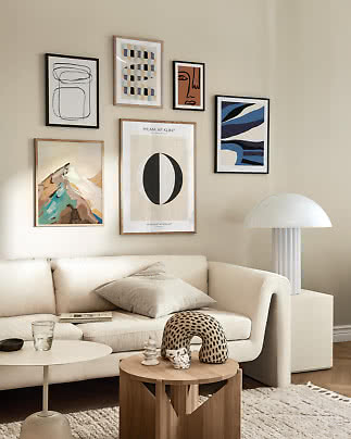
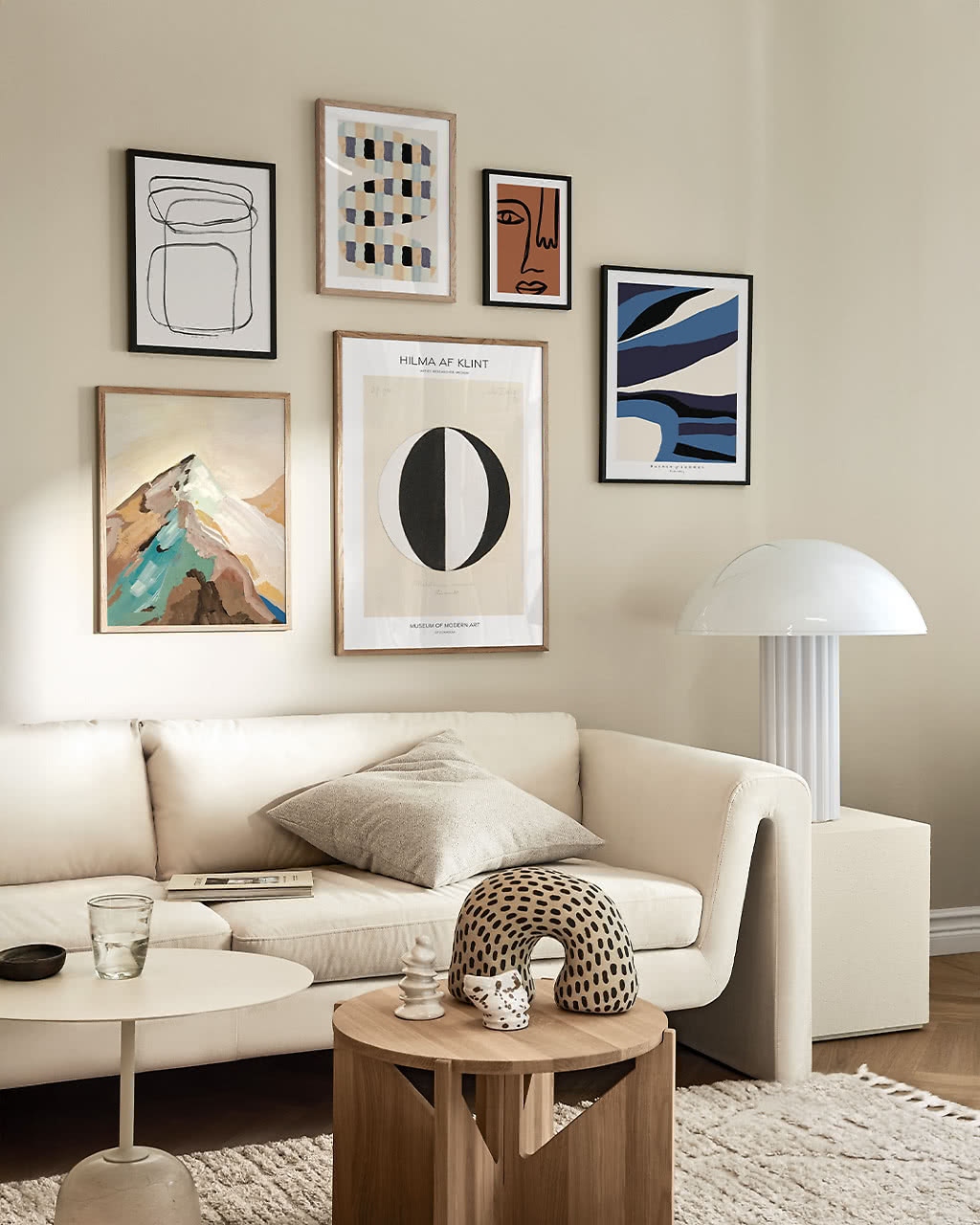
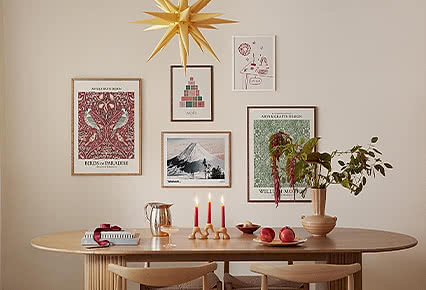
A gallery wall in neutral tones is one of the easiest to get right, because the motifs already agree on colour. That leaves you free to play with everything else.
Vary the sizes. Combine a 50x70 with smaller 30x40 and 21x30 prints, or hang two of the same size side by side for a quieter look.
Vary the motifs, not the palette. An abstract next to a photograph, a line drawing next to a painting. The shared tones hold it all together.
Hang to one line. Line up the tops or the centres of the prints, and even a mixed group looks calm.
Leave a little air. 5–8 cm between the prints lets each one breathe.
Our gallery wall ideas show five layouts that always work, and print pairs is the place to start if two is enough.
Neutral is a confident starting point, not a rule. Sometimes a room asks for more.
When everything is already beige. Walls, sofa and rug in the same soft tone can take one print with real colour, and the whole room gets a pulse.
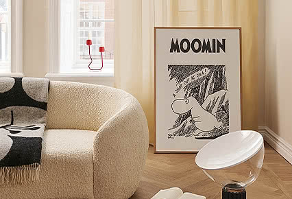
When you want a focal point. Above a sofa, at the end of a hallway or opposite the front door, a strong colour draws the eye exactly where you want it.
When the room needs energy. Kitchens, home offices and kids’ rooms often welcome a livelier palette than a bedroom does.
Start small: choose a colour that already lives somewhere in the room and let the rest of the wall stay calm. When you’re ready for more, styling with colourful prints takes it from there.
Art in calm, earthy tones such as beige, sand, cream, stone, greige and soft brown – often abstract, minimal or photographic, and muted landscapes belong here too. It suits any room because it doesn’t compete with furniture or other colours. Our Soft Neutrals collection gathers them in one place.
Add one or two of these: visible texture, a dark contrast such as black or espresso brown, a bigger size, a single accent colour or warm wood close by. One print in 70x100 is often livelier than several small ones.
Yes. Choose cool neutrals – stone, greige, chalk and off-white – with black or white details. Against warm grey walls, sand and caramel tones work too.
Black and white always work. For colour, choose one accent – sage, deep red, rust, mustard or navy – and repeat it once somewhere else in the room.
Keep the palette tight and vary the rest: sizes, motifs and techniques. Line up the tops or the centres, and hang the prints 5–8 cm apart. Our gallery wall ideas show five layouts to scale.
Soft neutral prints
New
New
New
New
New
More from the magazine
All articles →