 (1).png)


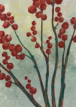
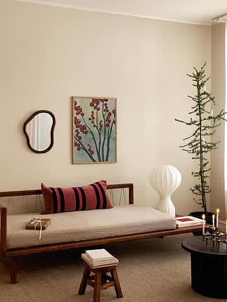
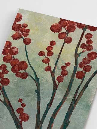
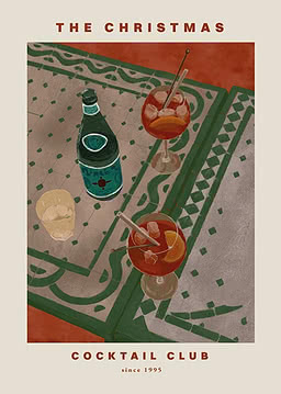
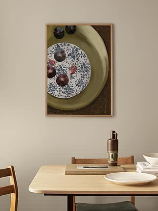
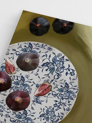
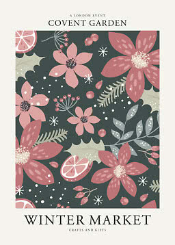
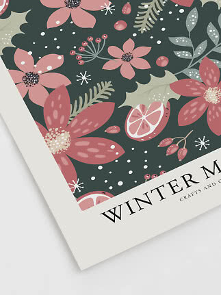
Winter Berry Branches
Rosana Laiz Blursbyai
New
$29.99$37.99
The kitchen is where art gets looked at the most, just never on purpose: over the first coffee, while the pasta boils, halfway through a long dinner. It’s also one of the rooms where a print is allowed to be a little funny. Here’s what to hang above the table, what to lean on the counter, and which motifs make you hungry in the right way.
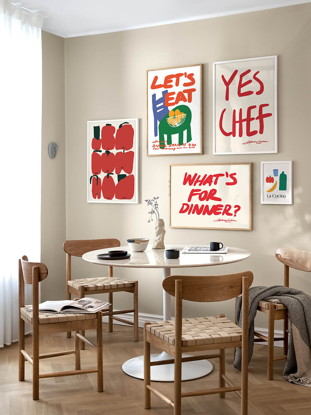
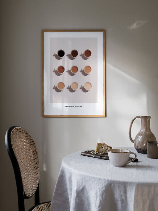
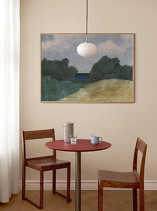
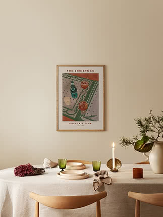
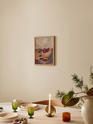
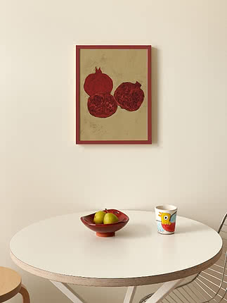
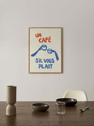
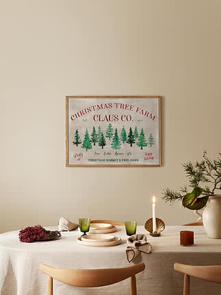
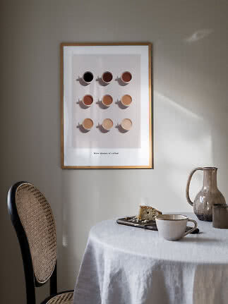
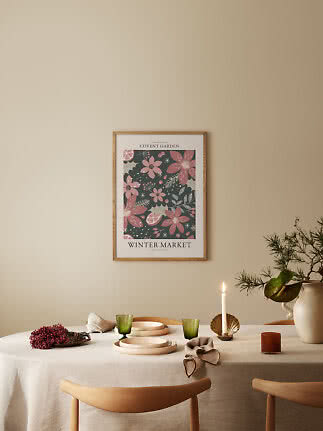
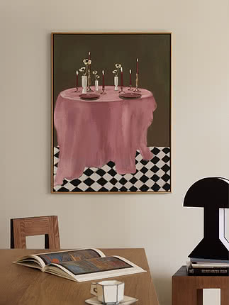
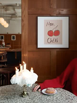
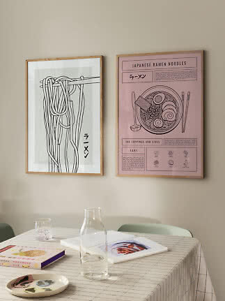
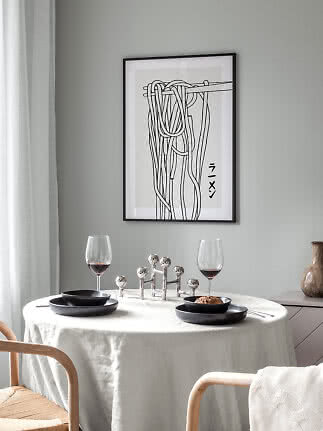
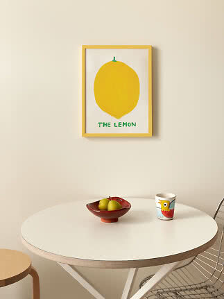
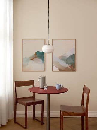
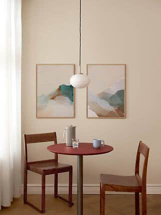
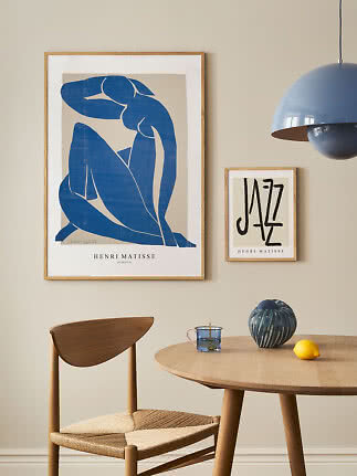
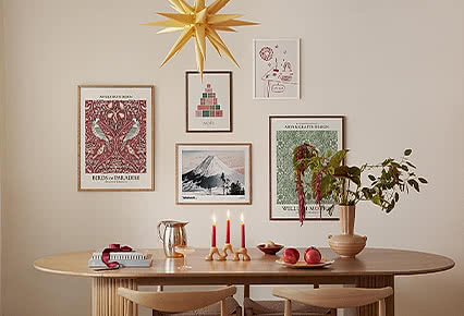
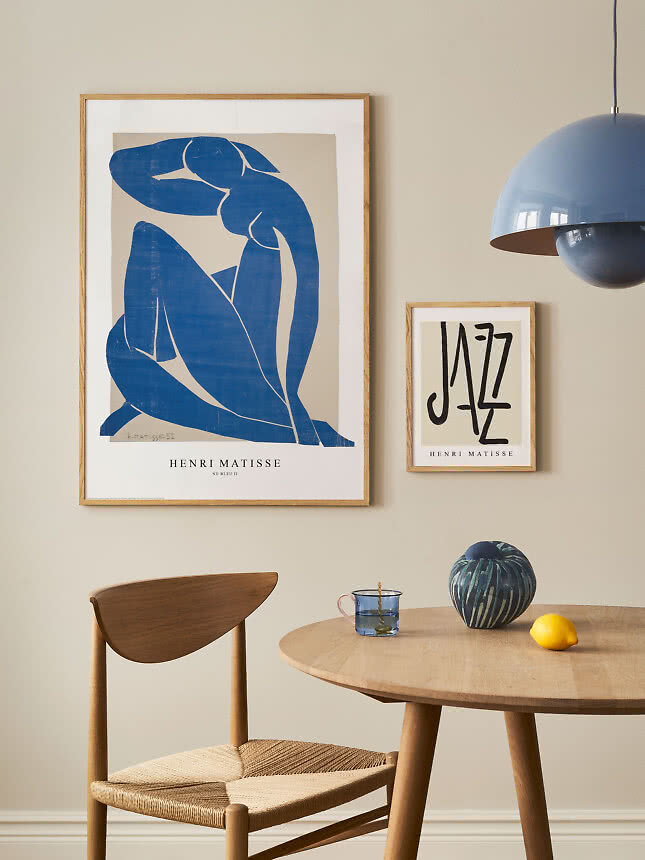
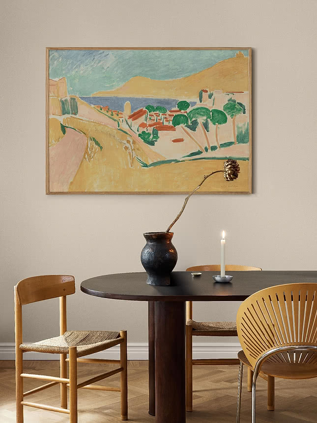
The table is the kitchen’s anchor, and the rule is the same as above a sofa: let the art cover about two thirds of the table’s length. With one twist – you look at it sitting down. Hang it a little lower than usual, with the bottom edge 25–30 cm above the table, so it stays in view across the plates.
One big or two side by side. Above a table of about 140 cm, one 70x100 on its side or two 50x70 is usually right. A round table likes a single print; a long table can carry a pair or a short row. Not sure? Enter your table below.
Size calculator
Choose the furniture, enter its width and see what fits – with the size, the gap and the height to hang it.
100x140 cm · landscape
One large print that sets the tone – the wall does the talking. Covers about 78% of the dining table’s width.
Shop 100x140 printsFive gallery wall layouts →Based on our hanging guide: 20–25 cm above the furniture, 6 cm between frames and the top edge no higher than 210 cm. Standard furniture heights and a 240 cm ceiling.
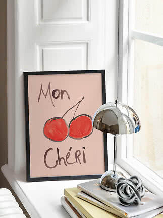
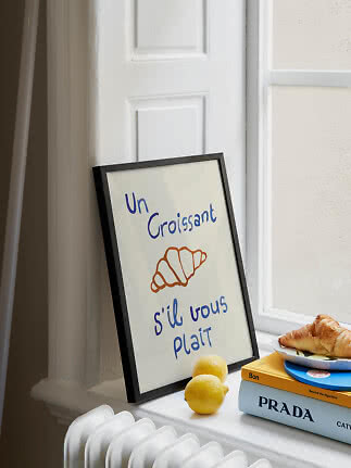
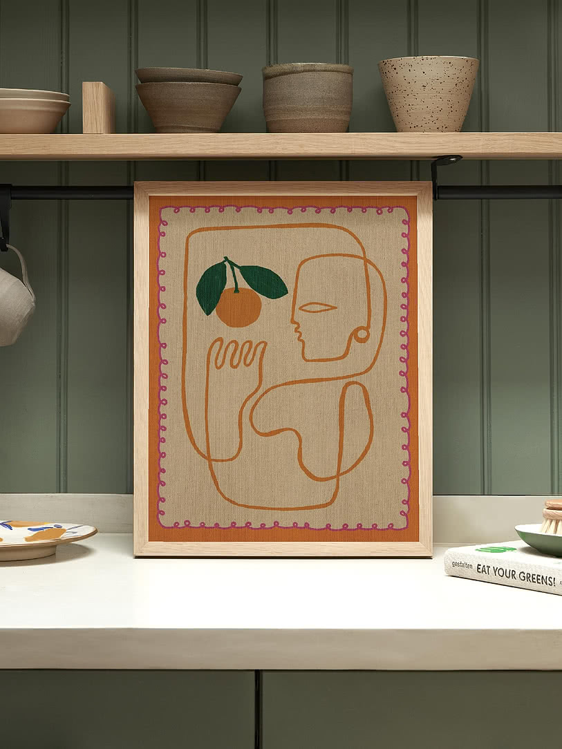
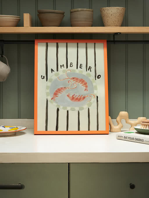
A frame leaning against the splashback is the easiest art in the house: no drilling, and you can swap it whenever the mood changes. Choose anything from 21x30 to 50x70 – big enough to be seen over the toaster, small enough to sit under the wall cabinets. For depth, put a small frame in front of a bigger one.
Keep it away from the hob and the kettle. Steam and splashes are hard on any print. A frame with glazing protects it, and a spot at the end of the counter keeps it out of the line of fire.
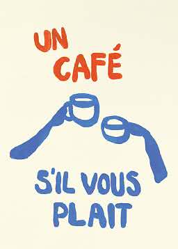
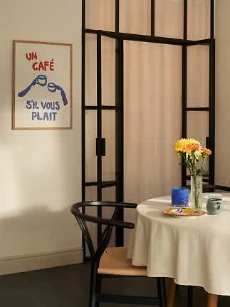
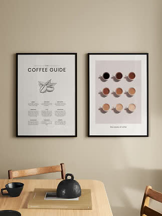
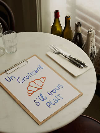
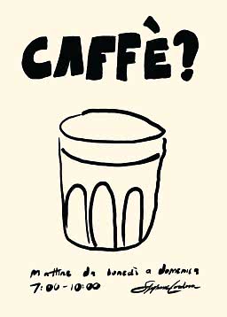
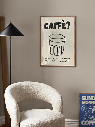
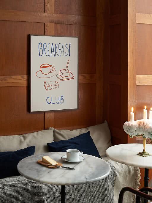
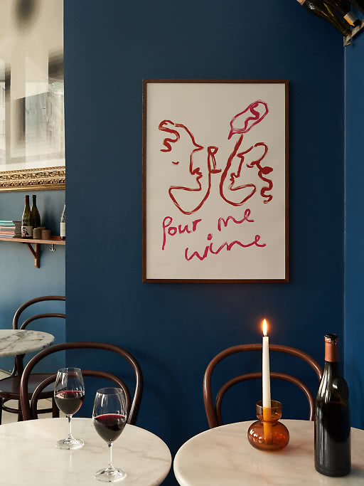
Every kitchen has a spot where the day starts: a small table, two chairs, the good cups. Give it one print that sets the tone and it starts to feel like your own café – the kind where the coffee is free and nobody rushes you.
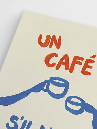
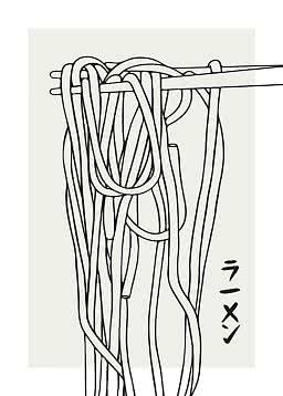
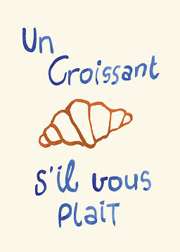
Typography and line drawings suit these corners best. They read from across the room, and they don’t take themselves too seriously.
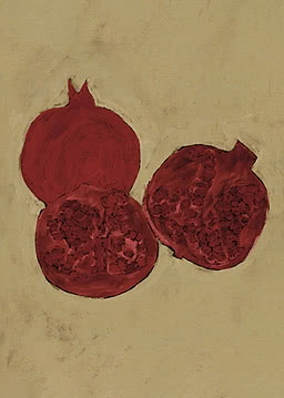
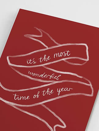
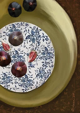
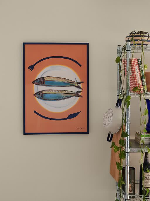
Food art works best when it’s a little graphic or a little classic – rarely both on the same wall. Pick one lane, then let colour tie it to the room: red and blue for a lively kitchen, soft greens and browns for a calmer one.
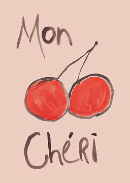
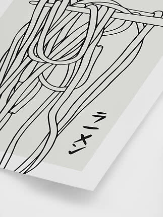
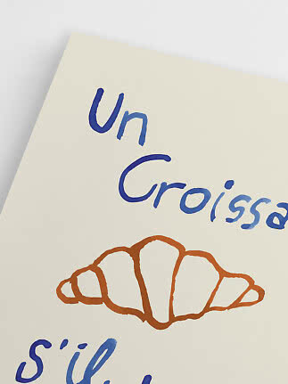
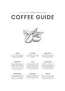
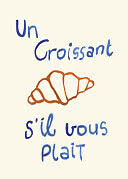
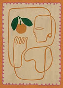
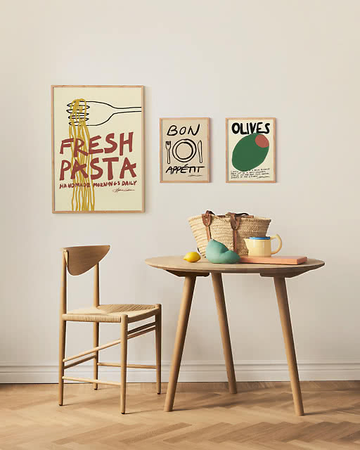
Typography and quick lines that read from across the room – and make the cook smile.
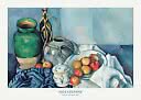
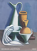
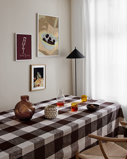
Fruit, bread and bottles, painted with patience. Calm above a long dinner table.
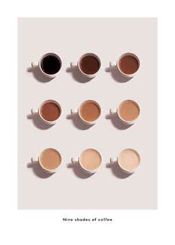
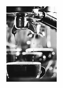
For the corner where the day starts. One is enough; two make it a café.
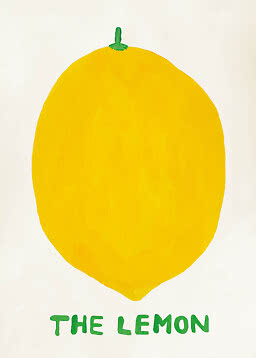
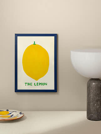
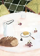
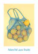
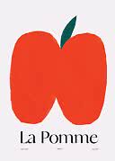
Lemons, oranges and apples bring colour to a white kitchen without a single new cupboard.
Want it done in one go? These walls from our inspiration pages are put together for kitchens and dining nooks, with every print in one place.
A little lower than elsewhere, because you see it sitting down: the bottom edge 25–30 cm above the table. The calculator above shows the height for your table.
Mostly the smaller sizes, from 21x30 up to 50x70 – on the counter, on a shelf or on a narrow wall between the cabinets. Above the dining table you can go bigger: a 70x100, a pair of 50x70 or, above a long table, an XL print in 100x140.
Yes. Keep them away from the hob and the kettle, and choose a frame with glazing, so splashes land on the glazing instead of the print.
Kitchen bestsellers
New
New
New
New
New
New
New
New
New
More from the magazine
All articles →