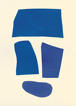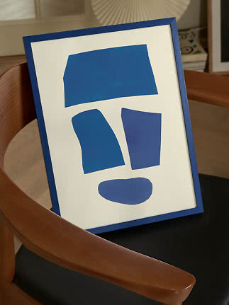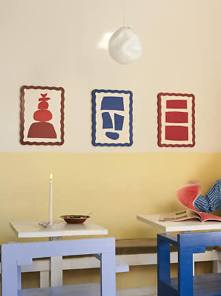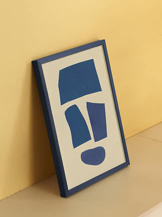
 (1).png)



53% off
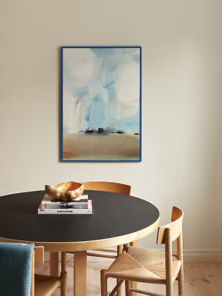
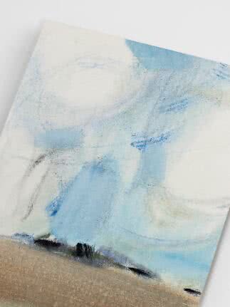
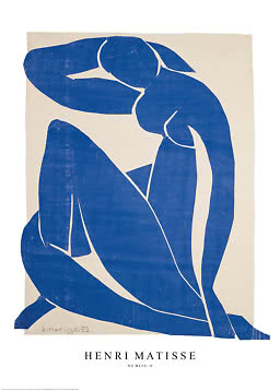
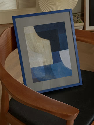
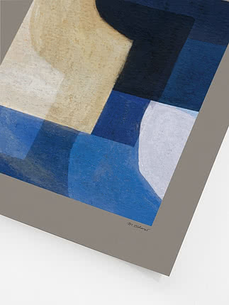
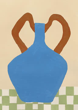
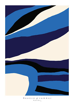
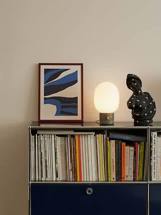
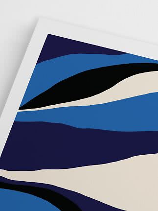
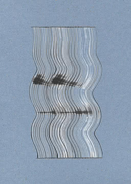
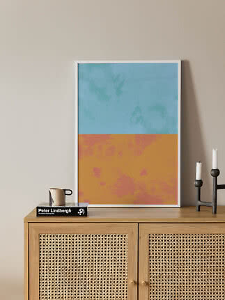
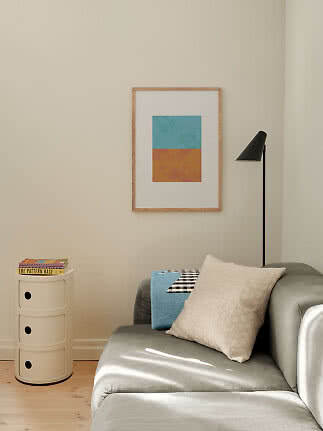
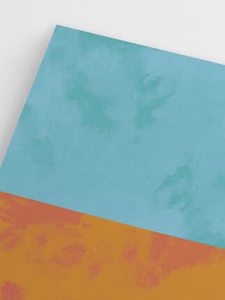
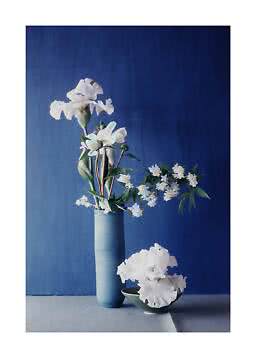
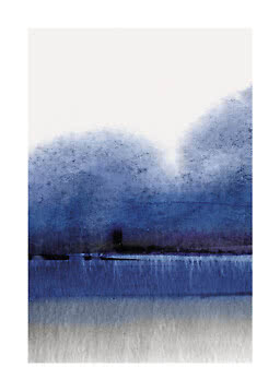
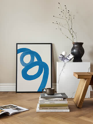
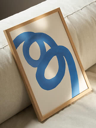
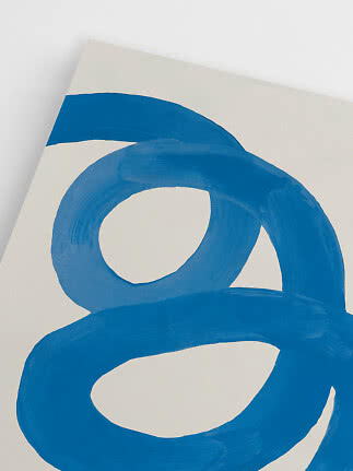
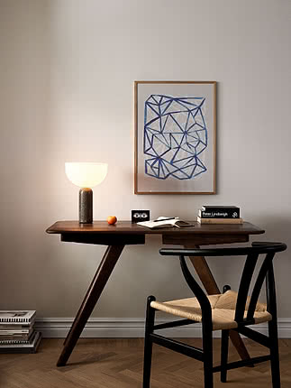
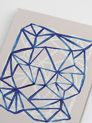
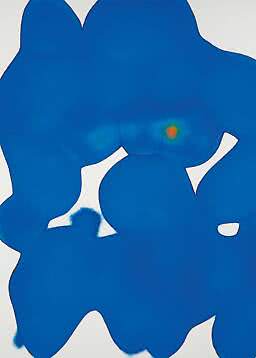
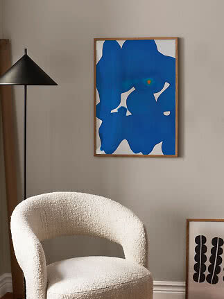
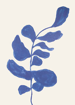
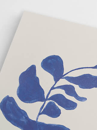
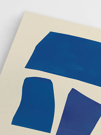
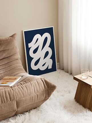
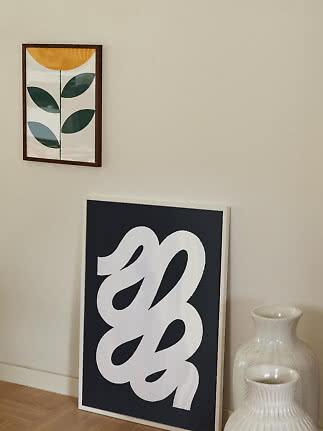
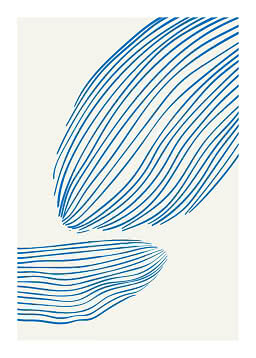
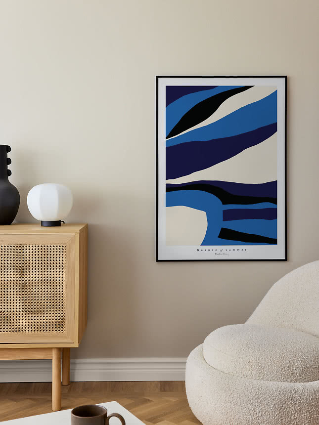
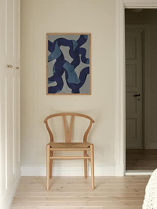
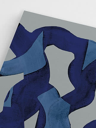
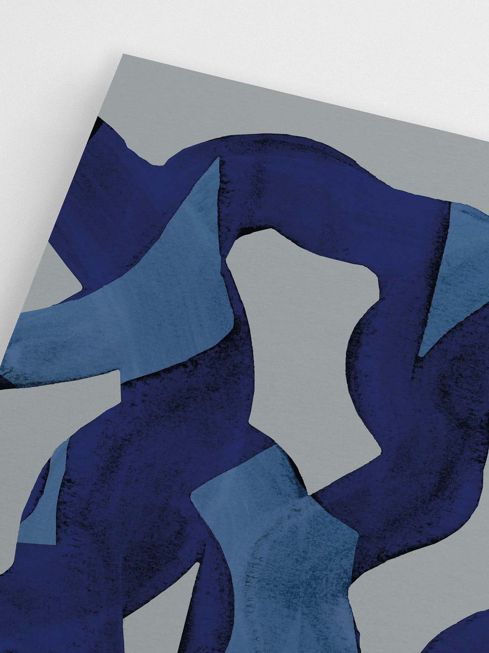
Ultramarine Swirls
Mareike Böhmer
New
$18.99$39.99
Trend notes
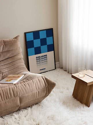
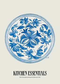
January is the quietest month of the year, with short days and long evenings. It is also the month that gave us Blue Monday, though we think the color deserves a better reputation. WGSN and Coloro have named Luminous Blue their color of the year for 2027: a clear, bright blue that brings a kind of light to a room that winter rarely does. From inky cobalt to soft sky, this is our edit of the color that makes the darkest weeks feel a little lighter.
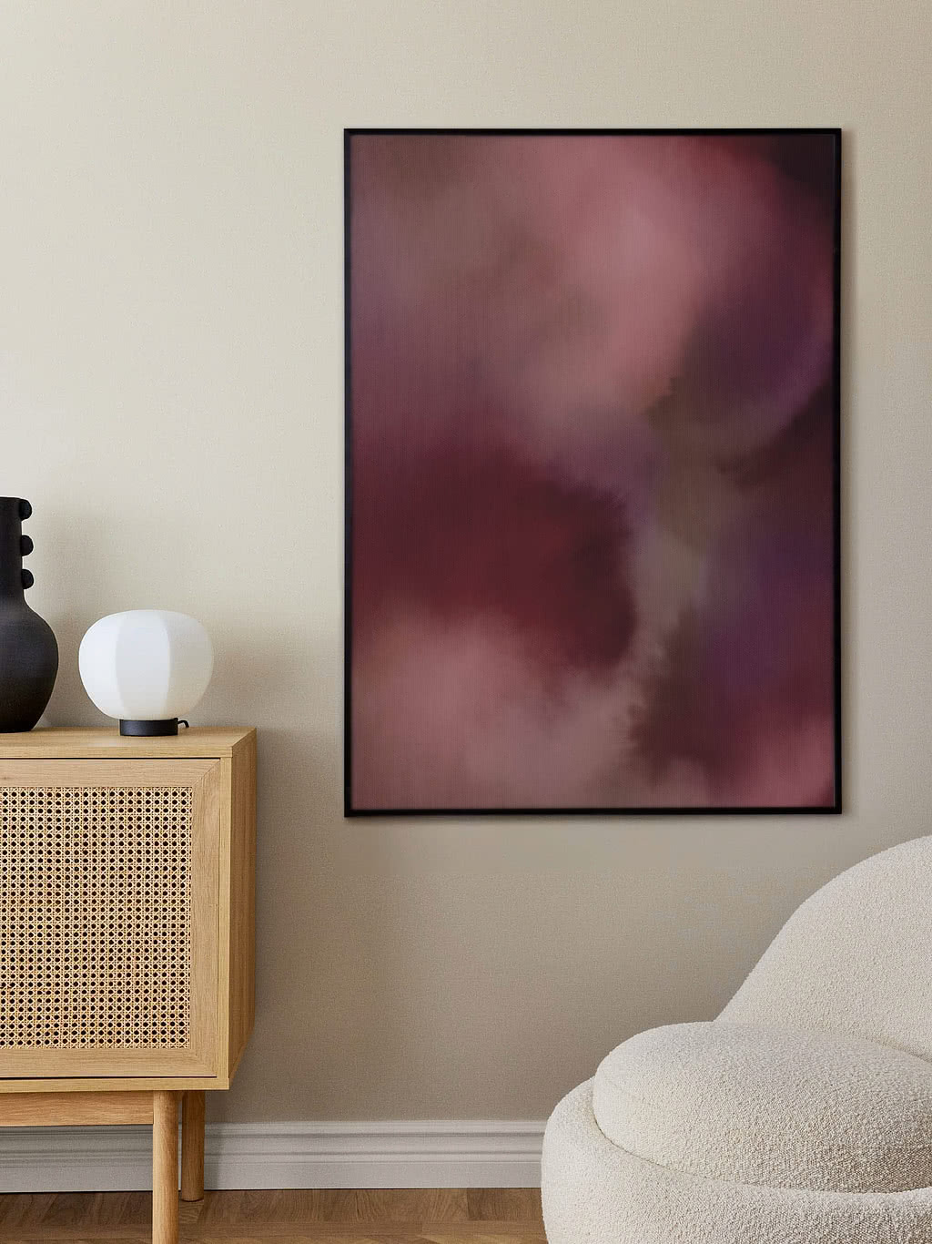
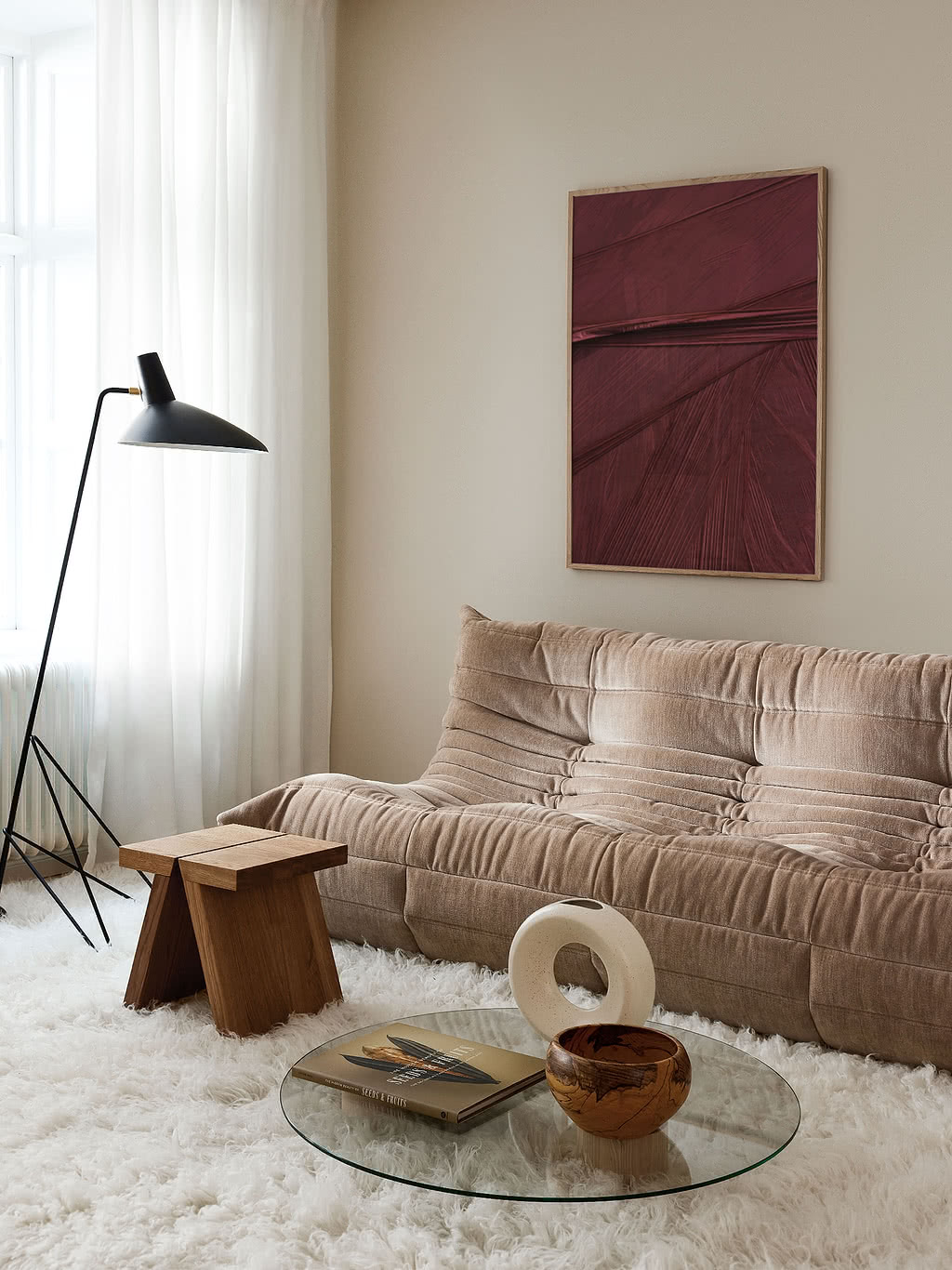
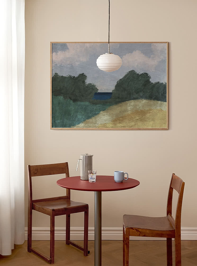
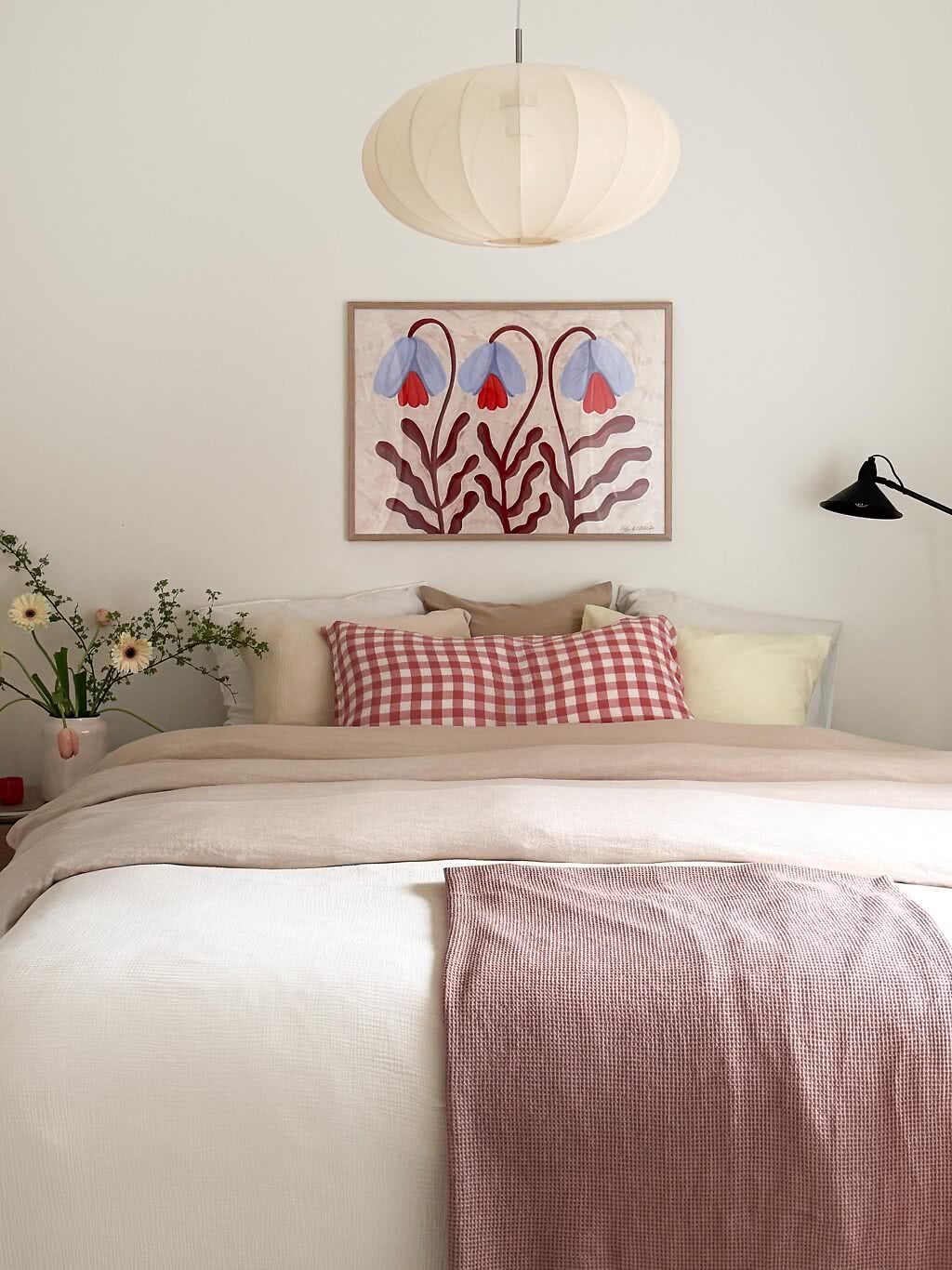
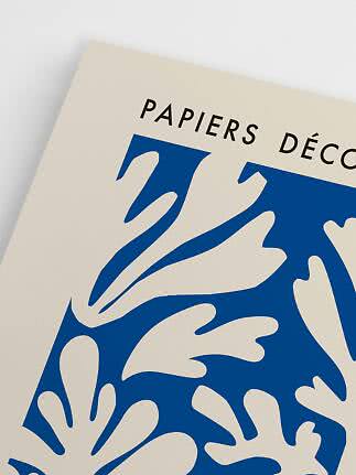
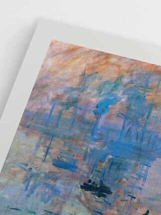
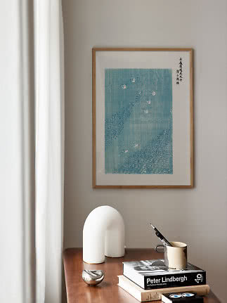
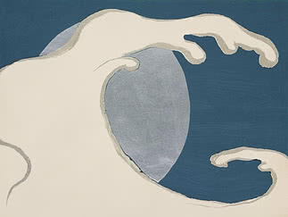
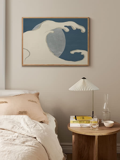
Blue has always been the color of distance: the sea, the sky and the horizon in between. On a wall it does the same thing, opening a room up rather than closing it in. The deepest shades, cobalt, ultramarine and navy, feel calm and grounded, almost like a neutral. The palest, cornflower, powder and sky, catch whatever daylight January has to offer and hold on to it. In between sits the clear, luminous blue of a cold, bright morning. Wallsauce lists Cobalt Blue among its color trends for 2027, and that comes as no surprise to us. After the neutrals, blue is the color you will find most often in our range.
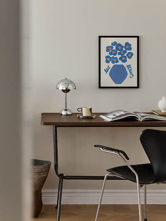
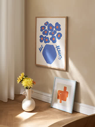
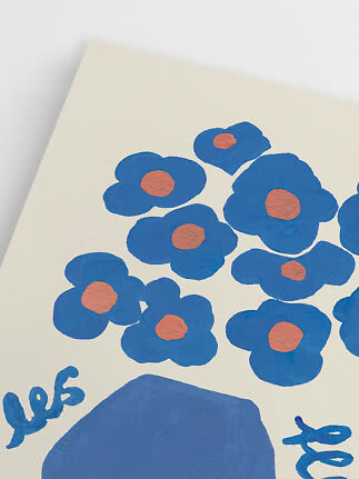
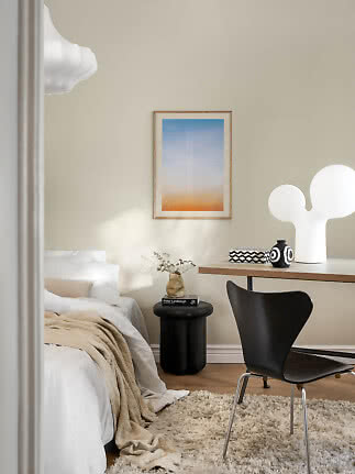
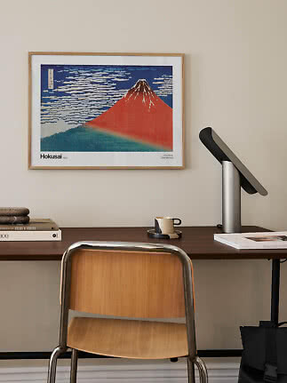
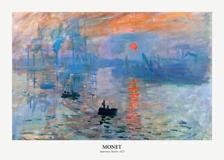
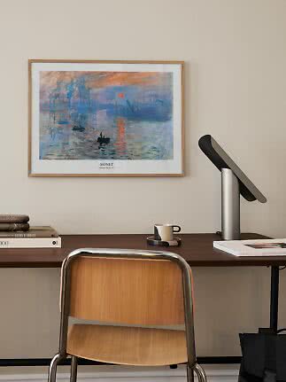
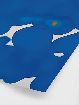
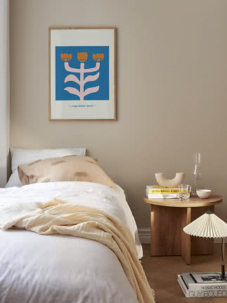
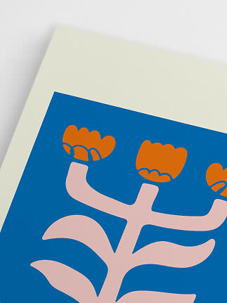
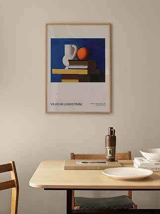
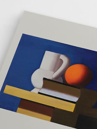
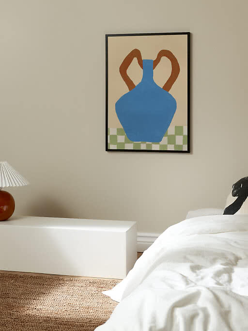
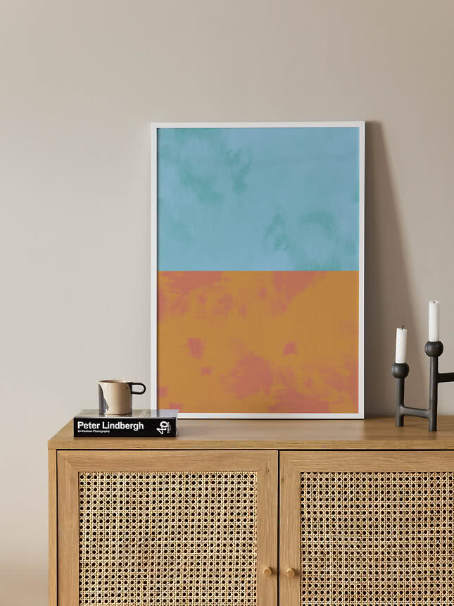
Blue is at its best when it has light to work with, which is why it suits winter so well. Pair the deep shades with warm wood and soft linen, and let the paler ones sit against white walls or stone. Wallsauce pairs blue with orange for 2027, and one warm accent is all it takes: a terracotta vase, an amber glass or a print where a little orange meets the blue. It is a color that feels fresh in January and will still feel right in June.
Five ways to live with blue.
1. Start with one clear blue
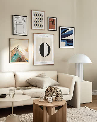
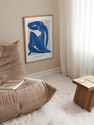
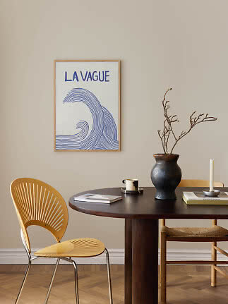
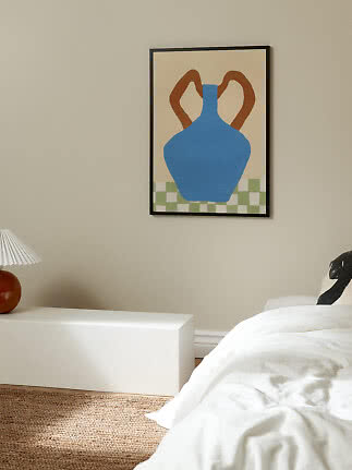
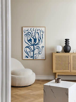
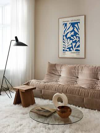
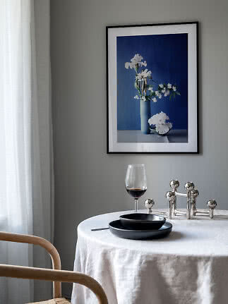
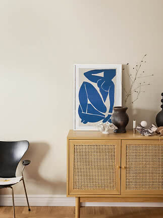
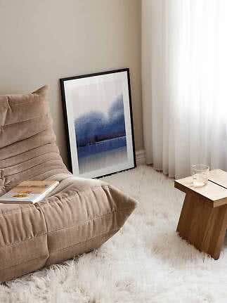
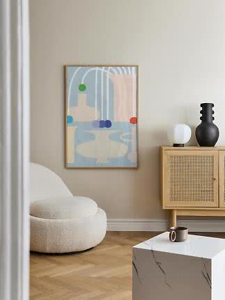
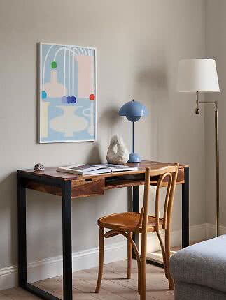
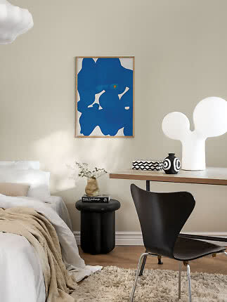
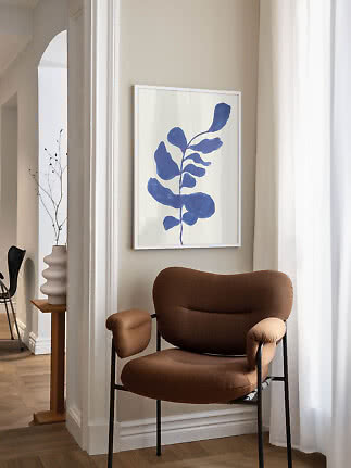
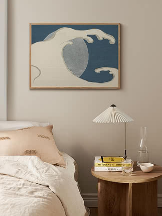
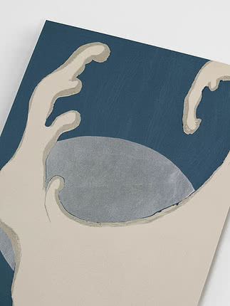
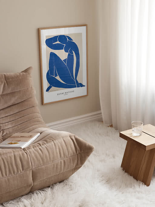
Choose a single print in cobalt or ultramarine and hang it where the daylight falls, opposite a window or above the sofa.
2. Mix deep and pale
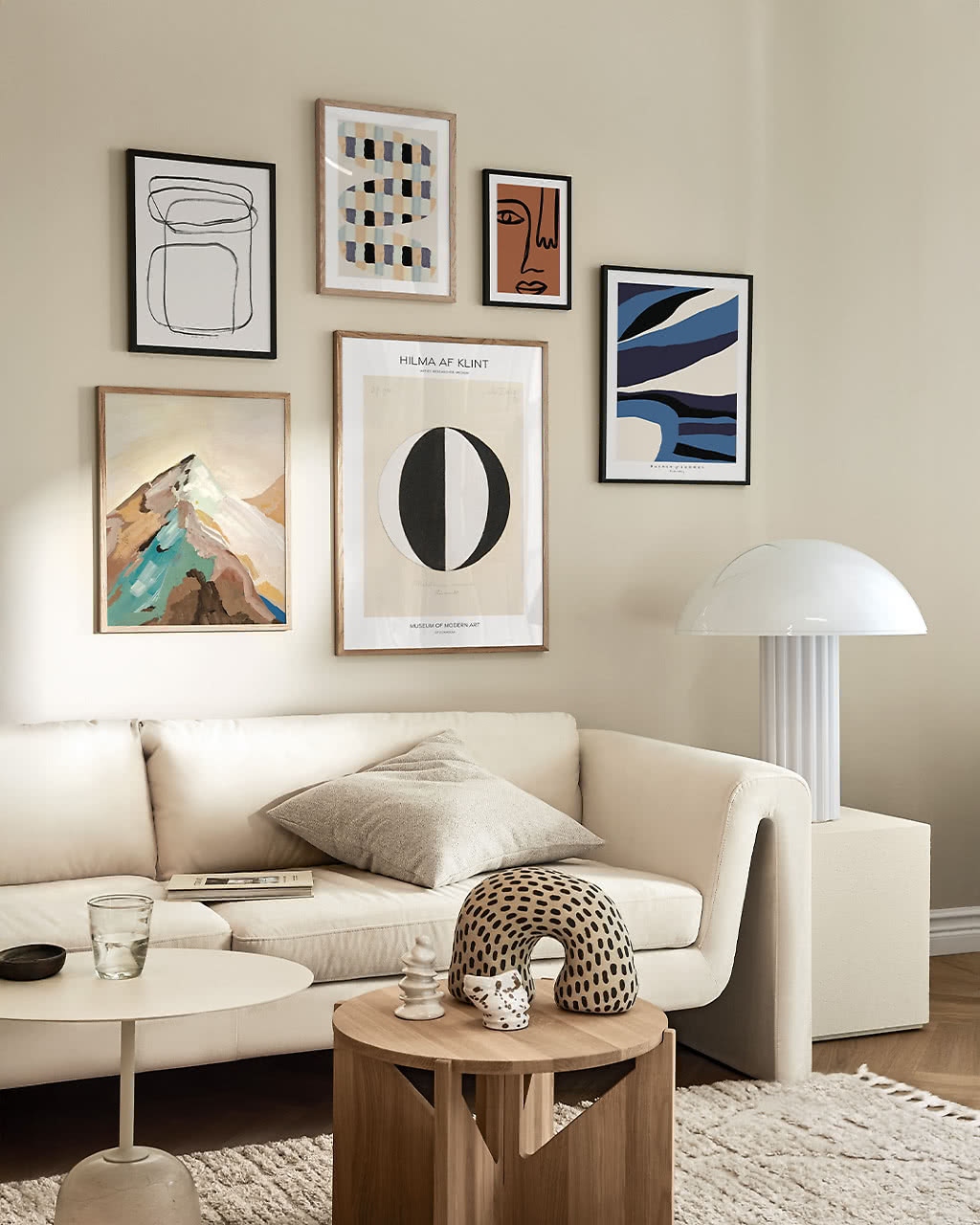
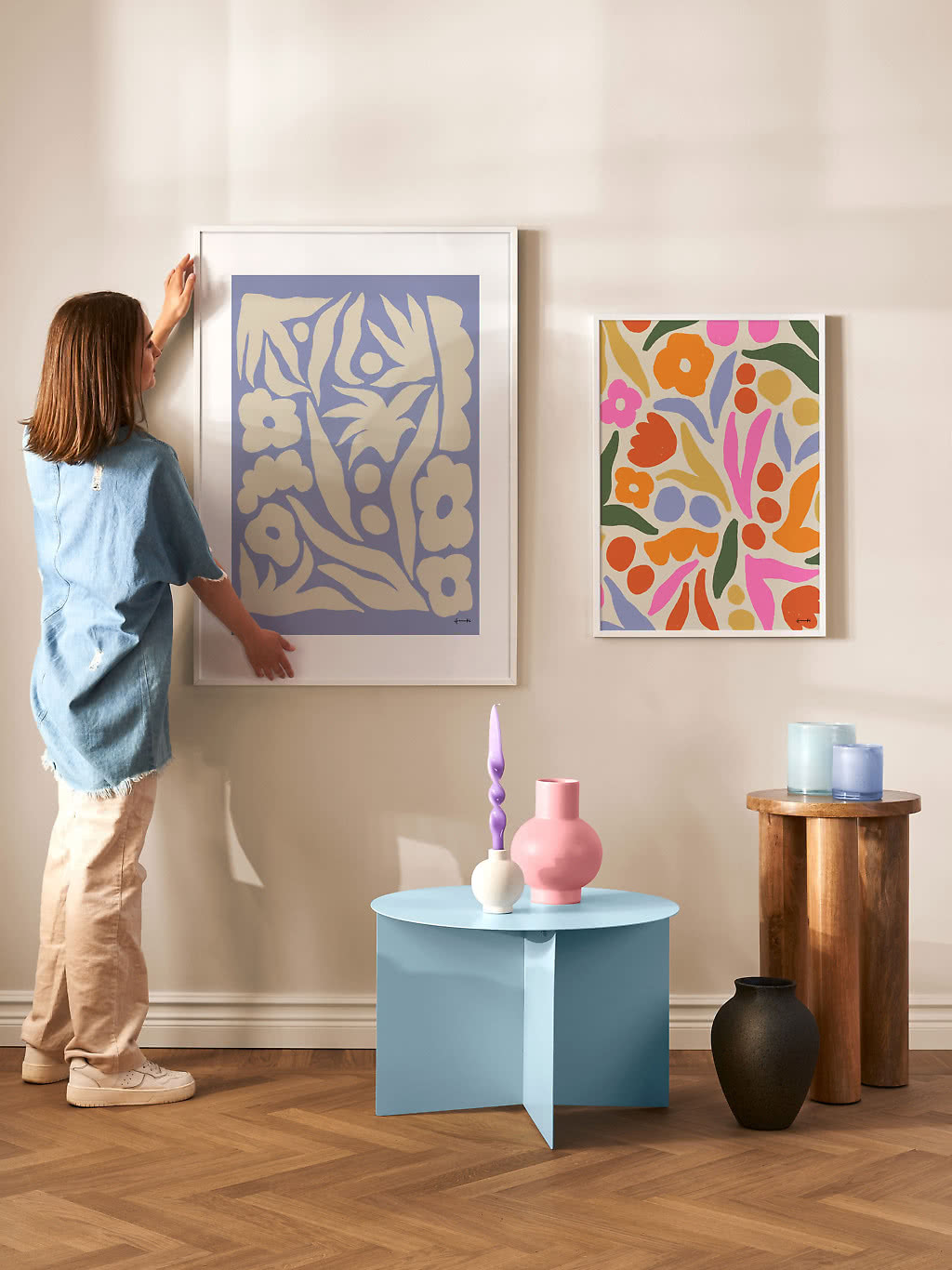
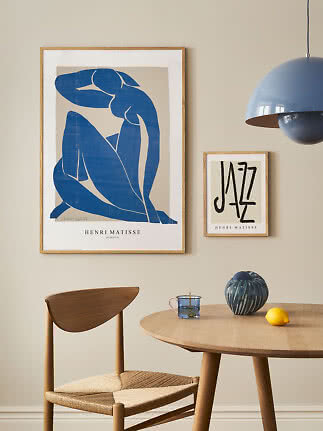
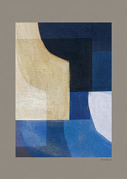
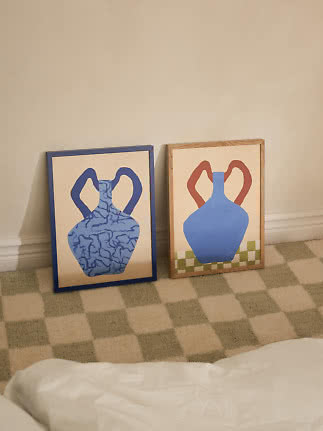
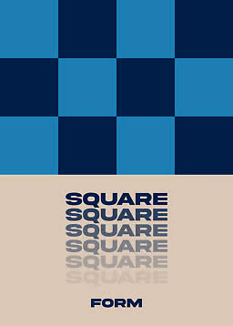
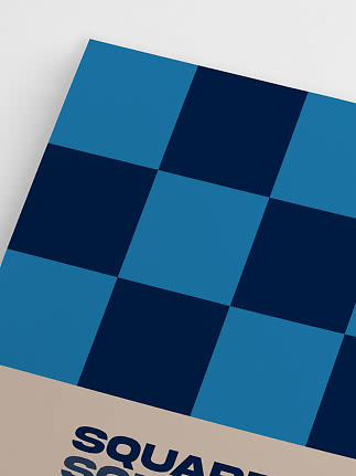
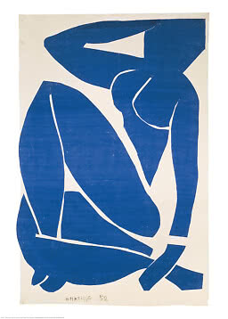
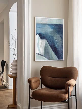
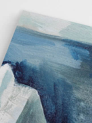
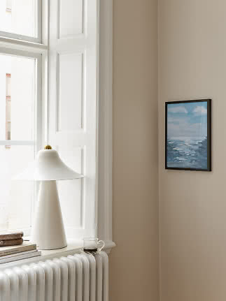
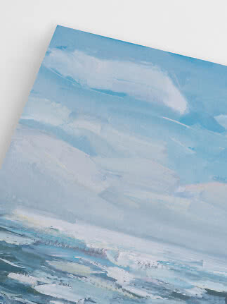
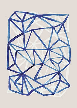
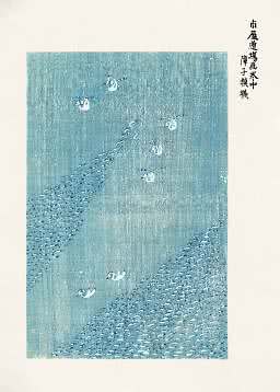
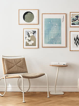
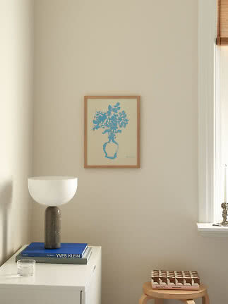
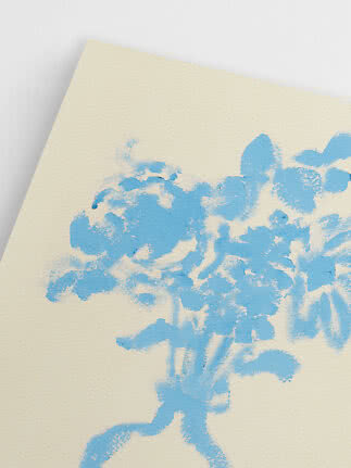
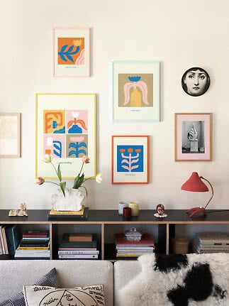
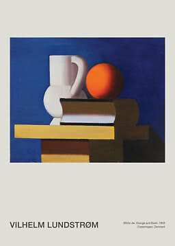
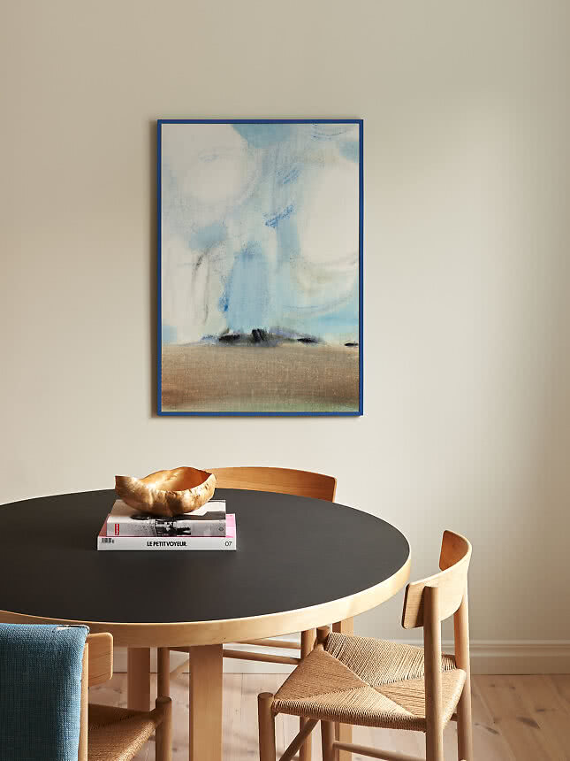
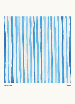
Combine a deep, graphic blue with a soft, painterly one on the same wall for a layered look that still feels calm.
3. Add one warm accent
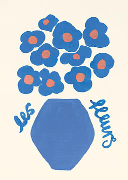
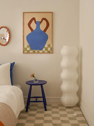
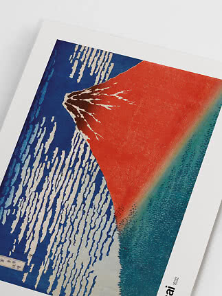
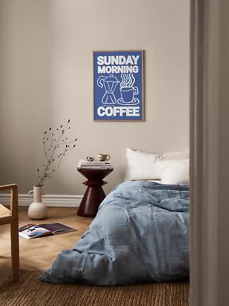
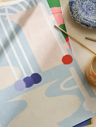
A touch of orange, terracotta or ochre, in a print, a vase or a cushion, makes the blue look even brighter.
4. Keep the rest quiet
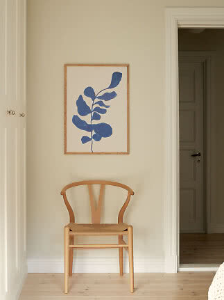
Warm white walls, light oak and natural linen let blue take the lead without the room ever feeling cold.
5. Choose the right frame
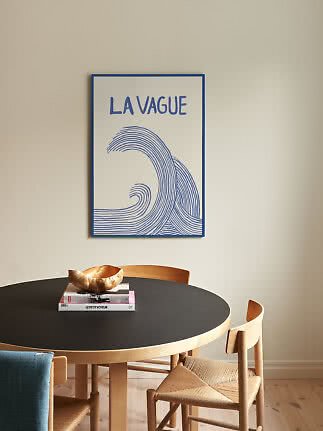
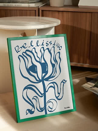
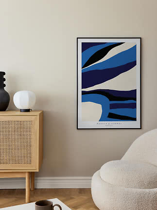
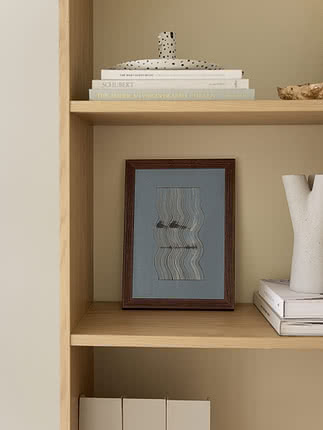
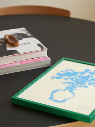
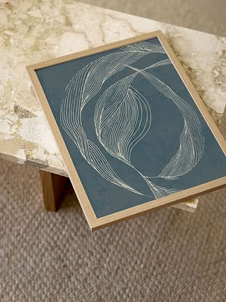
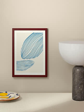
Oak warms blue up, black makes it more graphic, and a blue frame turns a pale print into something quietly bold.
New
New
New
New
New
New
More from the magazine
All articles →