 (1).png)

51% off
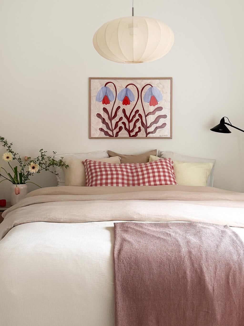
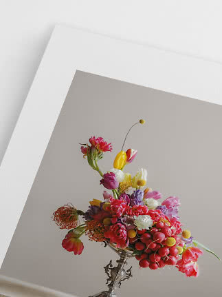
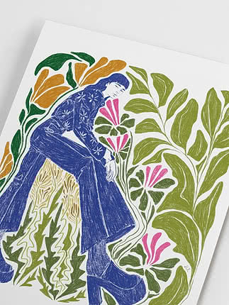
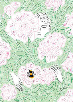
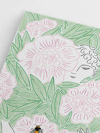
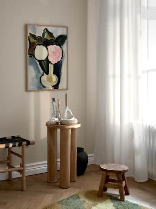
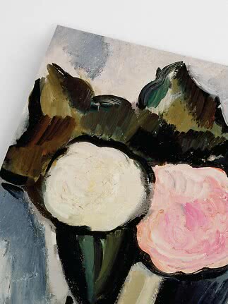
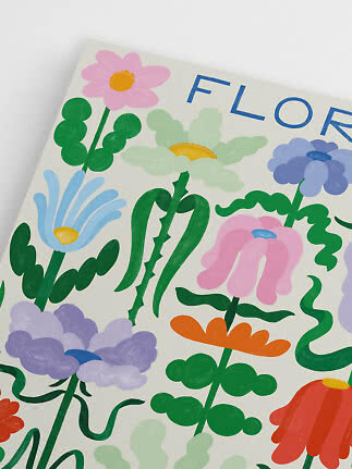
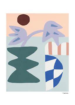
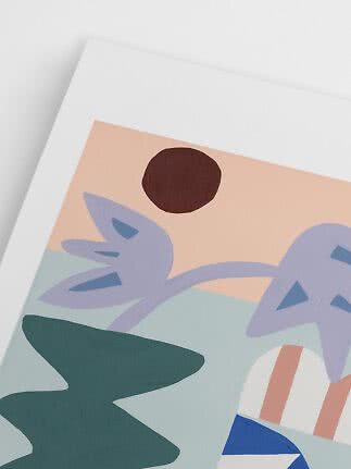
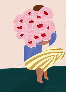
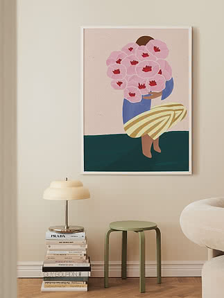
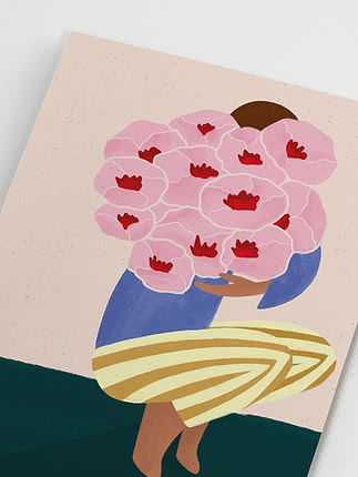
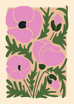
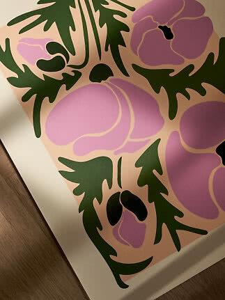
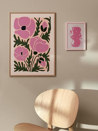
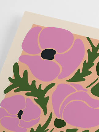
Purple Poppies
Postery
$17.99$36.99
Trend notes
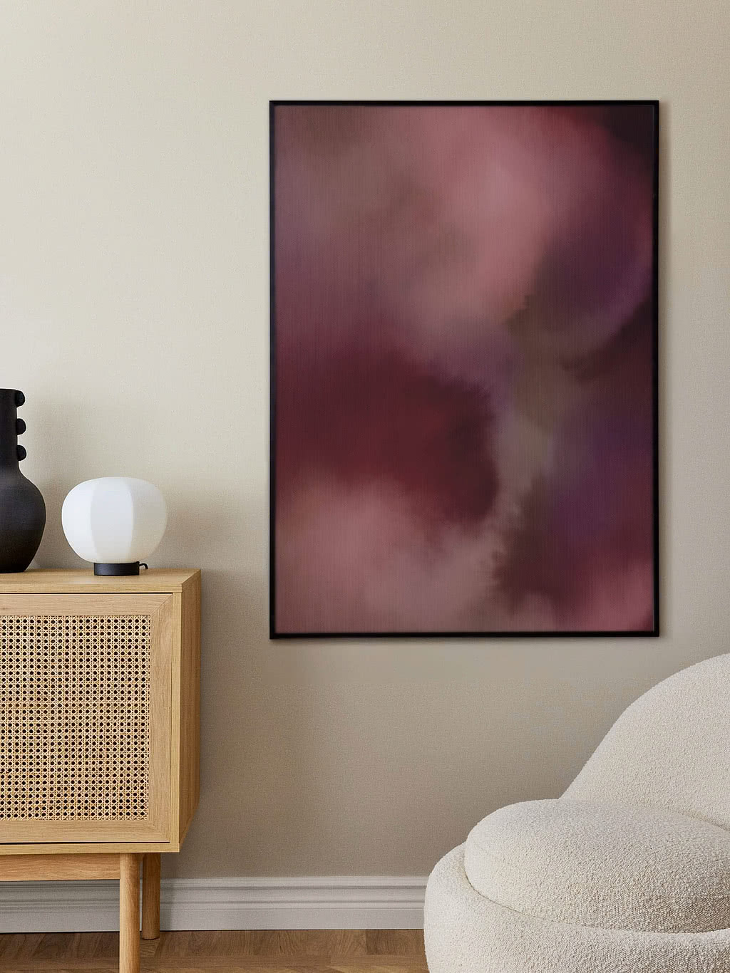
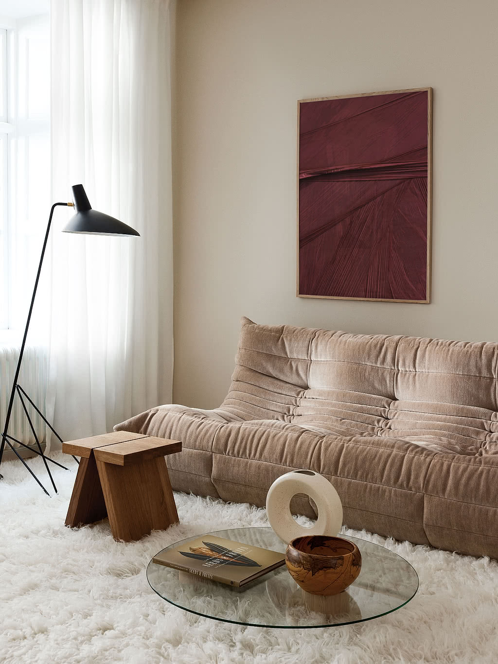
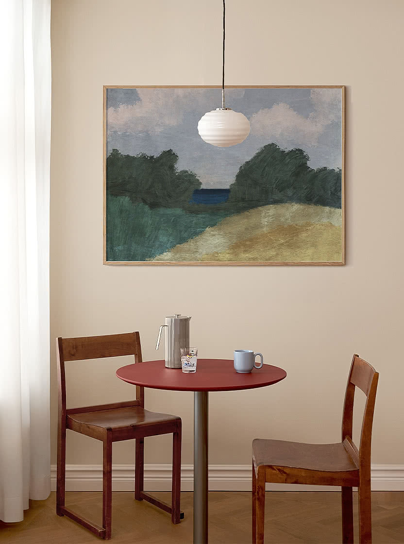
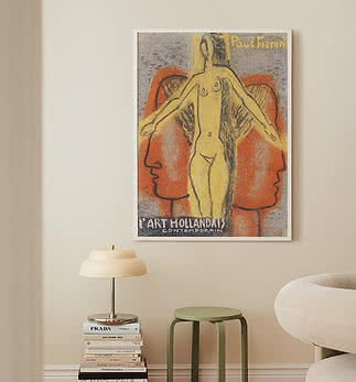
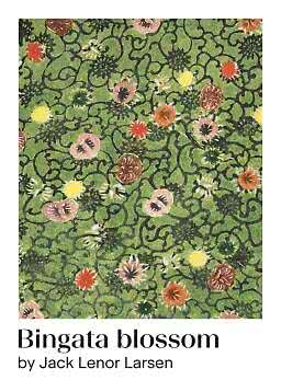
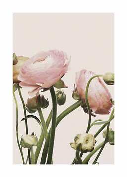
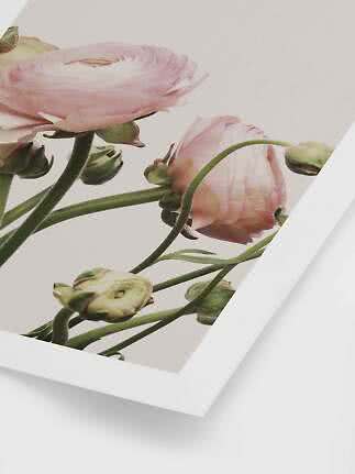
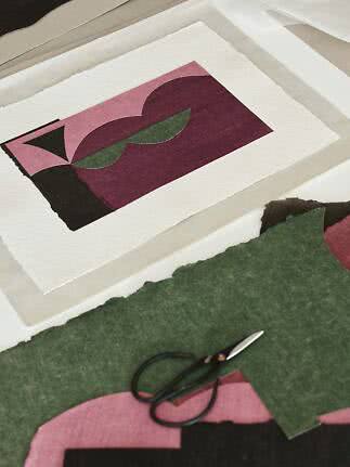
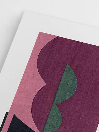
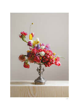
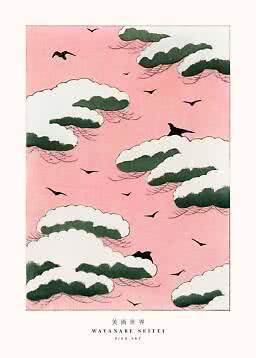
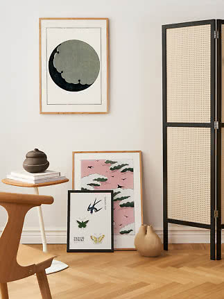
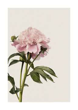
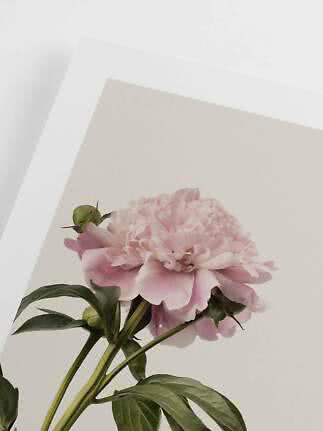
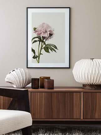
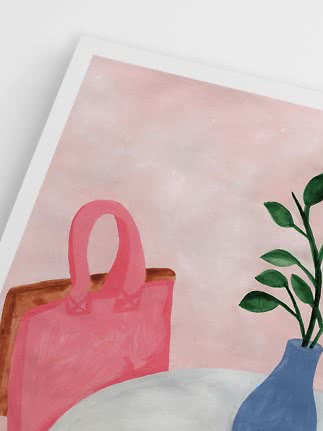
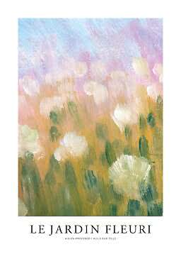
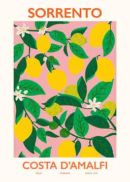
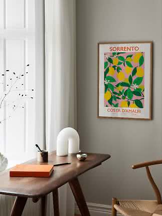
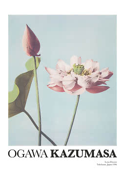
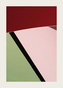
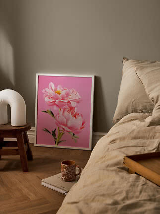
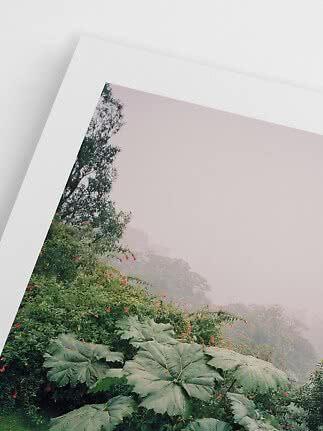
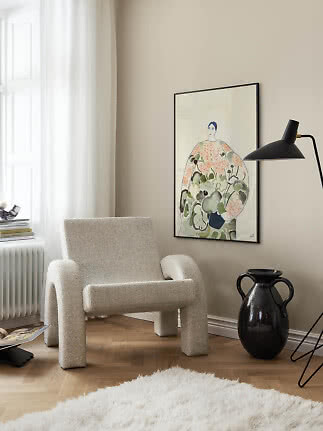
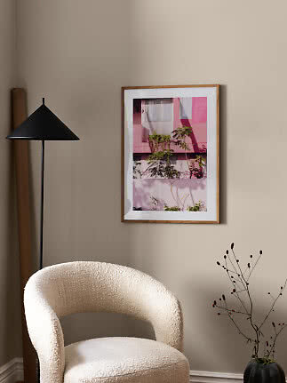
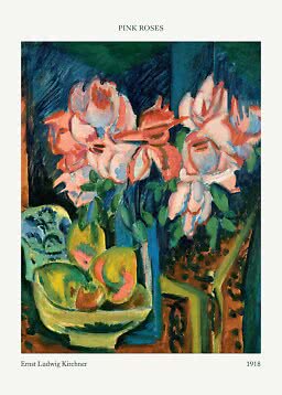
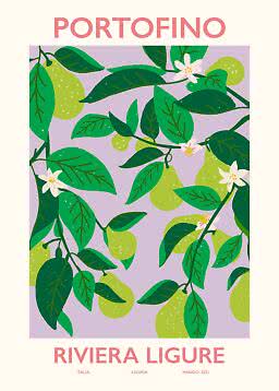
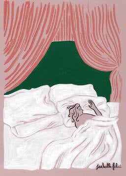
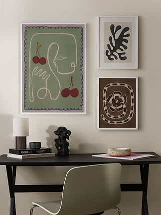
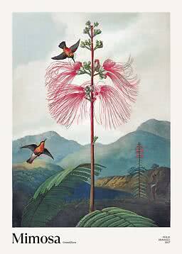
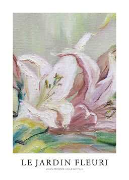
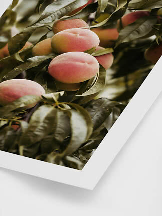
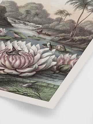
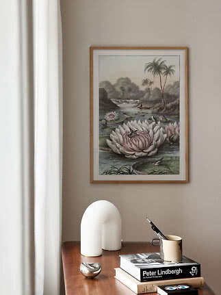
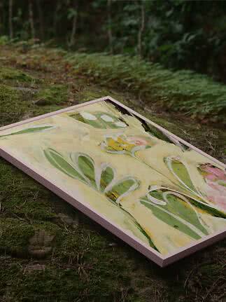
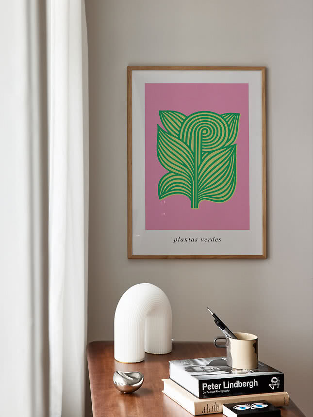
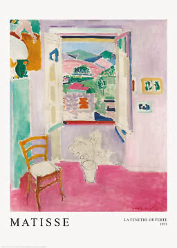
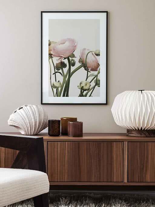
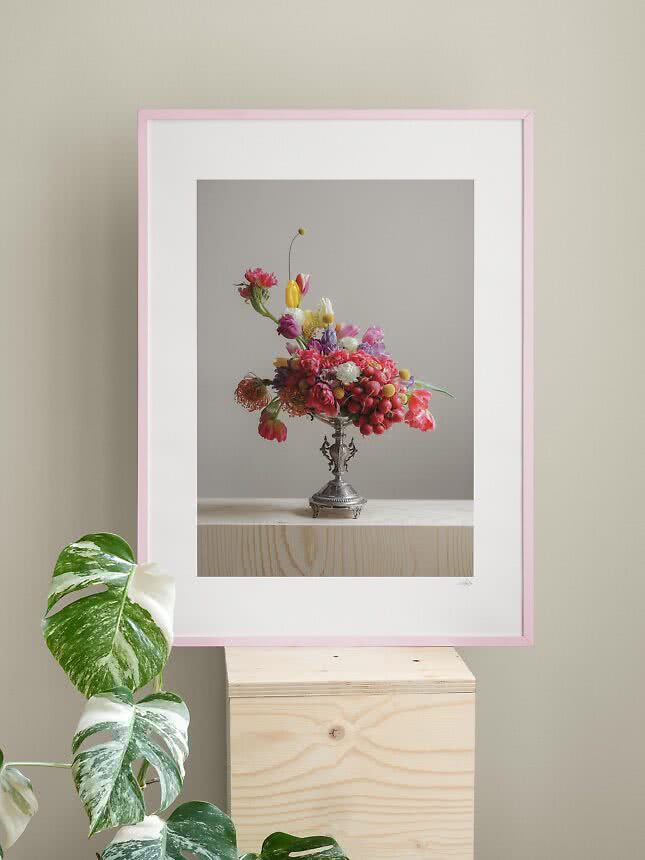
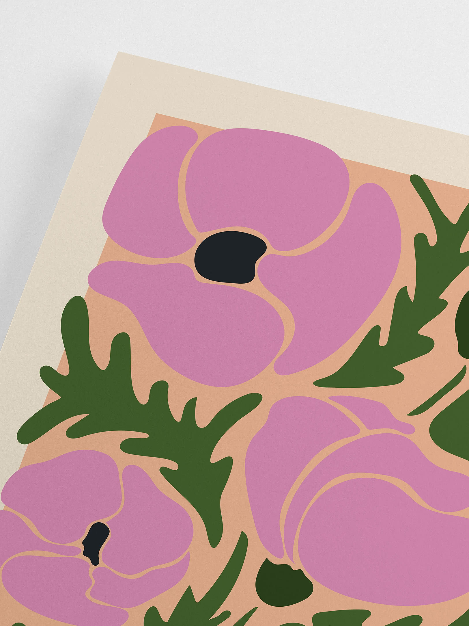
Pink and green is the pairing nature got right first: a rose and its leaves, a peony and its stem. Wallsauce pairs the two in its color trends for 2027, and WGSN and Coloro list Pop Pink and Meadowland Green among their key colors for spring and summer 2027. Done with a light touch, it is anything but sugary: blush with moss, coral with leaf, rose with sage. This is our edit for March, when the first green shoots appear and the walls can bloom a little before the garden does.
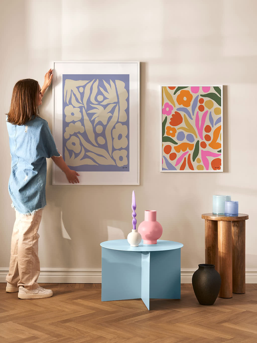
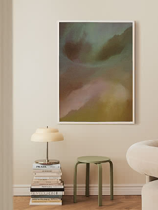
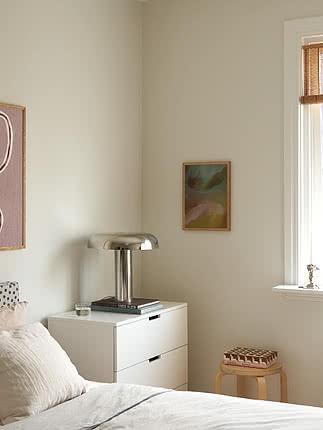
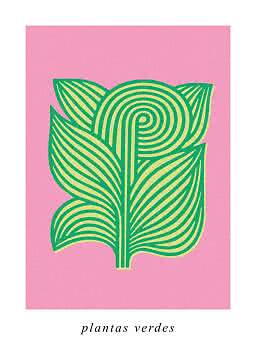
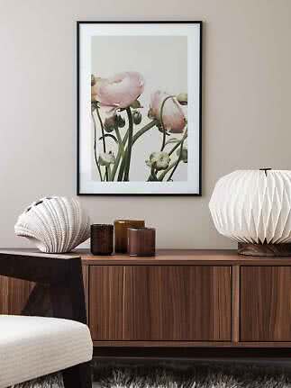
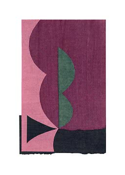
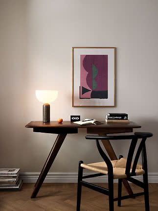
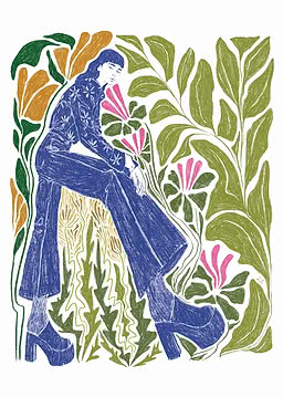
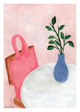
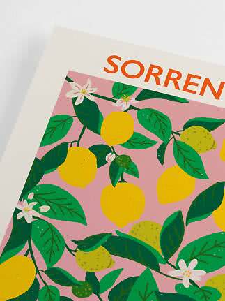
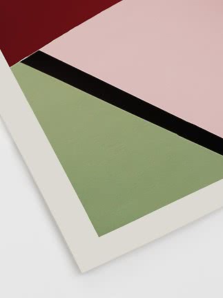
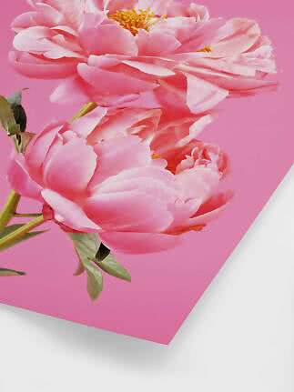
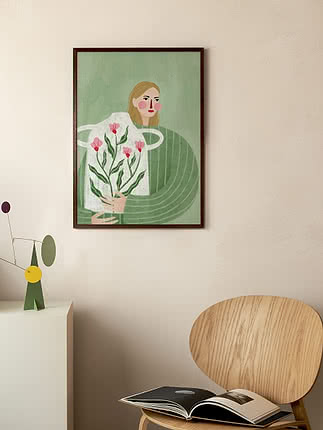
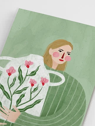
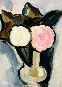
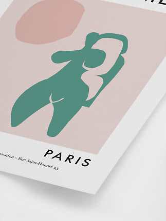
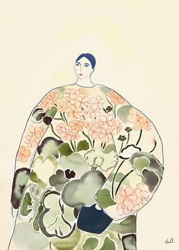
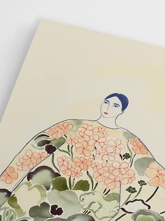
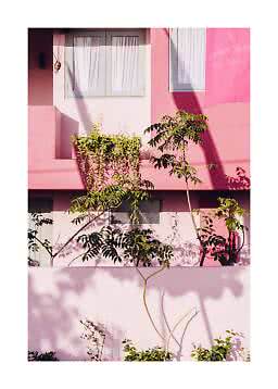
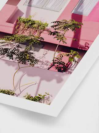
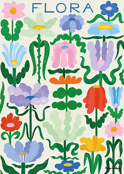
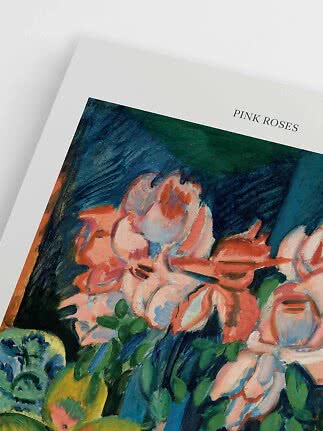
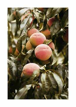
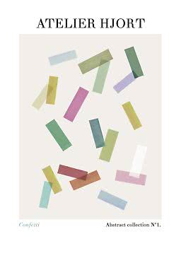
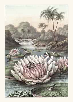
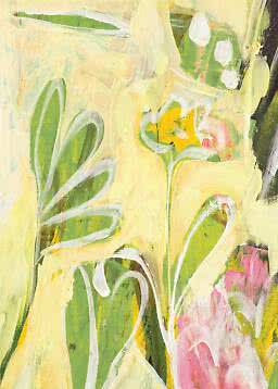
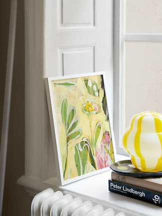
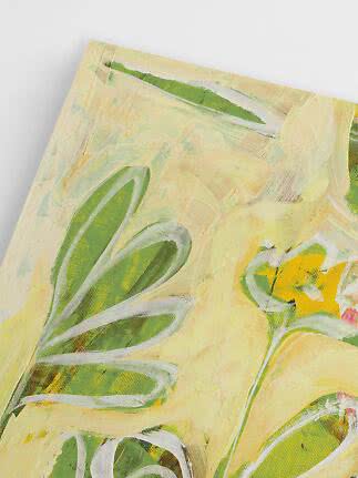
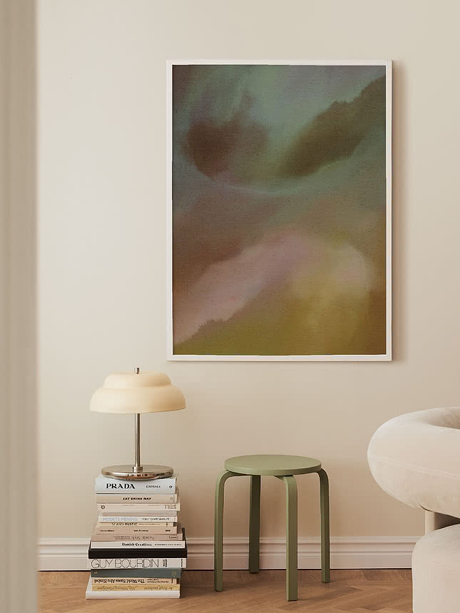
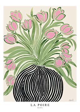
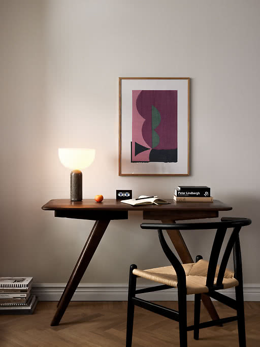
What keeps pink and green fresh rather than sweet is contrast. The two sit almost opposite each other on the color wheel, so each one makes the other look brighter, and the trick is deciding how loud you want that to be. Soft blush against moss green feels calm and grown-up, almost like a neutral. Coral with a clear leaf green is pure spring, sunny and bright. Rose with sage sits somewhere in between, gentle and a little romantic. Look across our range and you will find all three: in botanical studies and flower photography, in loose abstracts with a painted edge and in a few bold graphic prints that make the pairing feel modern.
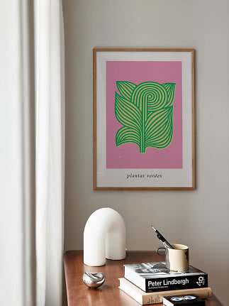
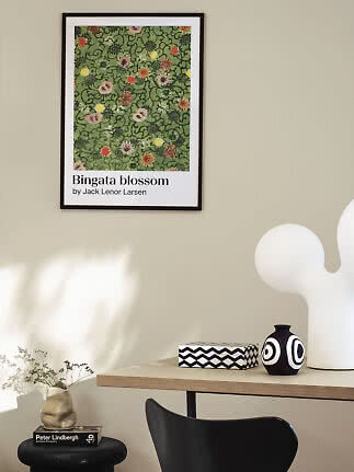
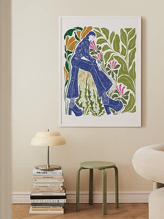
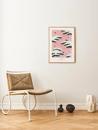
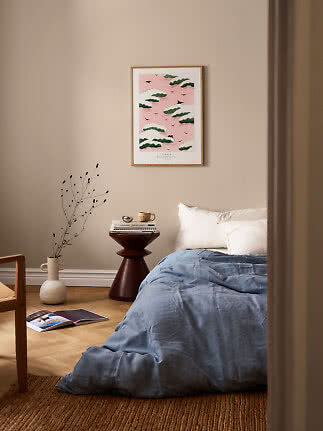
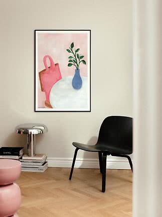
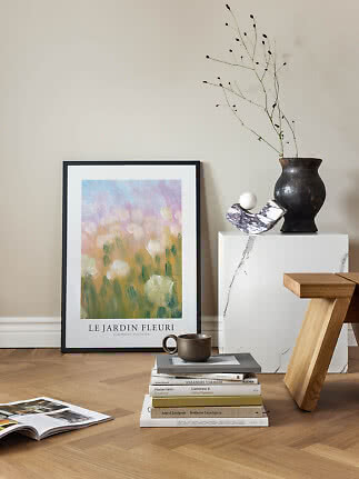
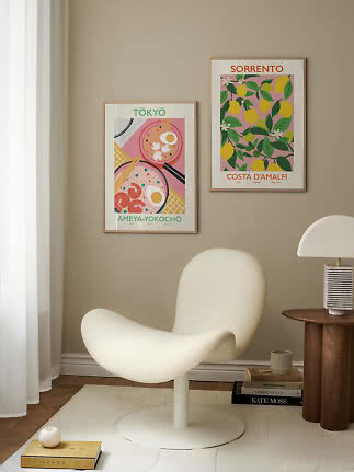
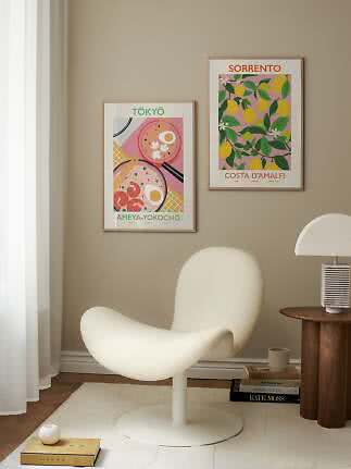
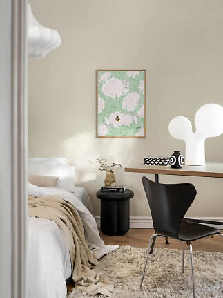
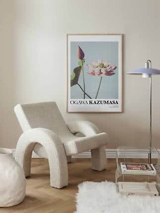
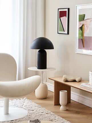
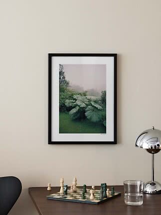
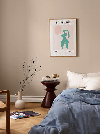
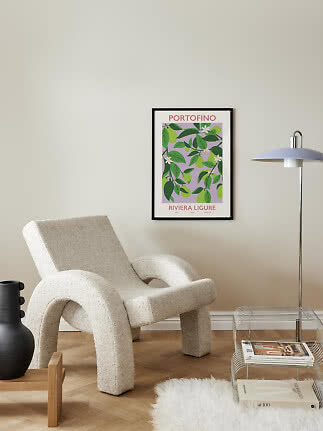
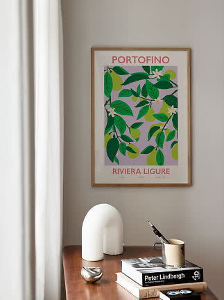
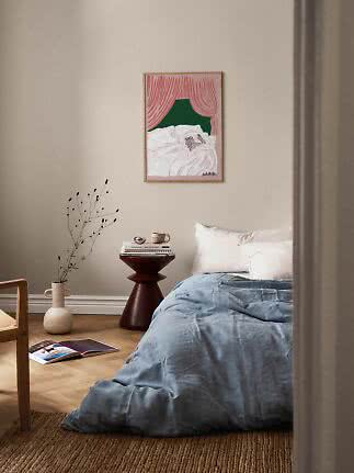
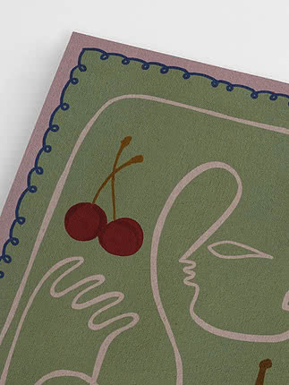
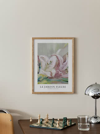
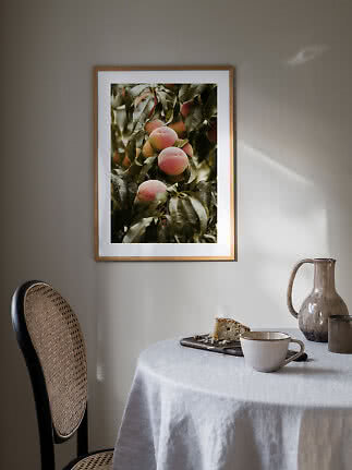
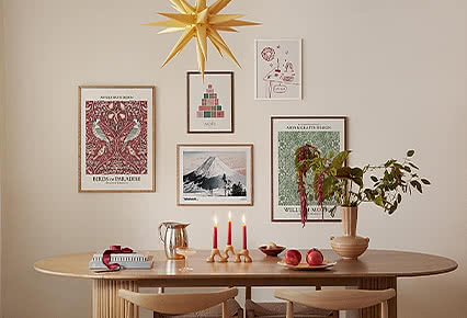
Pink and green work best when one of them is in charge. Let a pink print lead and bring the green in around it, through a plant, a linen cushion or a frame, or turn it the other way and let a green print carry a few notes of pink. Keep the rest of the room quiet, with warm white, oak and natural textiles, and the pairing feels like spring rather than a sweet shop. Chosen this way, it will feel just as right in June as it does in March.
Five ways to pair pink and green.
1. Let one color lead
Choose a print where pink or green clearly dominates and let the other play a supporting role, so the wall feels confident rather than busy.
2. Repeat it in textiles
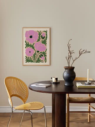
Echo the second color in a cushion, a throw or a linen tablecloth so the print feels connected to the room.
3. Let the frame join in
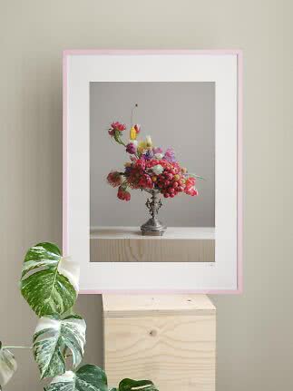
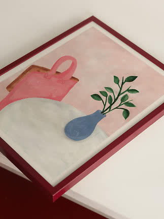
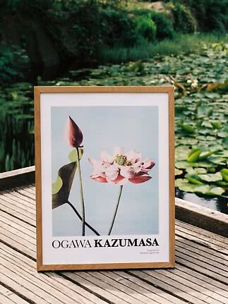
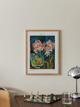
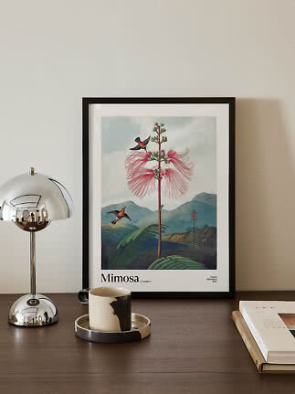
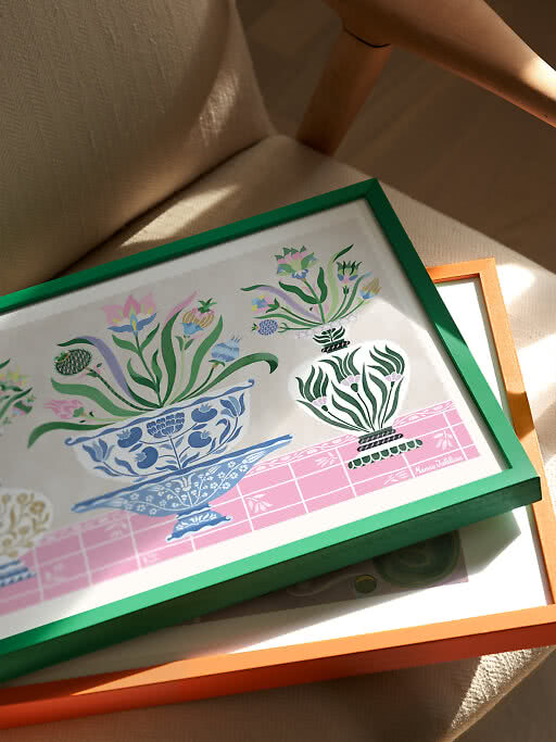
A green frame around a pink print, or a pink one around a green print, makes the frame part of the pairing, while oak keeps it warm and natural.
4. Bring in living green
A plant or a few branches in a vase beside a pink print is the simplest pairing of all.
5. Mix soft and graphic
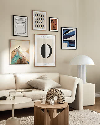
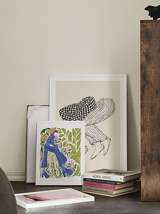
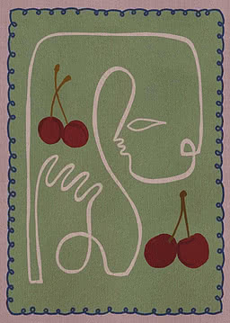
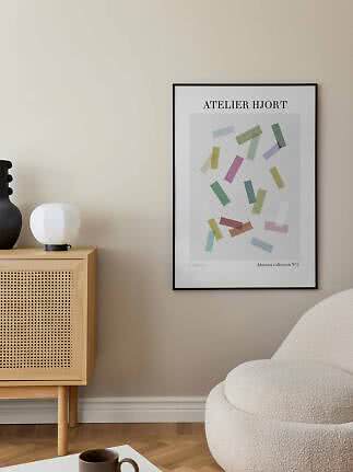
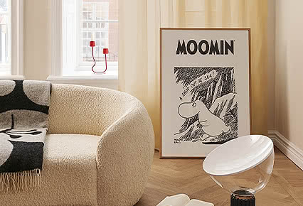
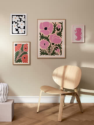
Combine a muted, painterly piece with one bold graphic print so the pairing feels considered and never sugary.
New
New
More from the magazine
All articles →