 (1).png)



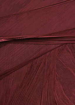
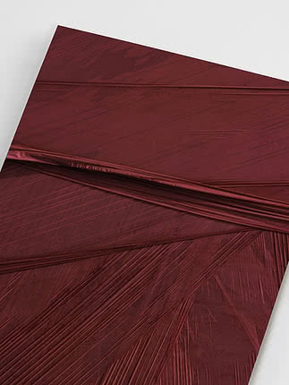
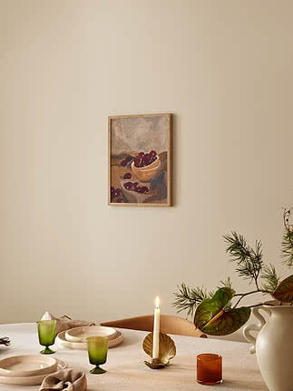
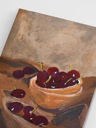
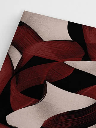
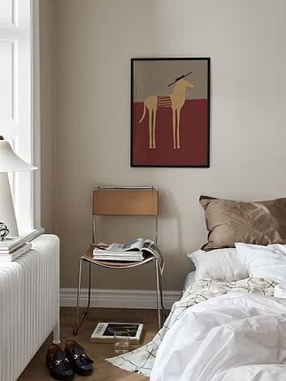
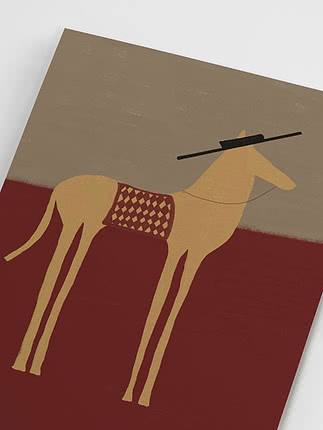
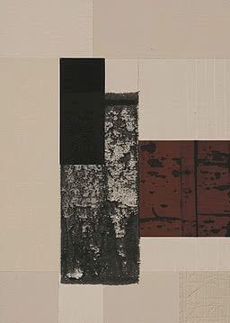
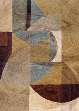
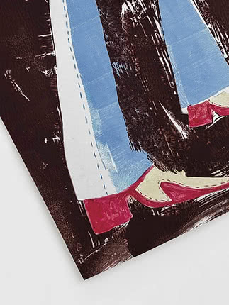
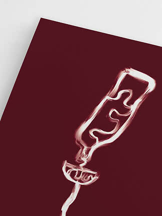
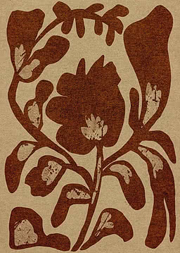
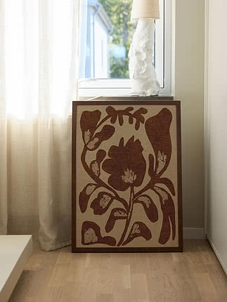
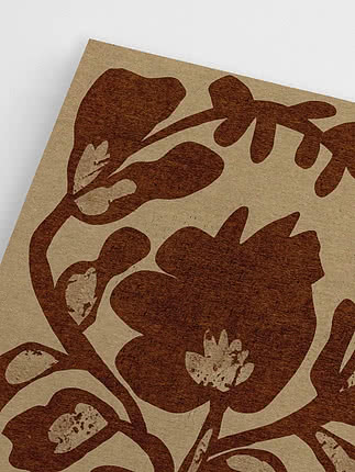
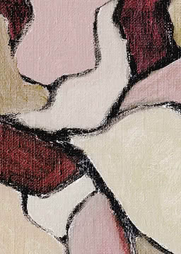
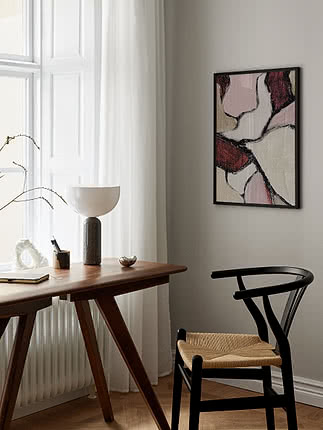
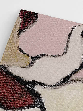
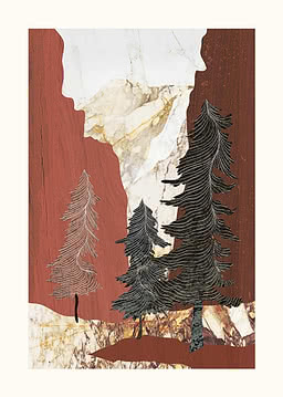
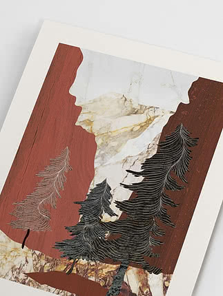
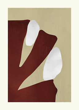
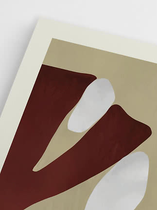
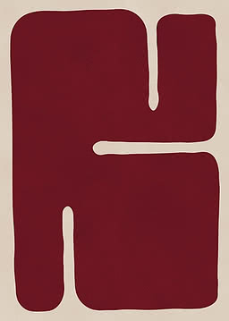
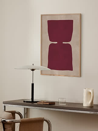
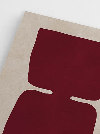
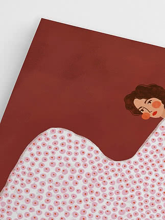
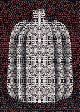
Oxblood Plume
Postery
New
$30.99$44.99

Trend notes
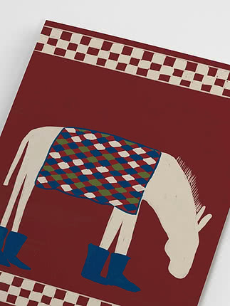
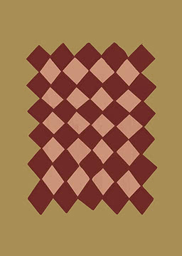
For years, beige, grey and black have been the quiet foundation of a well-dressed home. This season, a new shade is joining them. Burgundy has moved from fashion into interiors, bringing the same calm versatility with a little more warmth. It is deep enough to feel timeless and personal enough to feel like yours.
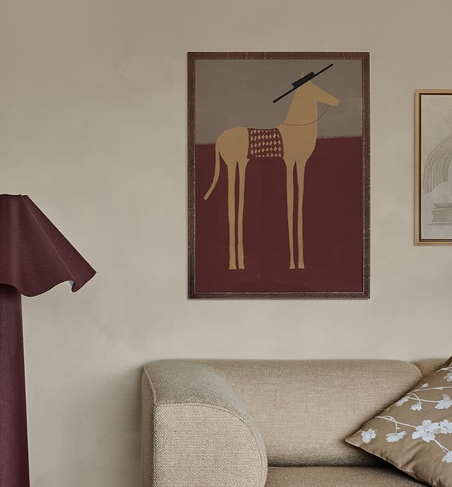
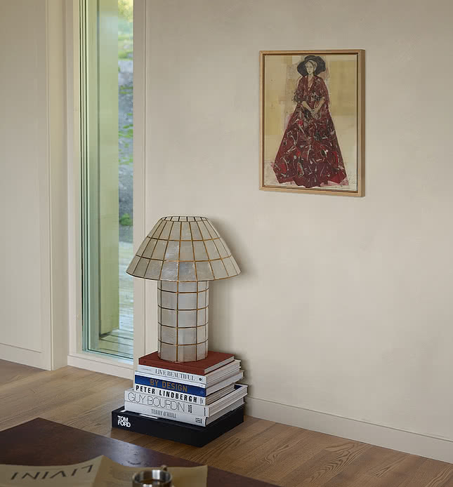
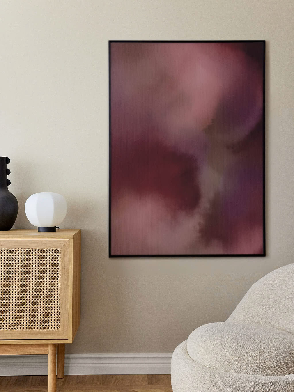
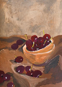
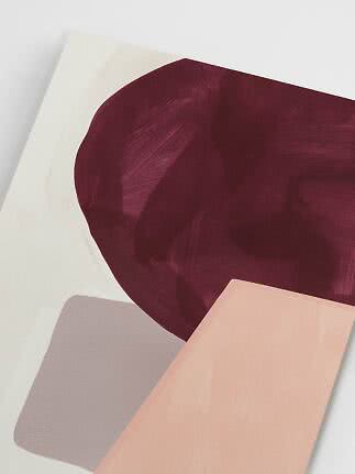
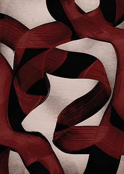
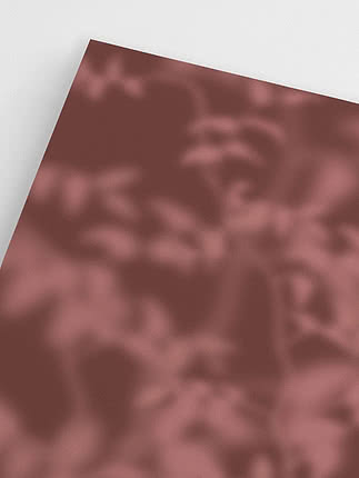
What makes burgundy a neutral is its depth. Where bright red stands out, burgundy settles in, sitting comfortably next to linen, oak and stone and bringing a softness to a room that black rarely can. Use it where you might have used charcoal or grey, and the space feels just as considered, only warmer. Look closer and you will find it is not one colour but a family. Some shades lean towards plum and violet, others towards brown and brick, and some carry the deep, wine-like tone most people picture first. Bring a few of them together on one wall and they create a richness no single shade can, like the same colour seen in different light.
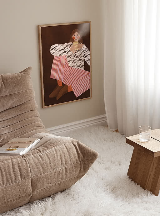
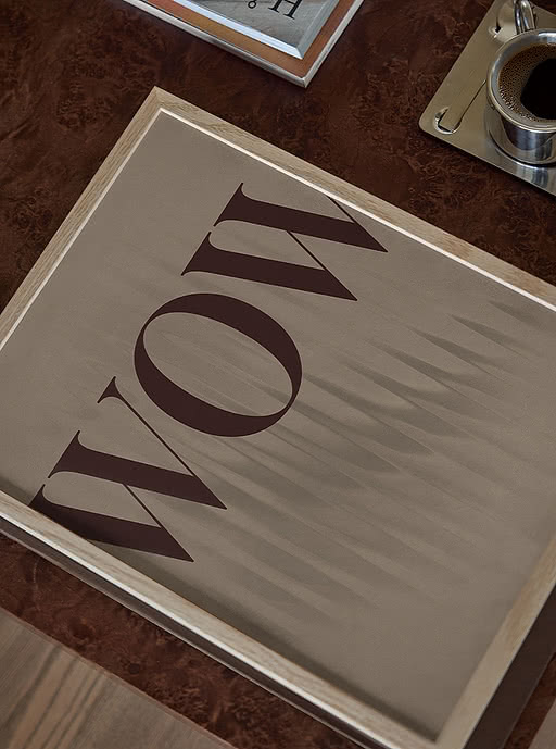
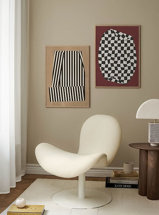
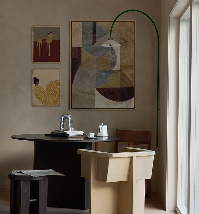
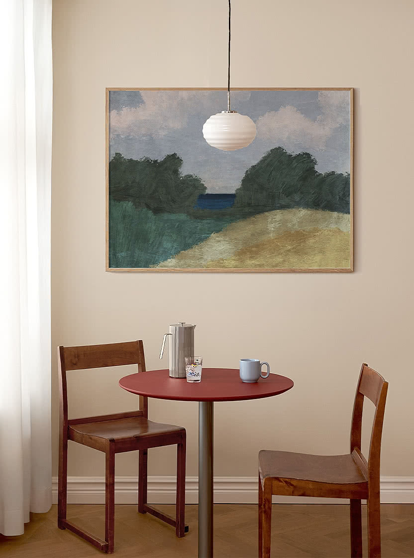
Burgundy is at its best in layers, something fashion understood long before interiors did. Keep it tone on tone for a calm, monochrome look, or bring in moss and forest green when you want more contrast. Like any good neutral, it is not tied to one moment. It feels at home in autumn, carries naturally into Christmas and will still look right long after, a quiet investment for your walls rather than a passing trend.
Five ways to bring burgundy home.
1. Start with one piece
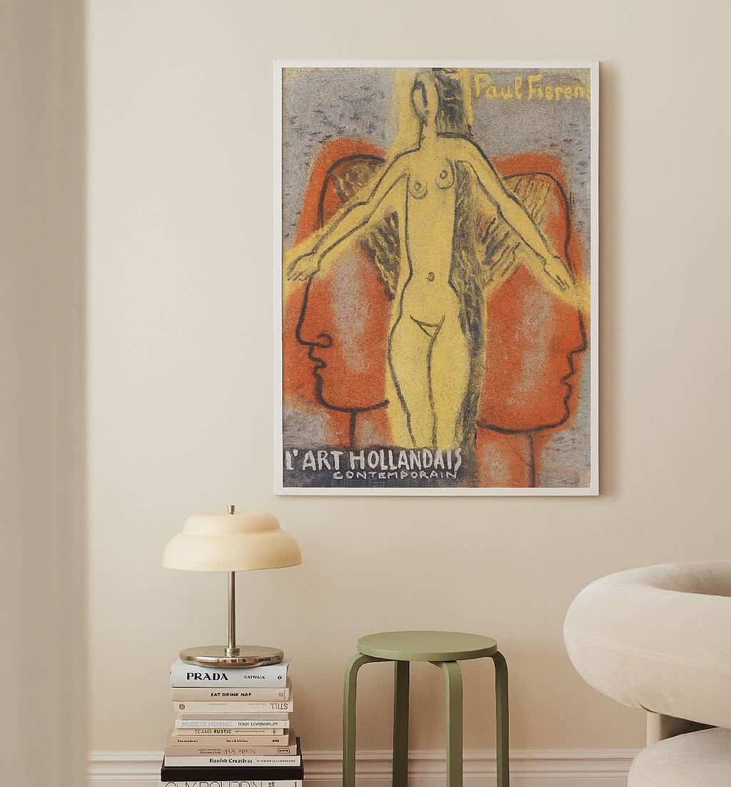
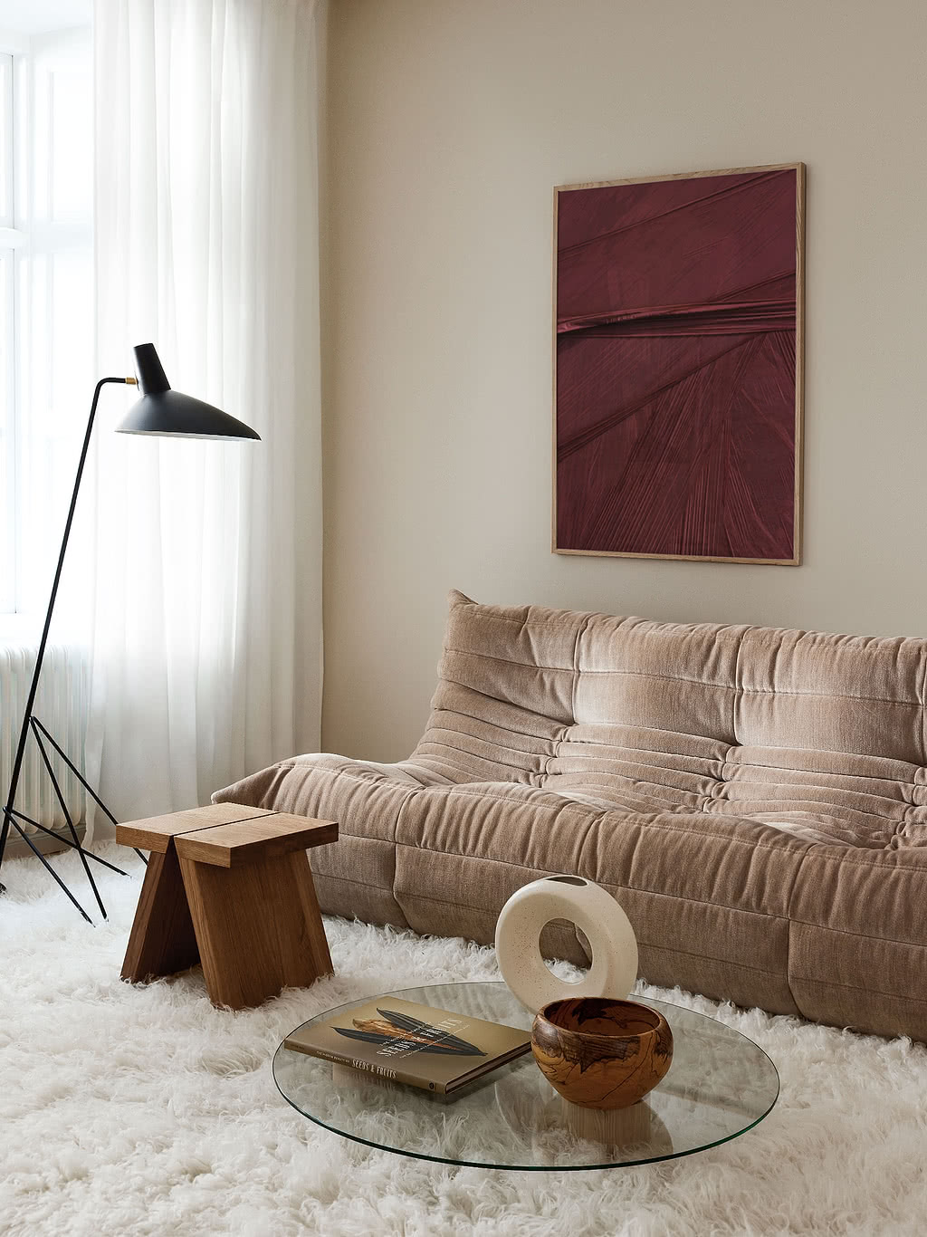
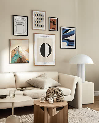
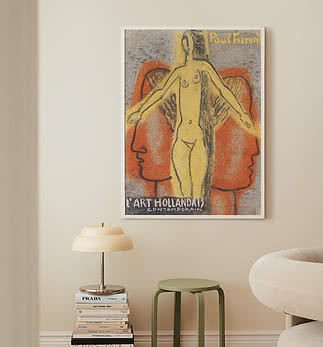
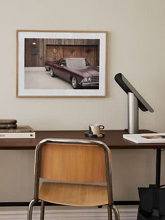
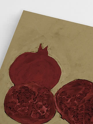
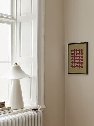
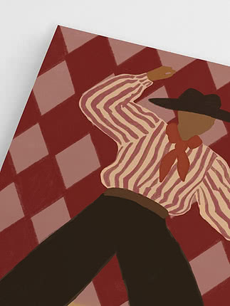
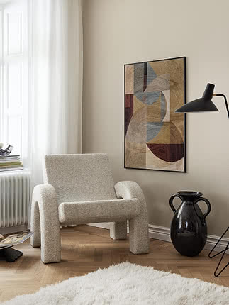
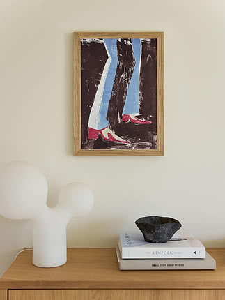
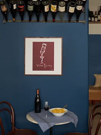
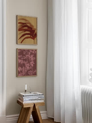
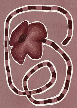
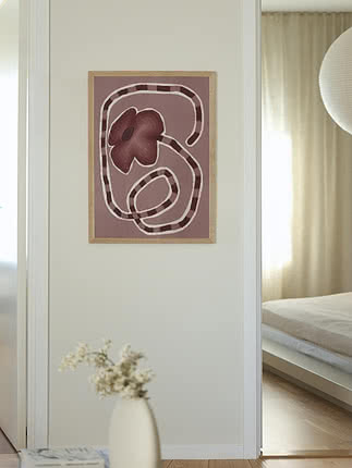
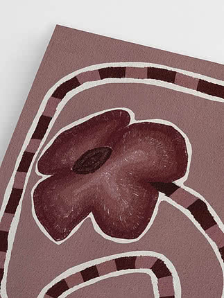
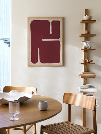
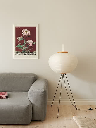
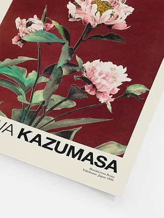
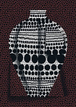
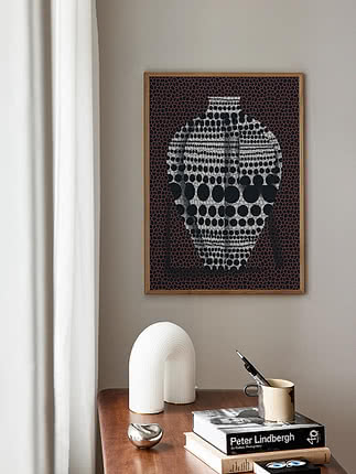
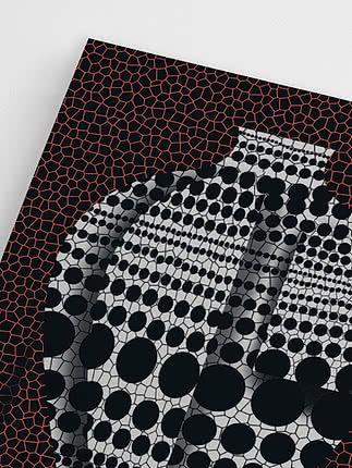
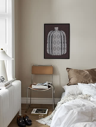
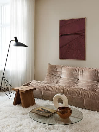
Choose a single print with a strong burgundy tone and hang it where you look most often, above the sofa, a sideboard or the dining table.
2. Repeat the colour
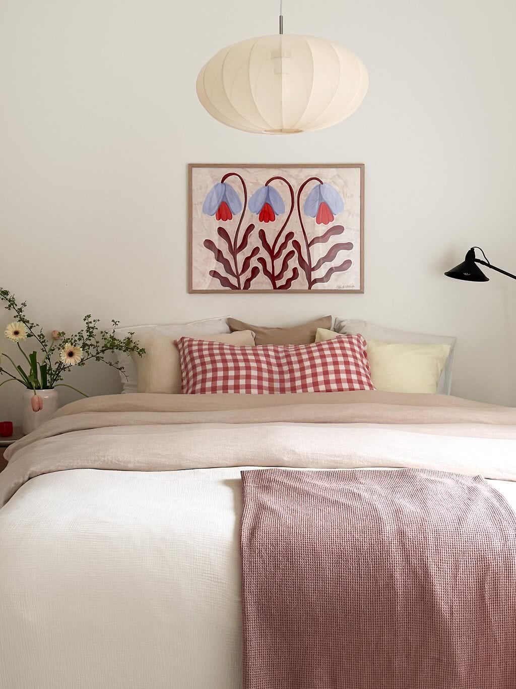
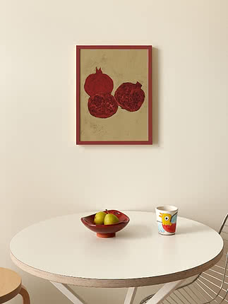
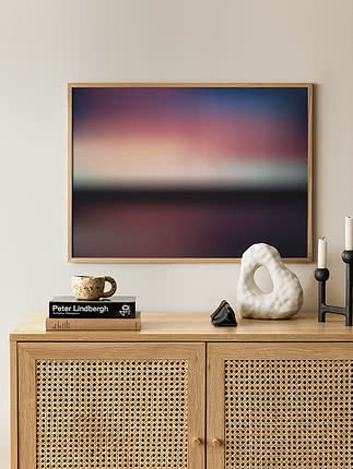
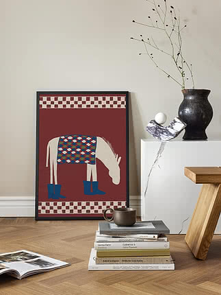
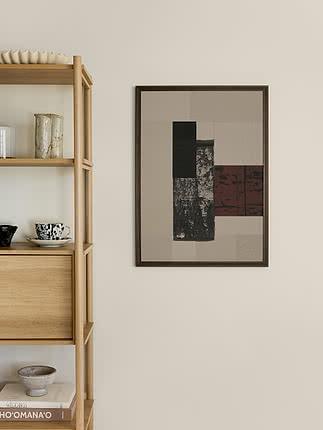
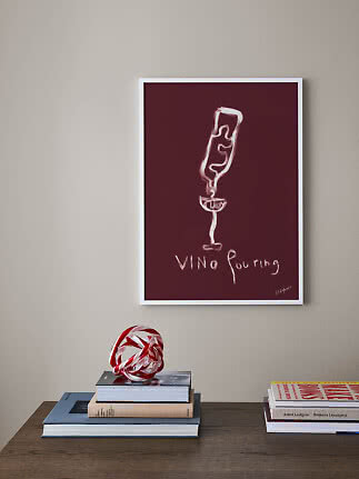
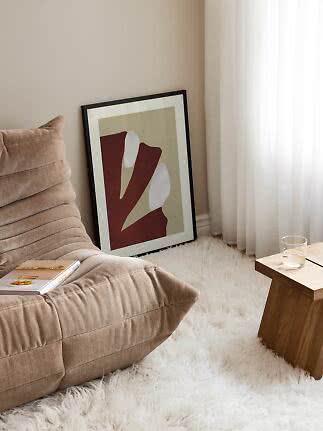
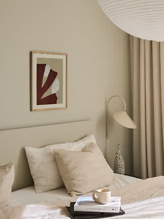
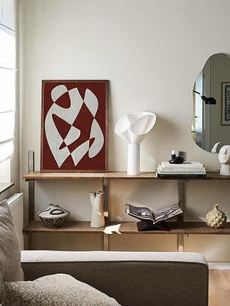
Echo it two or three times around the room in a cushion, a vase or a book spine so the print feels connected to the space.
3. Mix the shades
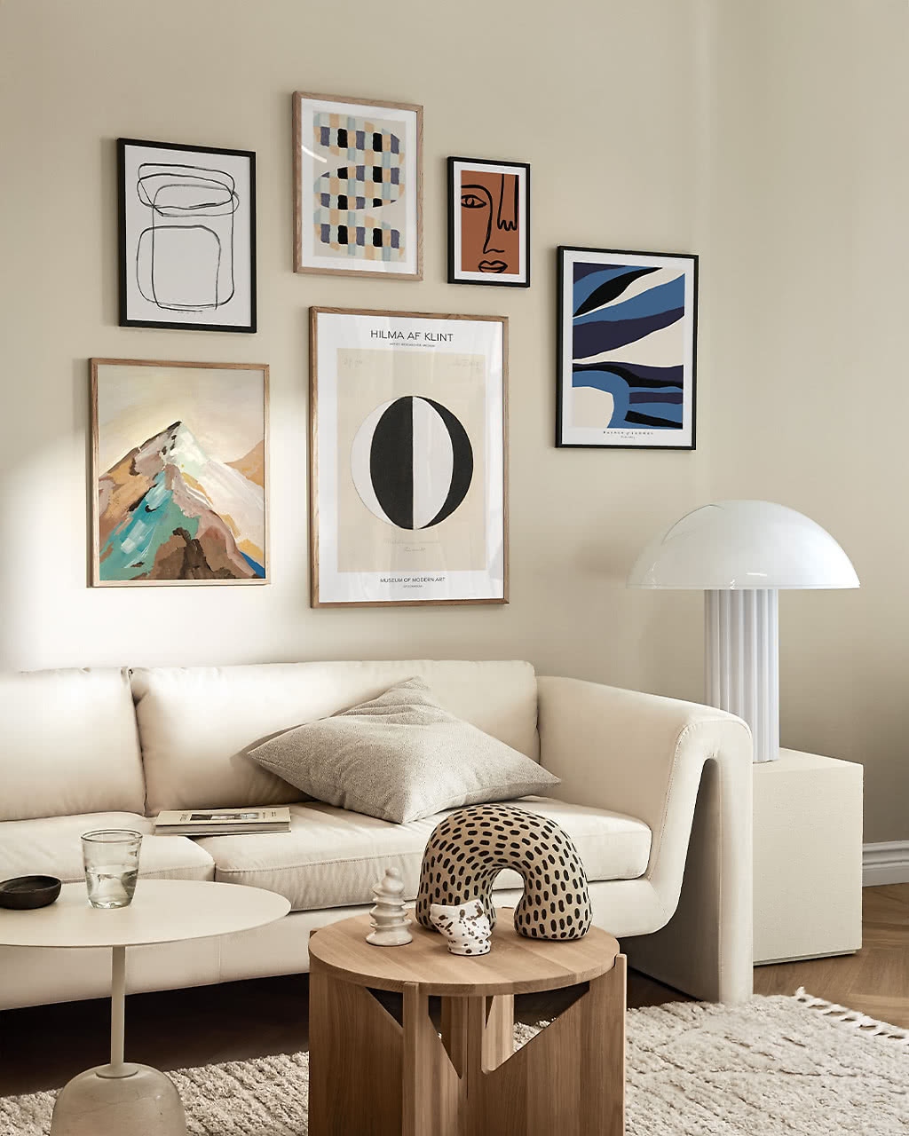
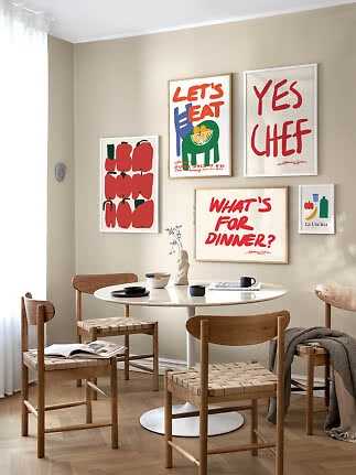
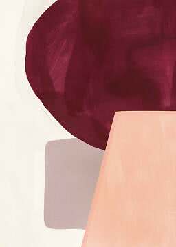
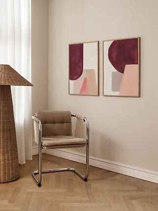
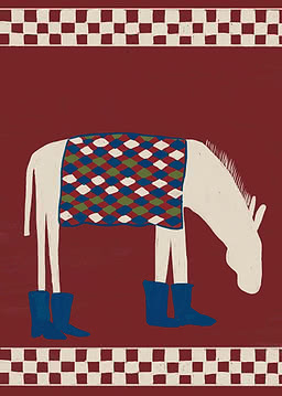
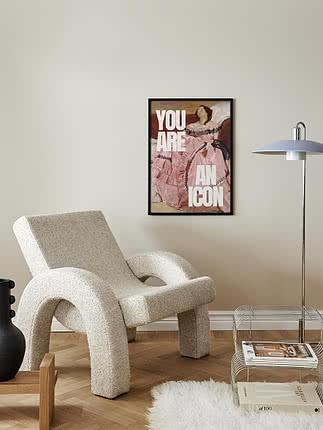
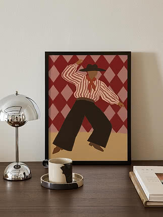
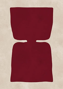
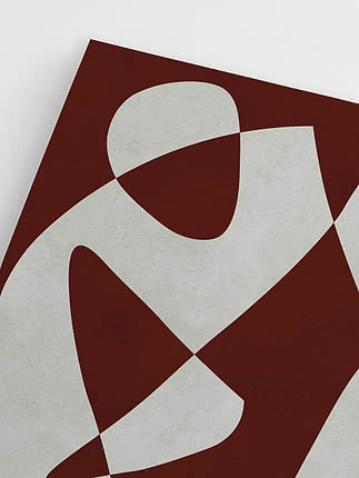
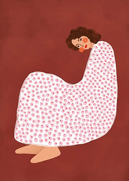
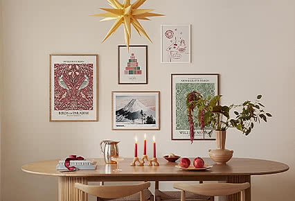
Combine prints that lean plum, brick and deep wine on the same wall for a layered look that still feels calm.
4. Give it room to breathe
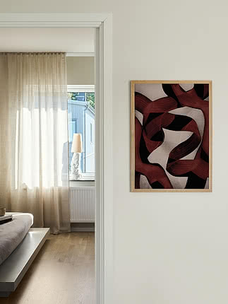
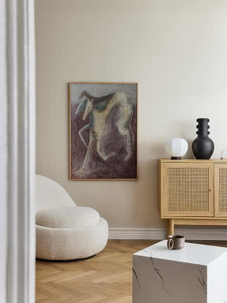
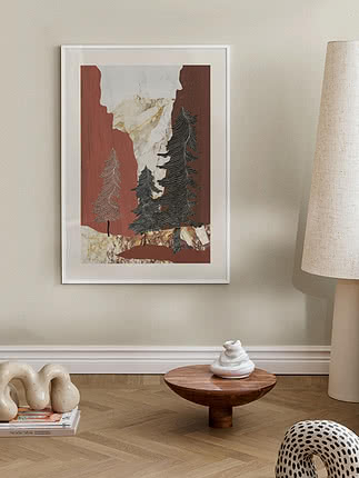
Balance deep reds with soft beige walls, natural textures and at least one lighter artwork so the colour never feels heavy.
5. Choose the right frame
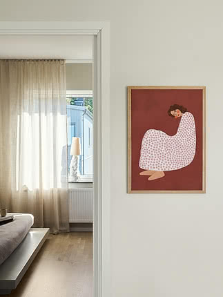
Dark wood and brass bring out its warmth, while light oak keeps it fresh and modern.
New
New
New
New
New
New
New
New
New
New
New
New
New
New
New
New
New
New
New
New
New
New
New
More from the magazine
All articles →