 (1).png)


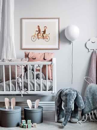
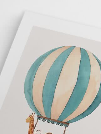
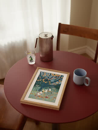
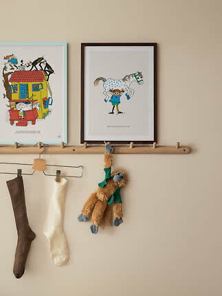
Monkey Ride
Postery Kids
$23.99$34.99
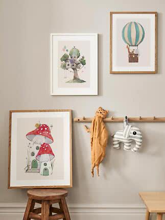
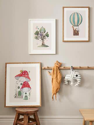
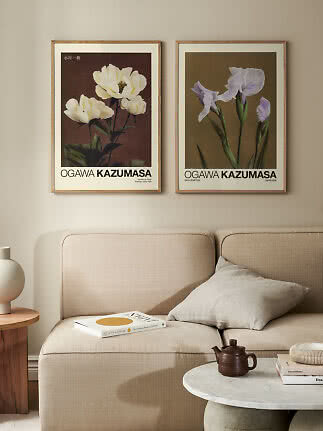
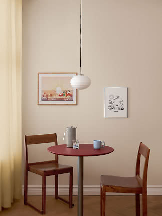
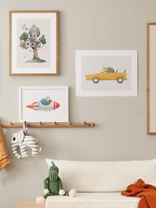
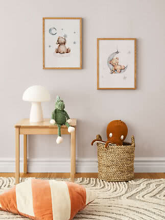
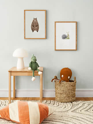
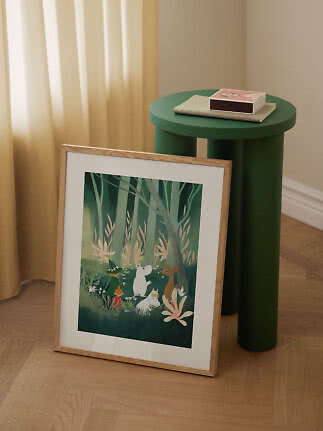
Studio In is a vibrant interior styling studio based in Gothenburg, Sweden. We teamed up with the founders Maja and Atta and asked them to curate a gallery wall and to share some of their invaluable tips for creating that flawless and beautiful gallery wall. They love a gallery wall with a lot of personality and guts, but there are some guidelines that they always keep in mind while creating it. They share three of their best tips for succeeding with your gallery wall.

A gallery wall is one of the most personal things you can do to a space. It's a collection of moments, moods and motifs that says something about who you are — and when it comes together, there's nothing quite like it. But getting there can feel overwhelming. Where do you start? How do you make it feel intentional rather than accidental?
Maja and Atta love a gallery wall with personality and guts — and after years of styling some of the most beautiful interiors in Gothenburg, they know exactly how to make it work. Here are their three essential tips for getting it right.
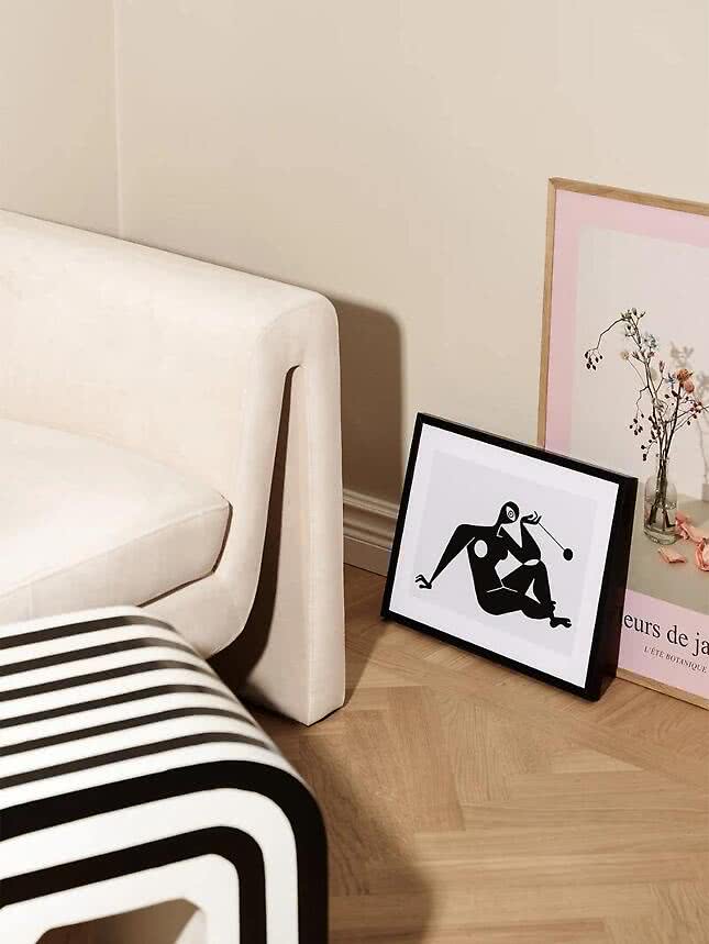

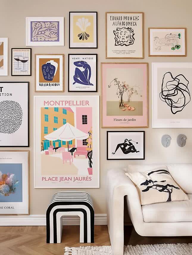
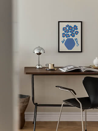
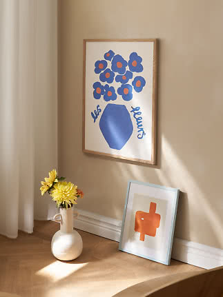
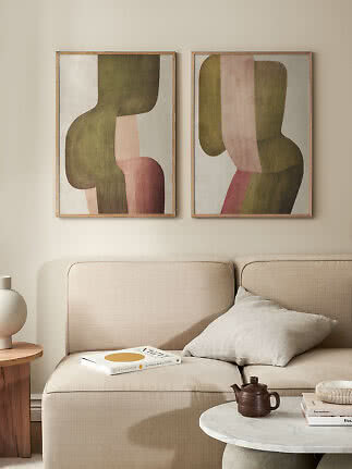
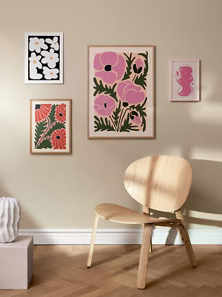
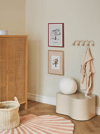
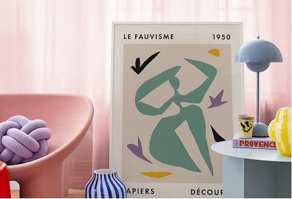
The secret to a gallery wall that feels cohesive — even when the prints are wildly different — is colour. Pick two or three tones that run through your selection and let everything else be free. In the gallery wall shown here, warm sand, dusty pink and deep navy anchor a mix of abstract art, travel prints and photography. The individual pieces couldn't be more different, but the shared palette makes them feel like they belong together.
A good starting point is your room. What colours are already on the walls, in the furniture, in the textiles? Pull from those. Warm rooms tend to respond well to earthy tones, terracotta and ochre. Cooler, minimal spaces often suit muted blues, sage and off-white. And if you want something more playful, a pop of a single bold colour can do wonders as a thread through an otherwise neutral collection.
Frames are the architecture of a gallery wall. They set the tone before anyone looks closely at the art itself. A mix of all different frames can feel chaotic; a wall of identical frames can feel flat. The sweet spot is somewhere in between.
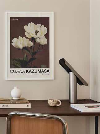
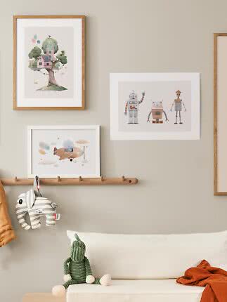
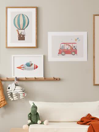
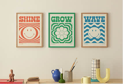
The most versatile approach is to work with two or three frame styles that complement each other. Black frames are graphic and contemporary. Oak and natural wood frames feel warm and Scandinavian, softening abstract or colourful art. White frames are the all-rounders — they disappear into the wall and let the print take centre stage. In this arrangement, the combination of black, white and oak frames creates visual rhythm without feeling rigid.
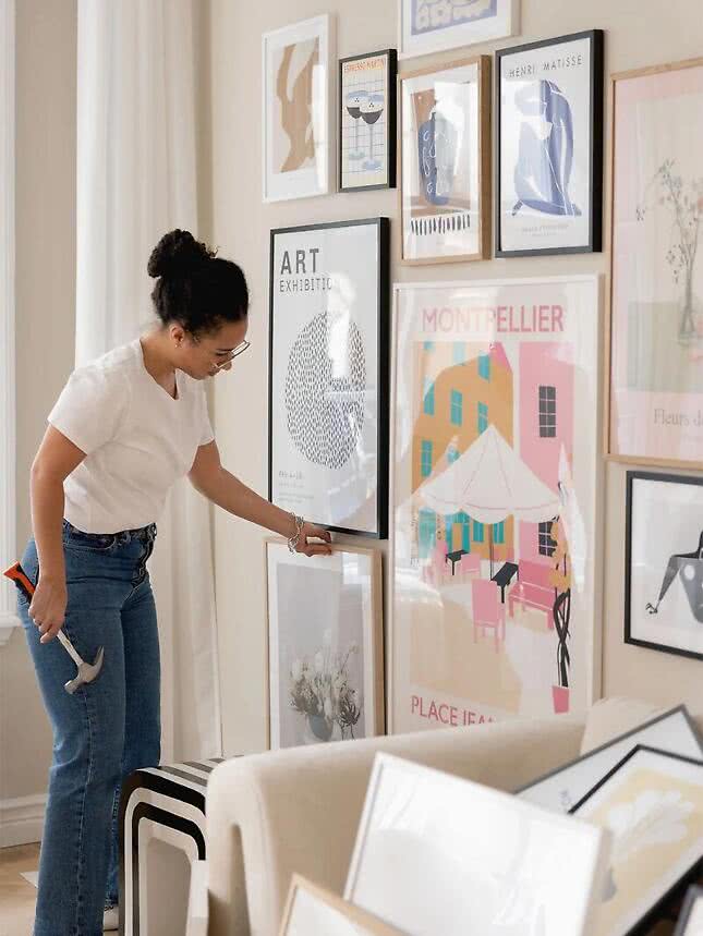
This is the step most people skip — and the one that makes the biggest difference. Before you put a single nail in the wall, lay everything out on the floor. Move pieces around. Try different combinations. Live with it for a day if you can.
Start with your largest piece and build outward from there. Keep the gaps between frames consistent — somewhere between 5 and 10 centimetres works well for most arrangements. Once you're happy with the layout on the floor, photograph it and use that as your reference when you move to the wall.
A great gallery wall takes a little patience, but the result is worth it. Start with colour, build with frames, and plan before you hang.