 (1).png)
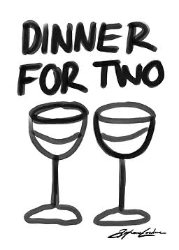
Dinner for Two
Stephie Cardona
$29.99$37.99

Up to 30% off selected prints
Valid until midnight, Monday 12 October


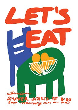
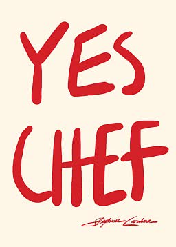
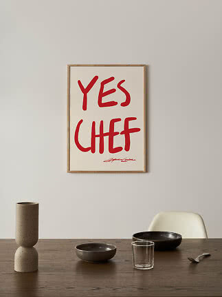
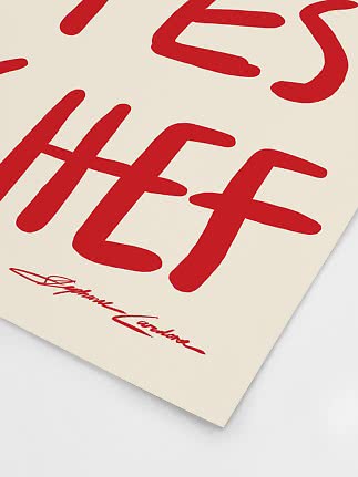
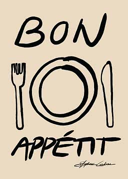
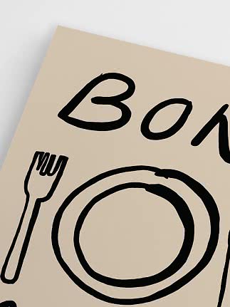
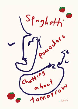
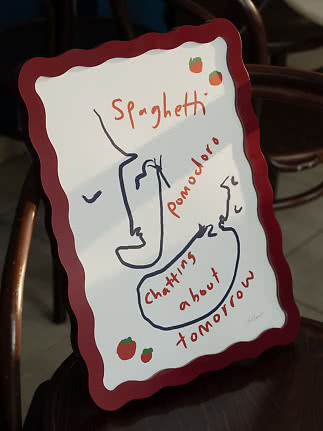
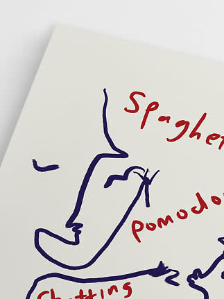
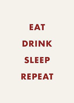
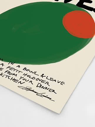
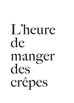
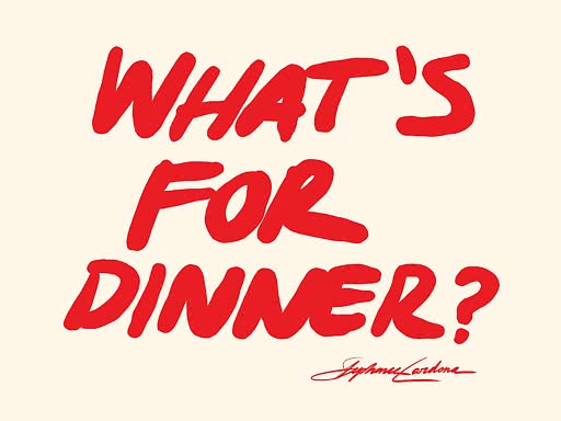
Bold typography meets playful attitude in this quote poster featuring the words “What’s for dinner?” in vivid red against a soft beige background. The oversized lettering gives the design a confident, expressive look that instantly draws the eye and adds energy to the wall. Clean yet full of personality, it brings a graphic pop of colour that works beautifully in modern, eclectic, and Scandinavian interiors. Perfect for creating a fun focal point, this poster suits spaces that benefit from a touch of humour and strong visual contrast. The warm neutral base keeps the look easy to style, while the bright red text adds impact without feeling heavy. Ideal for anyone looking for a statement art print with a casual, conversation-starting feel.
Bold typography meets playful attitude in this quote poster featuring the words “What’s for dinner?” in vivid red against a soft beige background. The oversized lettering gives the design a confident, expressive look that instantly draws the eye and adds energy to the wall. Clean yet full of personality, it brings a graphic pop of colour that works beautifully in modern, eclectic, and Scandinavian interiors. Perfect for creating a fun focal point, this poster suits spaces that benefit from a touch of humour and strong visual contrast. The warm neutral base keeps the look easy to style, while the bright red text adds impact without feeling heavy. Ideal for anyone looking for a statement art print with a casual, conversation-starting feel.
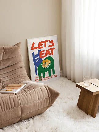
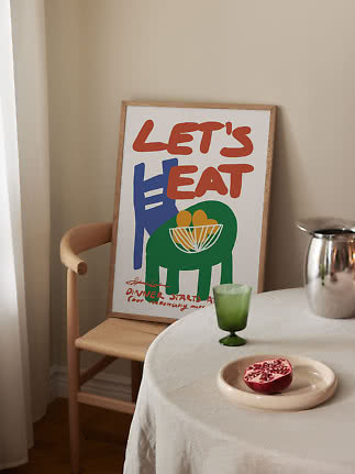
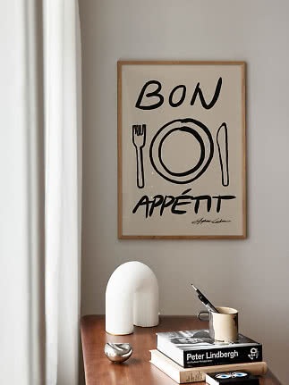
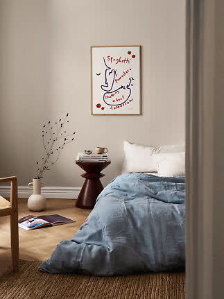
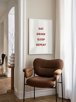
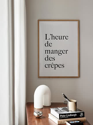
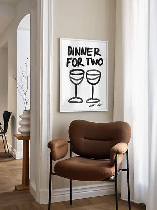
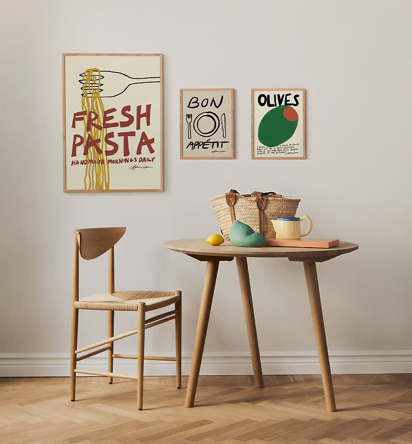
Product ID 416401Bold typography and the warm cream background could work beautifully in a dining area, kitchen, or hallway where you want an art piece with personality and wit. A slim oak, white, or natural wood frame would keep the look clean and Scandinavian, while a larger passepartout could give the graphic text a calm, gallery-like balance. It pairs nicely with light woods, soft beige textiles, and simple modern furniture, letting the vivid red become an energising accent in the room. For a more curated feel, try styling it alongside abstract line art or other typographic prints in a relaxed salon wall.
The size of our posters always refers to the actual paper size — not the motif. Some posters include a white border that frames the artwork, similar to a passepartout. Where this is the case, it will be noted in the product description and is also visible in the product images.
When choosing a frame, make sure to match it to the poster size. Our frames are designed to fit our posters exactly — a 50×70 cm poster takes a 50×70 cm frame. No trimming or adjusting needed.
We offer a wide range of sizes to suit any wall, from smaller formats perfect for shelves and gallery walls, to larger statement pieces that anchor a room. Not sure which size is right for your space? Feel free to contact us — we're happy to help.
Our posters are printed on 200 g/m² premium matte paper made from FSC® Mix Credit Paper 100%. The paper is archive-proof, meaning it won't yellow over time, and all printing is done in modern facilities with ISO 14001 certification.
Our frames come in a variety of colours and materials, all ethically sourced and produced with care for people and the environment. Available in multiple sizes to suit any wall and any home. If you have any questions about our products, don't hesitate to reach out to our customer support team.
We believe that greater transparency helps drive the change towards a more sustainable future. As part of this long-term commitment, we work continuously to know and share how and where our products are made.
Our products are sourced from carefully selected suppliers across the Nordics, Europe, and Asia. For example, our posters are printed at leading printing facilities in Northern Europe, certified with the Nordic Swan Ecolabel and operating as 100% climate-neutral since 2011.
We care about the conditions under which our products are made. If you'd like to know more about the origin or production conditions of a specific product, reach out to our customer support team — we're happy to share what we know.
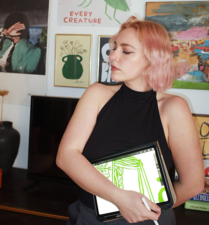
Stephie Cardona, also known as KunstbyStephie, is a Berlin-based artist whose work is deeply influenced by travel, typography, and the everyday moments that spark connection. Her artistic journey began with poetry, evolving into a blend of graphic design and typography that captures personal experiences and cultural discoveries. Inspired by the whimsy of David Shrigley, she embraces humor and emotion in her art, creating pieces that resonate with a broad audience.
Read the interview