 (1).png)
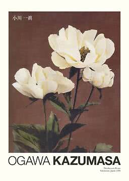
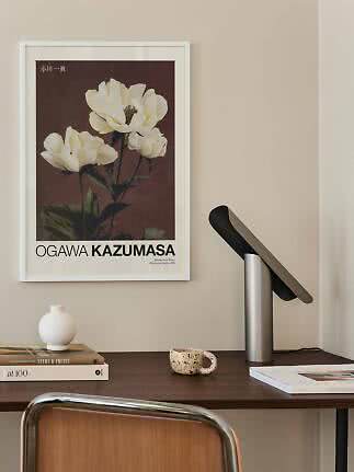
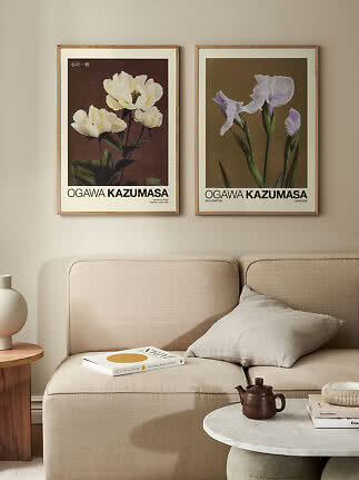
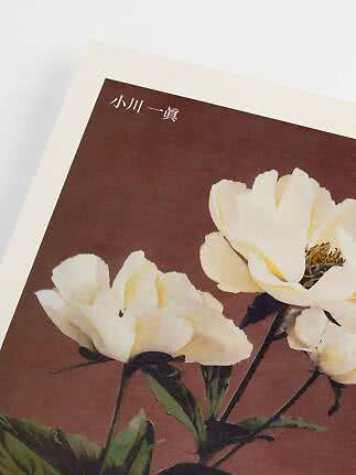
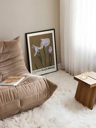
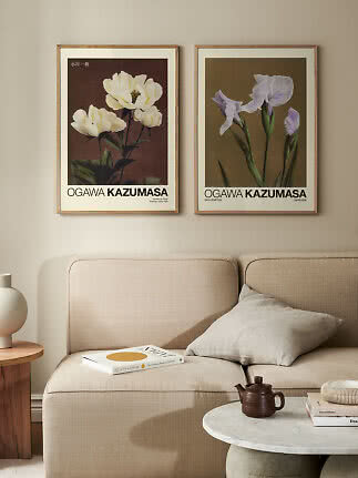
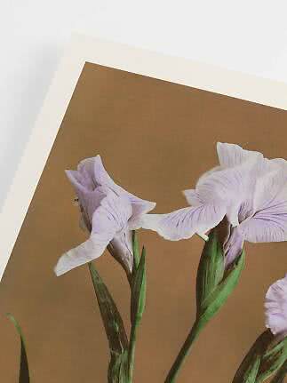
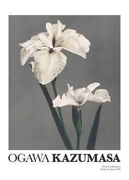
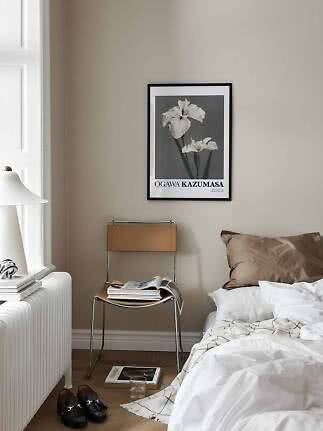
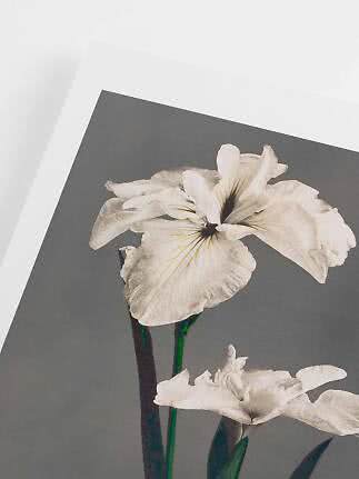
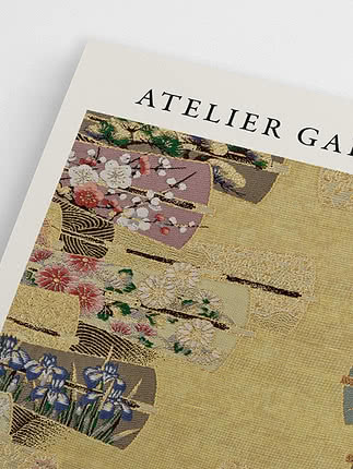
Haerdaceous Peony by Ogawa Kazumasa
Postery
£8.99£18.99
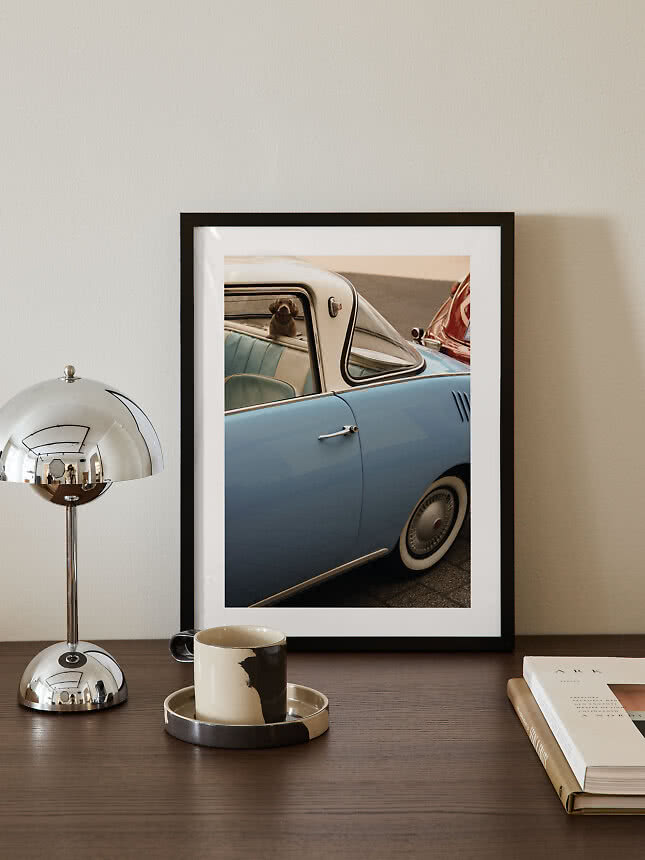
Some posters seem to arrive with a past. A dancer swirling across a Folies-Bergère bill, a fashion cover with a hand-drawn masthead, a pale blue car parked in the sun: they bring a story to the wall, a little patina and the kind of warmth that new things take years to earn. Vintage and retro are having a real moment, and they sit beautifully in a calm, modern home, as long as they feel like finds rather than fancy dress. Here is how we would decorate with them, from the eras and the colours to the frames and the art of mixing old with new, and how to keep the whole thing from tipping into a theme park.
In short
Vintage is the real past. Posters, photographs and illustrations from another time: a Belle Époque music-hall bill, a fashion magazine cover, a snapshot of a film star by a pool. They carry their era in every line, right down to the lettering.
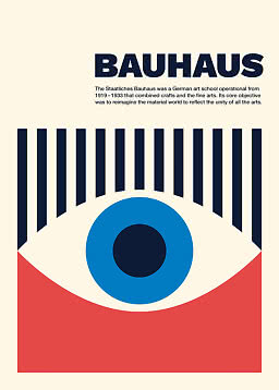
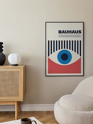
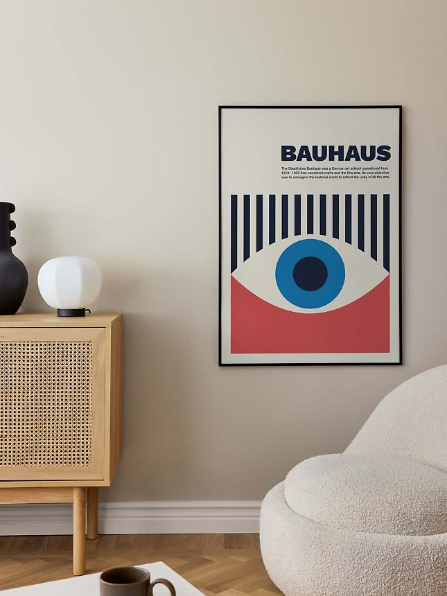
Retro is new, made in an old spirit. Today’s illustrators borrowing the rainbows of the seventies, the flat colours of the old travel posters or the clean geometry of the Bauhaus. Brand new, yet instantly familiar.
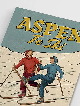
On the wall, both do the same job. They add character, a sense of time and a little humour to a room that might otherwise look straight out of a catalogue. The trick is to choose a mood rather than a decade, and to let one or two pieces lead.
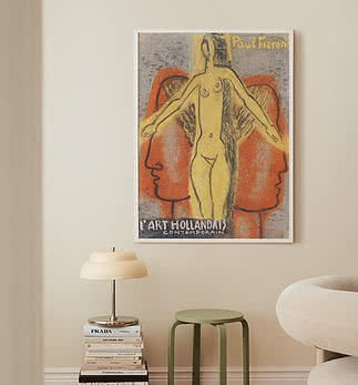
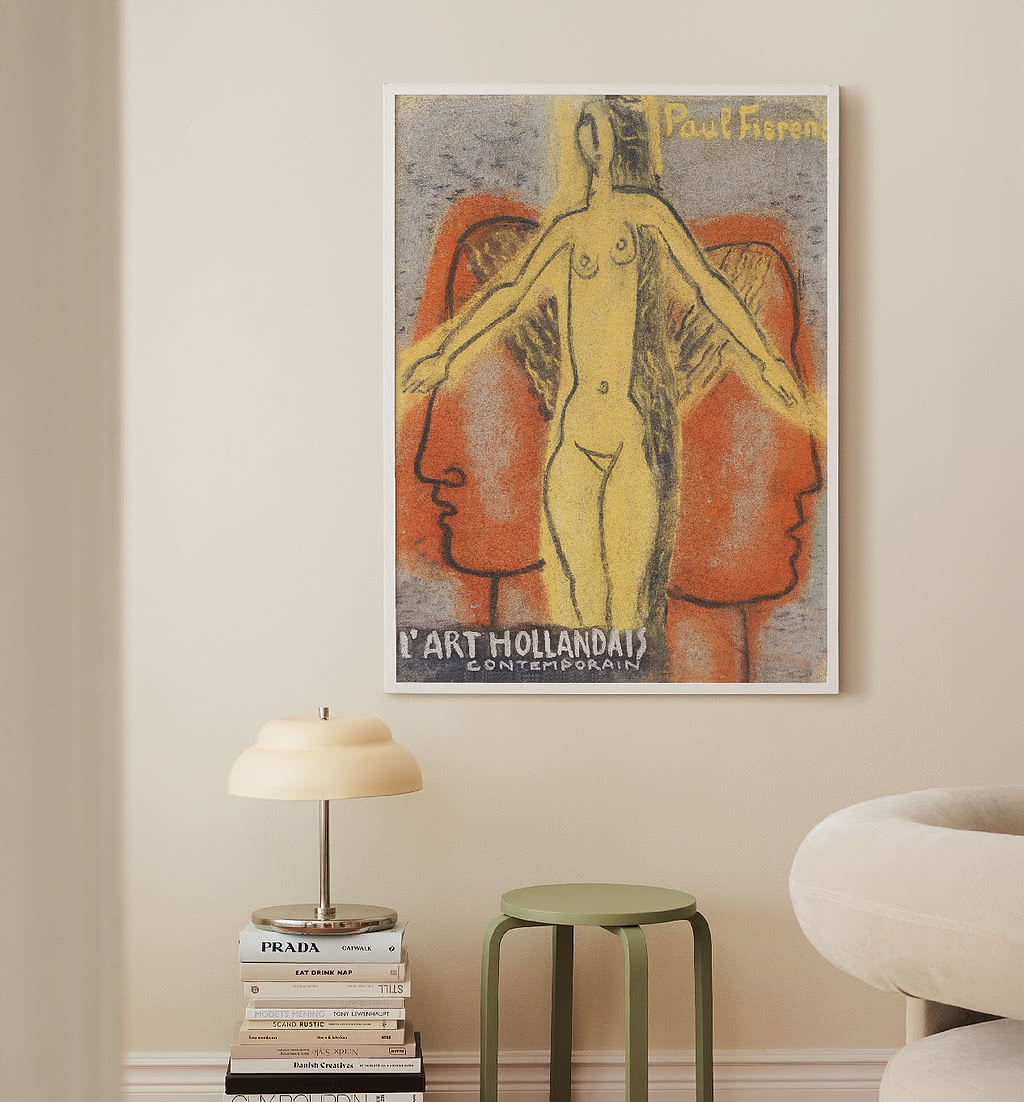
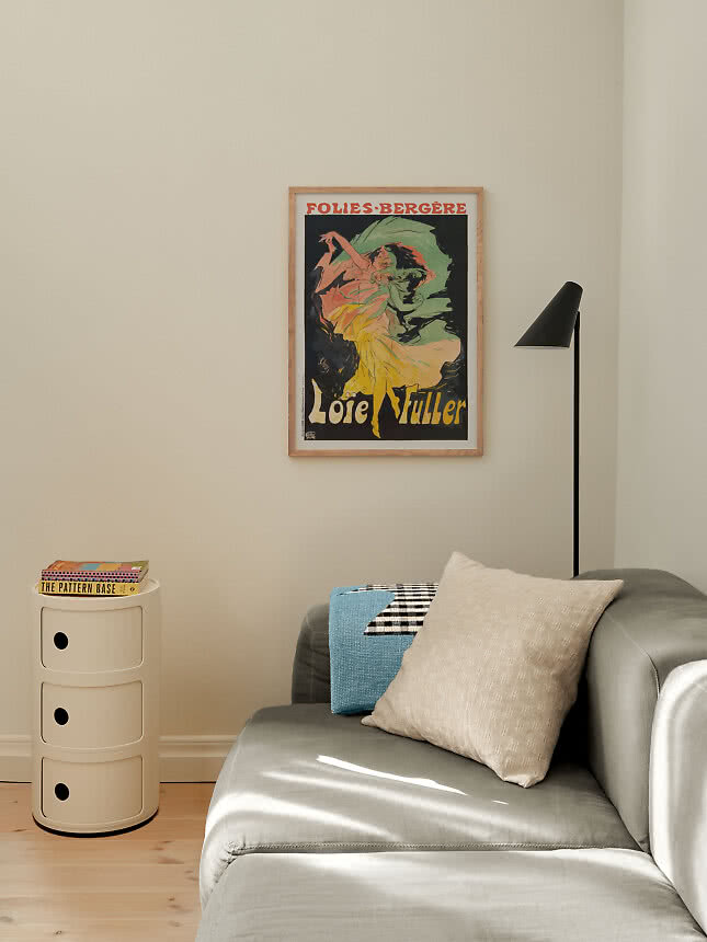
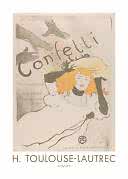
Belle Époque and art nouveau. Dancers, cafés and books, drawn in flowing lines with lettering painted by hand. Theatrical and colourful, so one poster is often enough to carry a wall.
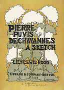
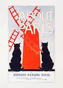
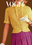
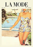
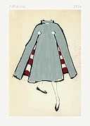
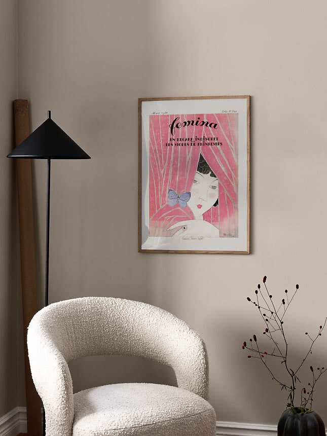
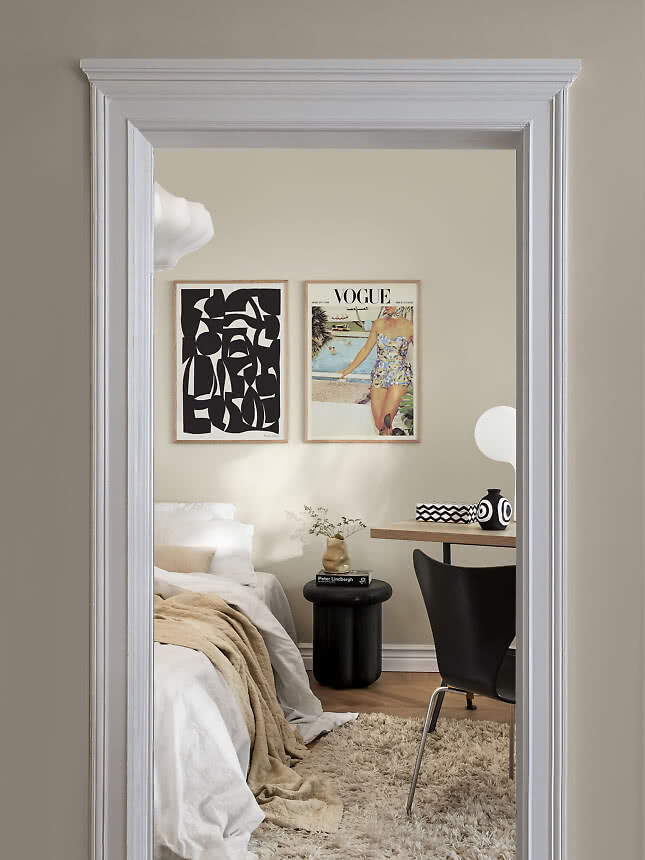
Magazine covers and fashion. Elegant women, sharp tailoring and mastheads that work like typography. From art deco softness to sixties pastels, they bring a little glamour and a wink.
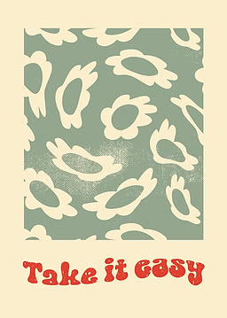
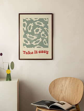
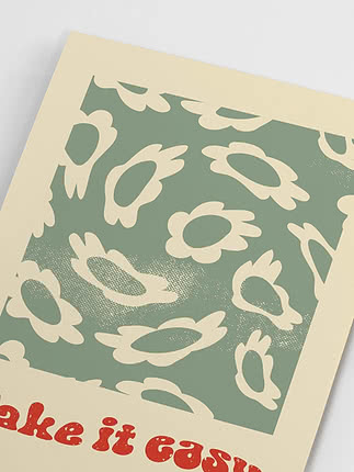
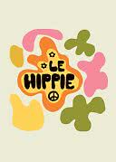
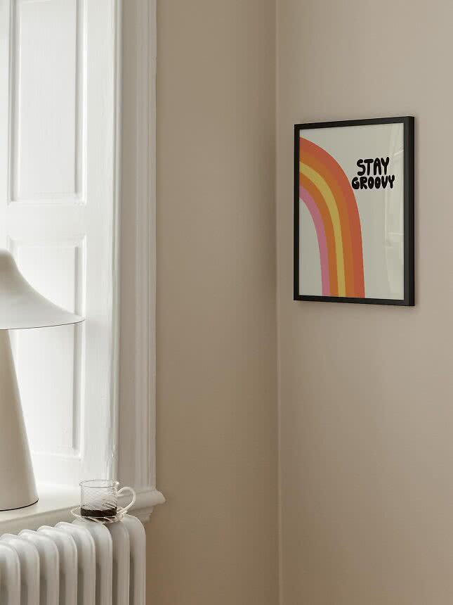
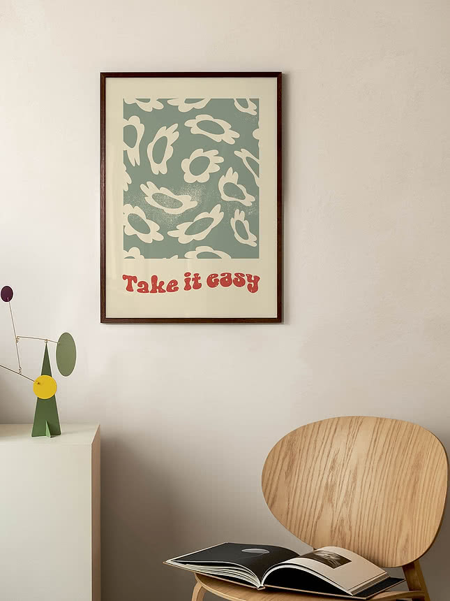
Seventies colour. Rainbows, daisies and groovy lettering in mustard, orange, pink and brown. The most playful era, and the easiest one to make look modern.
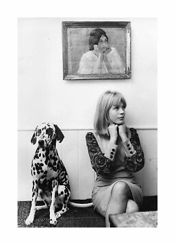
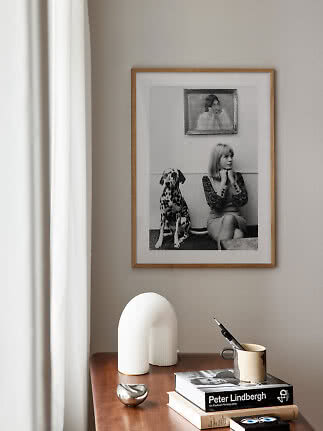
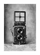
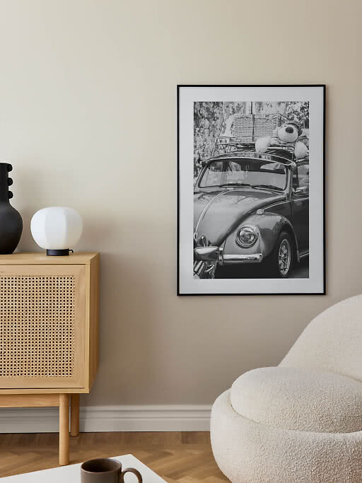
Black-and-white snapshots. Film stars, crowded swimming pools, an old twin-lens camera. Archive-style photography brings nostalgia and calm at the same time.
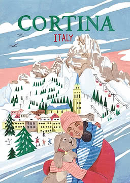
The most romantic branch of retro, the vintage travel poster, has an article of its own: travel posters for the places you love.
Street posters from around 1900: bold colour, flowing lines and lettering drawn by hand.
A masthead, a swimsuit by the pool and a cape sketched in a few strokes. Glamour with a light touch.
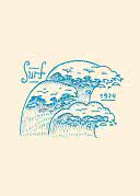
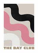
Groovy lettering, a surfing wave dated 1974 and soft pink curves. Instant sunshine for a hallway or a desk.
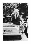
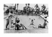
A film star on a car bonnet, a crowded pool and a classic camera. Nostalgia in shades of grey.
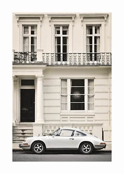
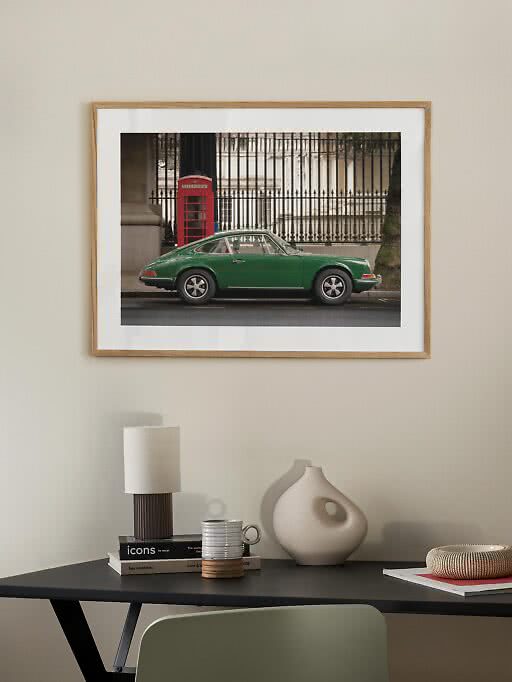
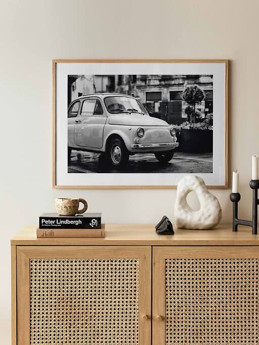
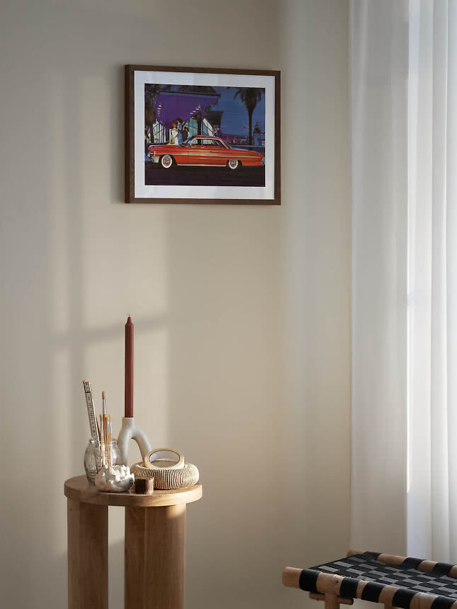
A beautiful old car is retro at its most universal. Even people who never think about engines tend to love a green Porsche on a London street or a little Fiat in the rain. Our vintage car posters run to more than 60 motifs, from sports cars and camper vans to motorbikes and petrol pumps.
Colour or black and white? Colour photographs feel sunny and cinematic, and suit a living room or a bright hallway. Black and white is calmer and more graphic, and works almost anywhere, not least in a home office or a hallway.
Let the car stretch out. Almost half of our car posters are landscape. Hang one above a sideboard or a desk, where its width can follow the furniture.
Every era has its colours, and borrowing them is the easiest way to make a room feel retro without a single old object in it.
Warm earth and sunshine. Mustard, burnt orange, brown and olive are pure seventies. They glow against white walls and pale wood, and look even better with a little chrome or rattan nearby.
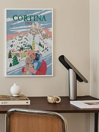
Soft pastels. Pale blue, pink and mint belong to the fifties and sixties: magazine covers, sun loungers, ice cream. Lovely in a bedroom or a bright kitchen.
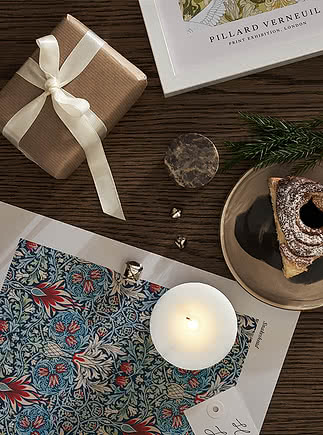
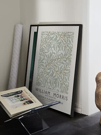
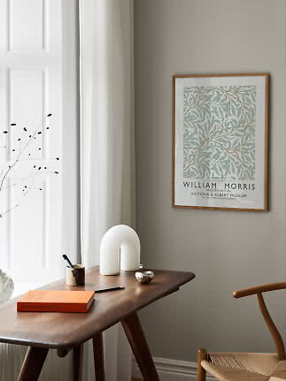
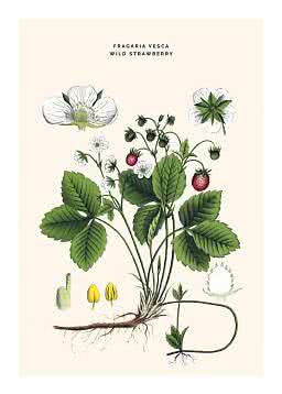
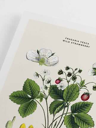
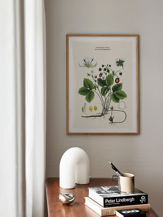
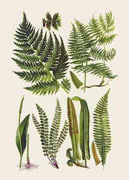
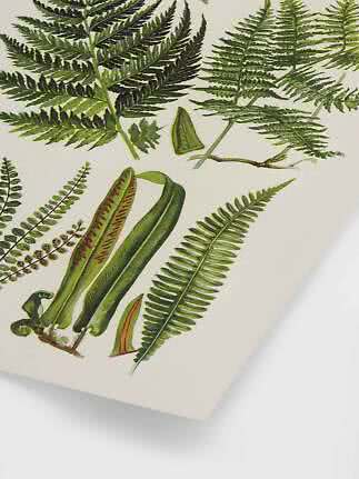
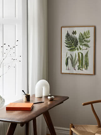
Ink and paper. Faded cream, deep green and inky blue are the colours of old botanical plates and Belle Époque posters. They make a room feel collected and calm.
Black and white. Timeless, and the best bridge between old and new. There is more in our guide to black and white wall art.
Typographic prints like Stay Groovy sit somewhere between art and slogan. If you like words on the wall, our guide to quote posters has more ideas.
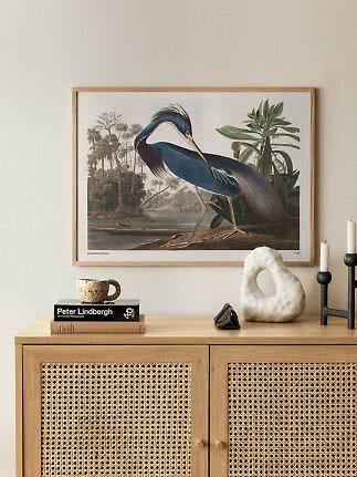
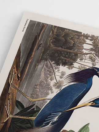
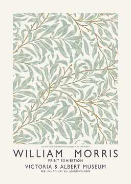
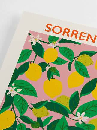
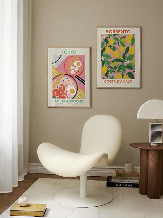
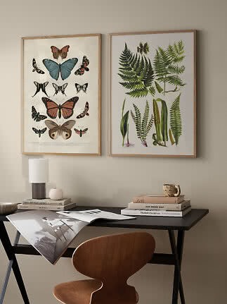
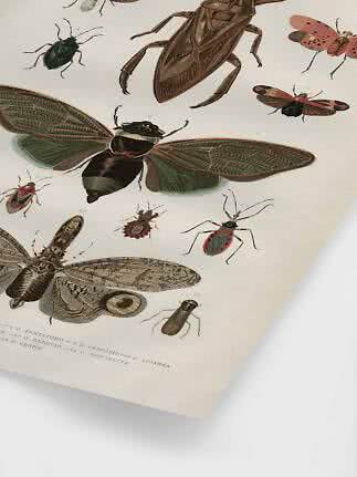
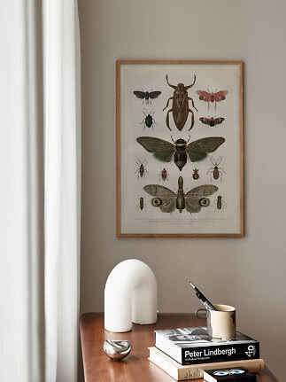
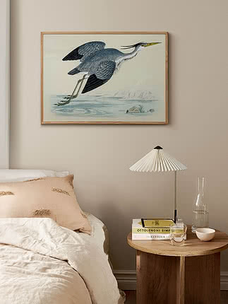
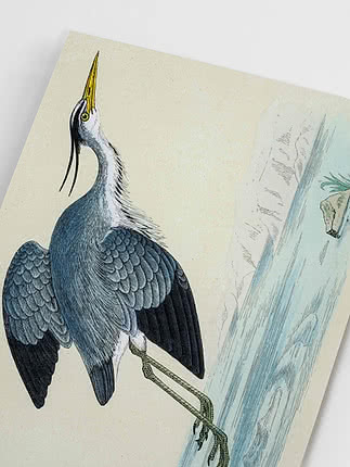
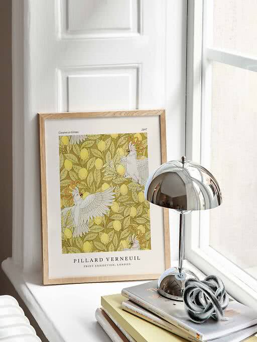
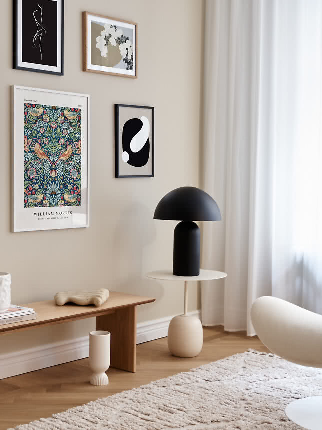
Natural history, framed. Birds, insects and plants drawn by hand, in the muted colours of old books. Cockatoos among lemons, a heron in flight or a page of butterflies bring the calm of an old library to a living room or a hallway. Our guide to botanical wall art goes deeper into flowers, leaves and William Morris.
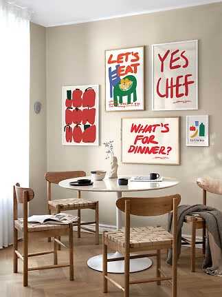
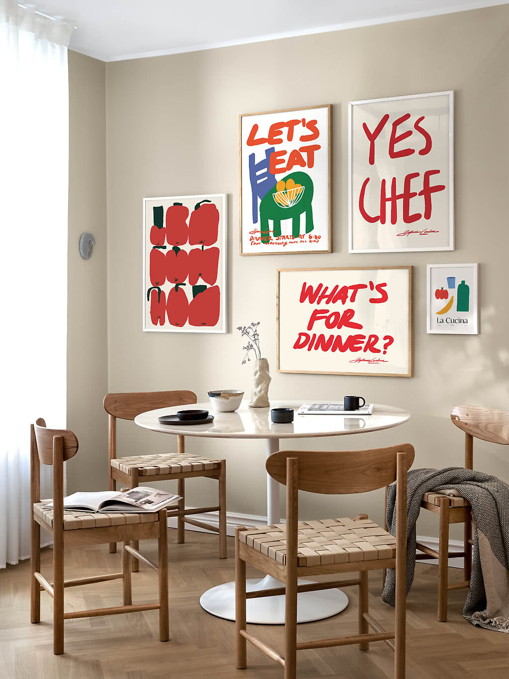
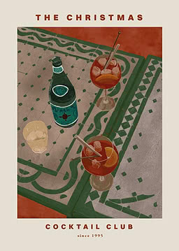
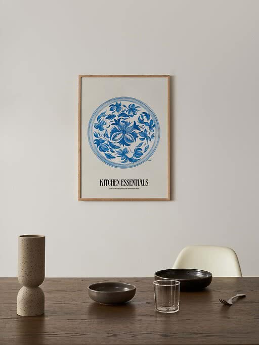
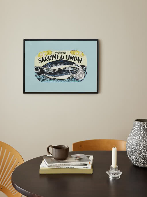
The retro kitchen. Old packaging and tableware make witty kitchen art: a sardine tin label, a blue china plate, a page of seafood cans. Hang one above the dining table or lean it on the worktop, and see our kitchen guide for more.
The frame decides whether a vintage poster looks like a precious find or a quick souvenir. Our guide to choosing the right frame covers the basics; for retro, these are the rules of thumb.
Dark oak adds patina. A deep wood tone makes a print look older and richer, and suits warm colours, old photographs and anything with a painted feel.
Oak keeps it light. In a Scandinavian home, a pale oak frame lets even a 1920s magazine cover feel fresh.
Black for graphics and photographs, white for pastels. Black is crisp and modern, the natural partner for snapshots and bold lettering. White lets soft fifties colours float on the wall.
Colour for the seventies. A red, yellow or green frame picked from the motif turns a retro print into a statement. Our guide to coloured frames shows how.
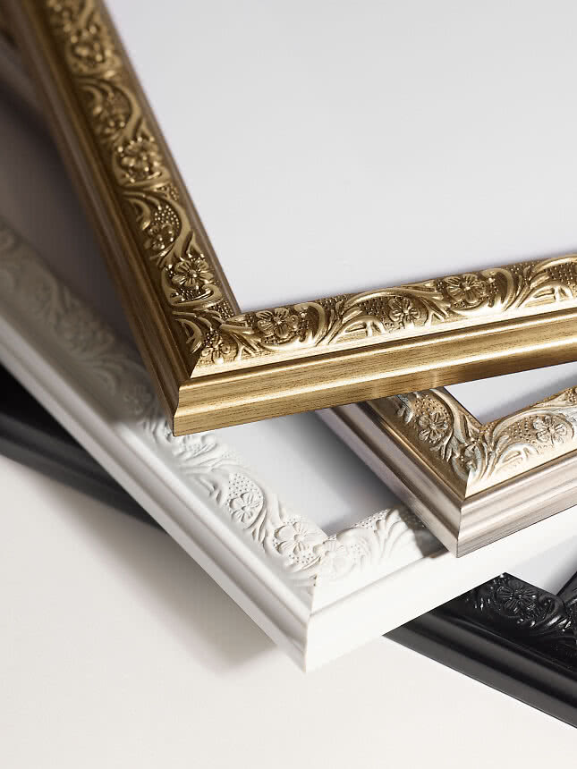
Classic frames for the grand gesture. Ornate mouldings in gold, silver, black or white give a Belle Époque poster the gallery treatment. We have 11 of them, from Versailles to Madeleine in walnut; read more about classic frames, or add a mat board for a museum look.
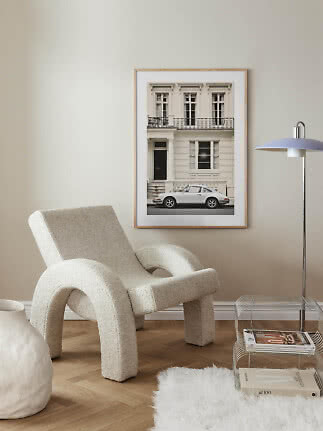
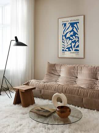
Retro looks its best when it has something modern to play against: a clean sofa, a simple lamp, plenty of wall around it. Think of the poster as the one old thing in a new room.
Living room. One large Belle Époque poster or two magazine covers above the sofa, with modern furniture and soft textiles around them. More ideas in our living room guide.
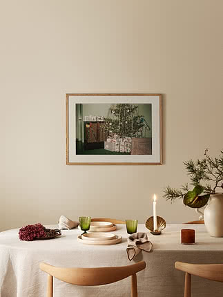
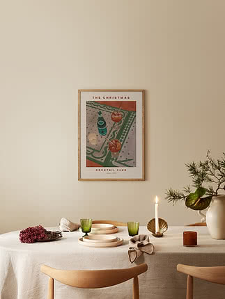
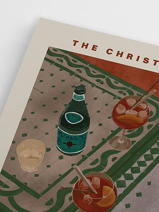
Kitchen and dining. Food labels, china and old drinks adverts, mixed with something contemporary so the room doesn’t look like a film set.
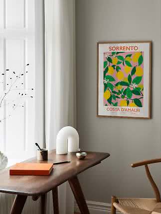
Hallway and home office. Classic cars and black-and-white snapshots, framed in black or oak. They make a strong first impression without asking much of the space.
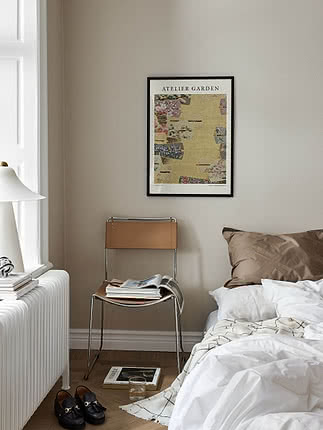
Bedroom. Softer fashion illustrations and pastel covers: calm colours and a little romance. See our bedroom guide for sizes above the bed.
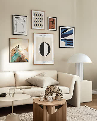
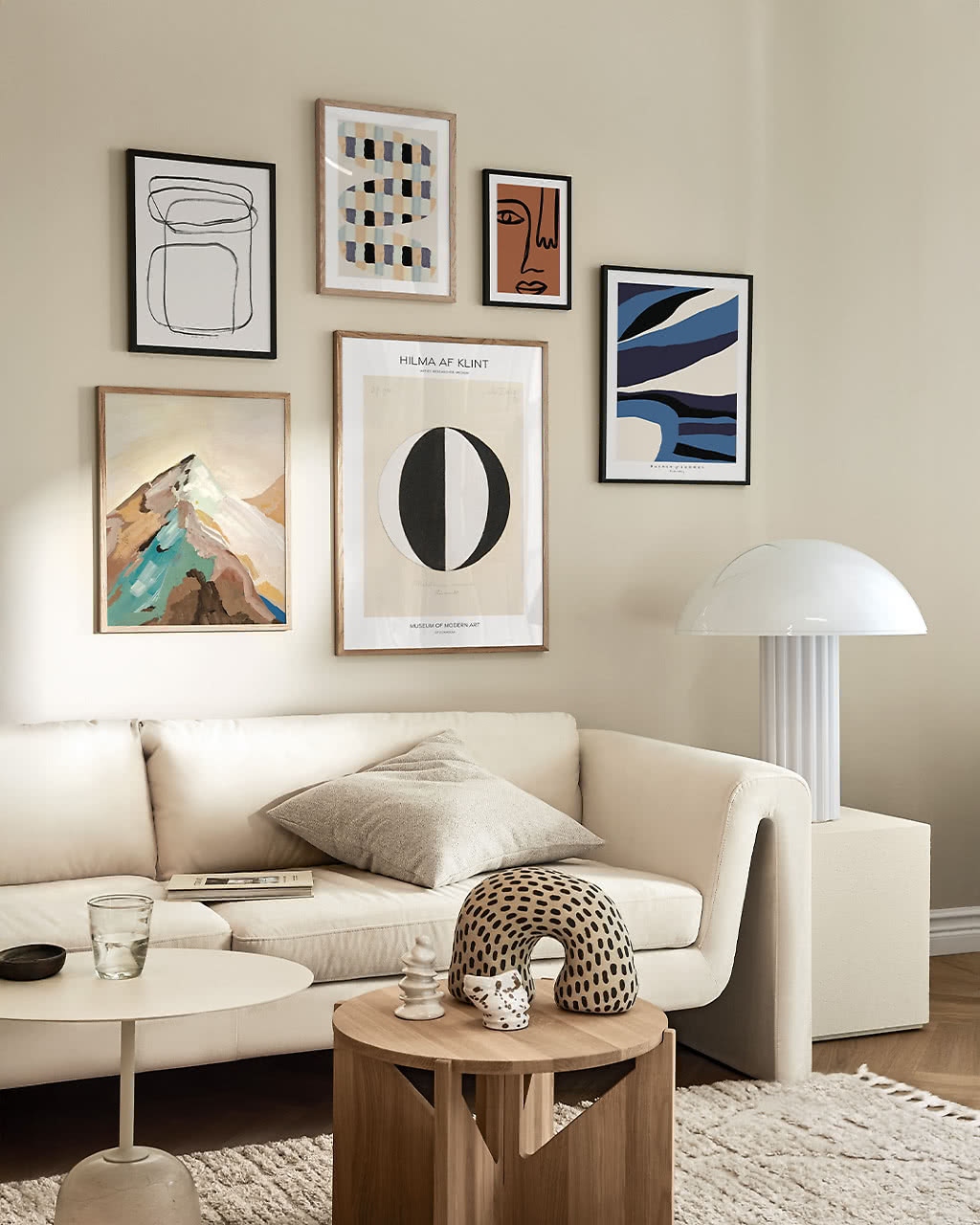
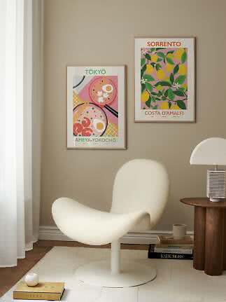
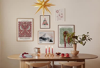
Gallery wall. Mix one or two old pieces with modern abstracts and a photograph. The contrast is what makes it interesting, and our gallery wall ideas show five layouts that work.
Vintage posters show real motifs from an earlier era, such as old posters, magazine covers and archive photographs. Retro posters are new designs made in an old style. They mix well, and many homes have a little of each.
Let one or two pieces lead, keep the furniture around them modern and add at least one contemporary print. Frames in the same wood or colour help a mix of decades look like a collection.
Dark oak adds patina, oak keeps it light and Scandinavian, black suits photographs and graphics, and a classic ornate frame gives a Belle Époque poster the gallery treatment.
Yes, and the contrast is often what makes the wall interesting. Pair an old poster with a modern abstract or a photograph, and repeat a colour or a frame to tie them together. Our gallery wall ideas show five layouts.
Above a sideboard or a desk, or in the hallway, where a landscape motif can follow the furniture. Black and white suits a calm home office; colour brings sunshine to a living room.
Our vintage and retro posters come in rectangular sizes from 21x30 to 100x140, and nine in ten come in both 30x40 and 50x70. The poster size guide helps you choose.
Vintage and retro posters
New
New
New
New
New
New
New
New
New
New
New
More from the magazine
All articles →