 (1).png)






56% off
Hohoho
Treechild
New
€6,99€15,99
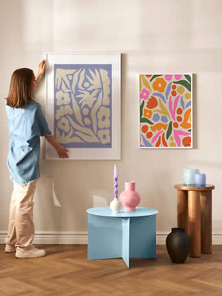
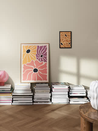
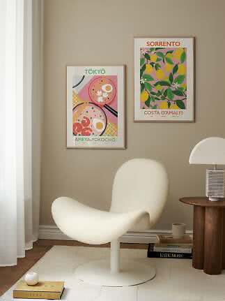
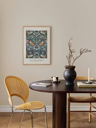
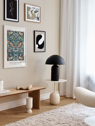
The most common question before buying a poster is not about size or frame. It is simply: will it suit my home? You need neither a trained eye nor a colour wheel to answer it, only a look at what is already in the room: the wall, the sofa, the floor and a cushion or two. Pick up a colour that is already there, or choose one that stands against it, and the print will look as if it had always belonged. Here is how we would choose wall art by wall colour and by sofa, from white walls and grey sofas to green walls and brown leather, with the frame as the finishing touch.
In short
Before you look at a single print, look at the room. Four things decide which colours will feel at home there.
The wall is the background. It is the largest surface and the one the print sits directly against, so it decides how much a colour stands out. The lighter and more neutral the wall, the freer you are.
The sofa is the biggest block of colour. Art above a sofa is always seen together with it, so think of the two as a pair. There are more ideas in our living room guide.
The floor sets the temperature. Oak, pine and warm parquet lean towards yellow and red and go naturally with earthy tones. Grey and white floors are cooler and welcome blue, green and black.
Textiles are the easiest link. A colour that appears in a cushion, a throw or a rug and then again in the print ties the room together. It works the other way round too: buy the print first and let a cushion follow.
Most walls are some shade of white, beige or grey, and all three are generous backgrounds. They still have a temperament of their own.
White walls take everything. A white wall is the closest a home comes to a gallery, so strong colour, deep black and large formats all come into their own. If the room feels cold, choose warm tones or an oak frame. If you want it crisp, go for black and white wall art in a black frame.
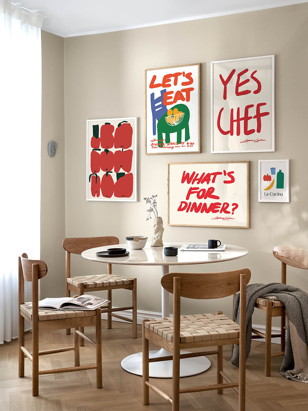
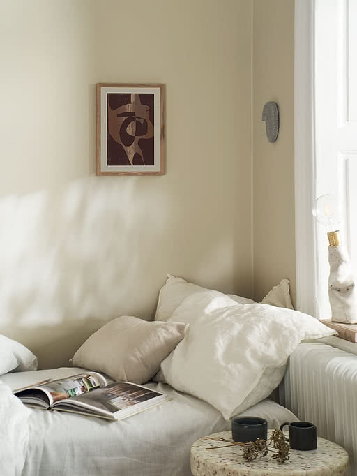
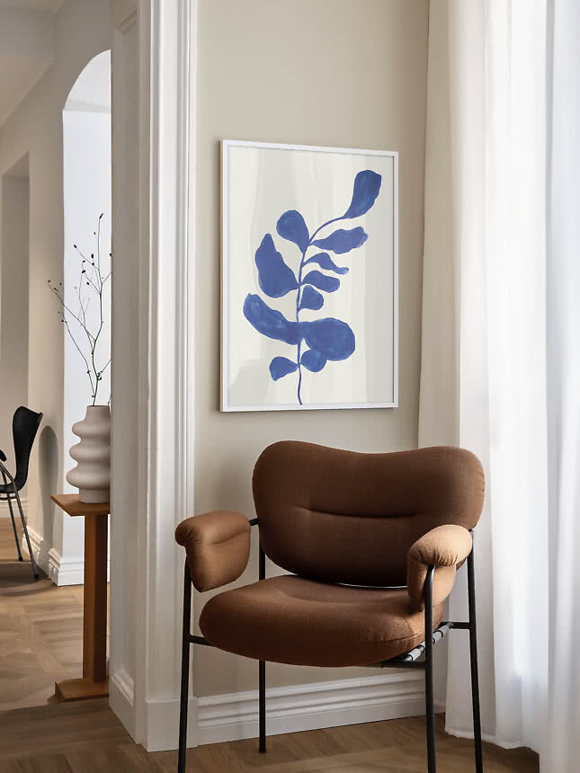
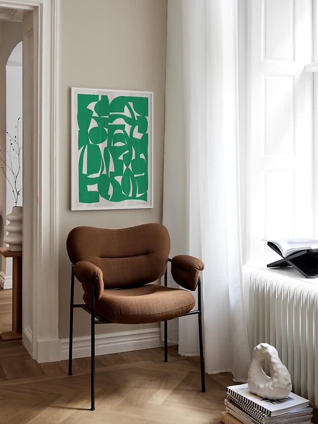
Beige and greige like their own family. Warm walls are flattered by sand, brown, terracotta and deep red, colours that share their warmth. For calm on calm, see our guide to neutral wall art. For a fresher look, add a clear blue or green.
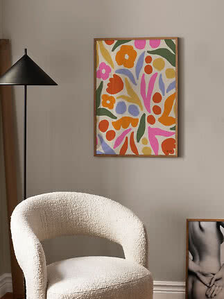
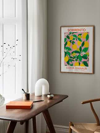
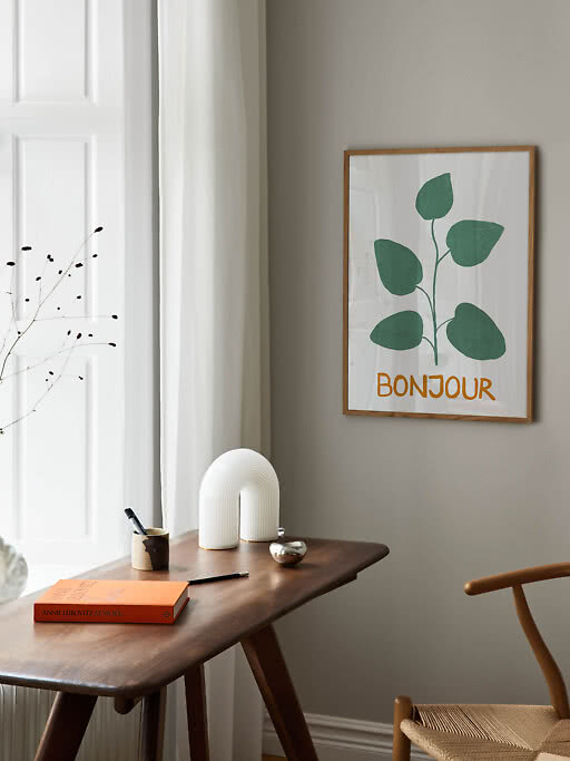
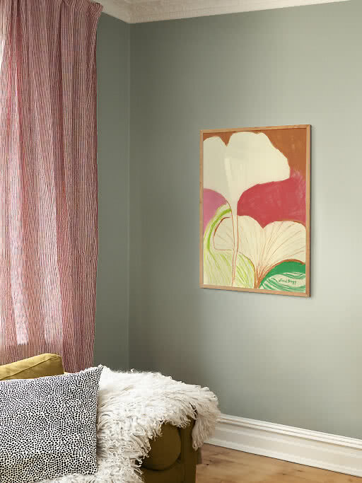
Grey walls want a little warmth or one clear colour. Grey is cool and quiet, so it lifts with pink, yellow and terracotta and looks fresh with green. Black and white on grey is elegant, especially with a white margin or a mat board that lets the motif breathe.
A coloured wall is already a statement, so the print has a simple job: to agree with the wall or to answer it.
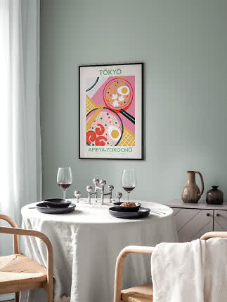
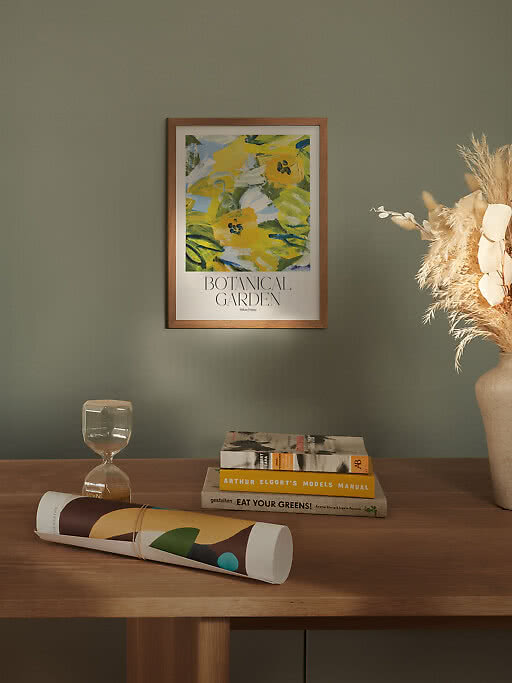
Green walls love warm colours. Sage and olive make pink, terracotta and yellow glow, and they are calm enough to carry black-and-white graphics too. Botanical motifs in a different green give a quiet tone-on-tone effect. You will find more deep greens in The Evergreen Edit.
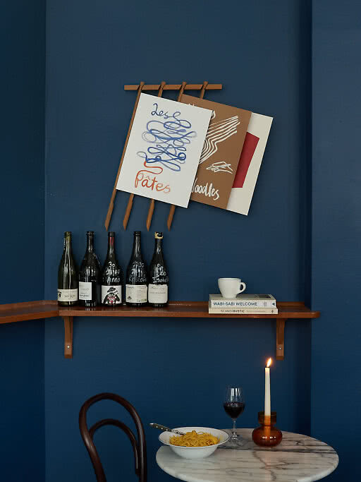
Blue walls want something light or something warm. Cream paper, white margins and sand tones stand out clearly against blue, and orange is its natural opposite. Blue on blue works when the tones differ. The Blue Edit has the whole range.
Dark walls need light. On navy, charcoal or forest green, a motif with plenty of pale paper or a white mat board keeps its outline. Frames in oak and white stand out, while a black frame melts into the wall and lets the motif float.
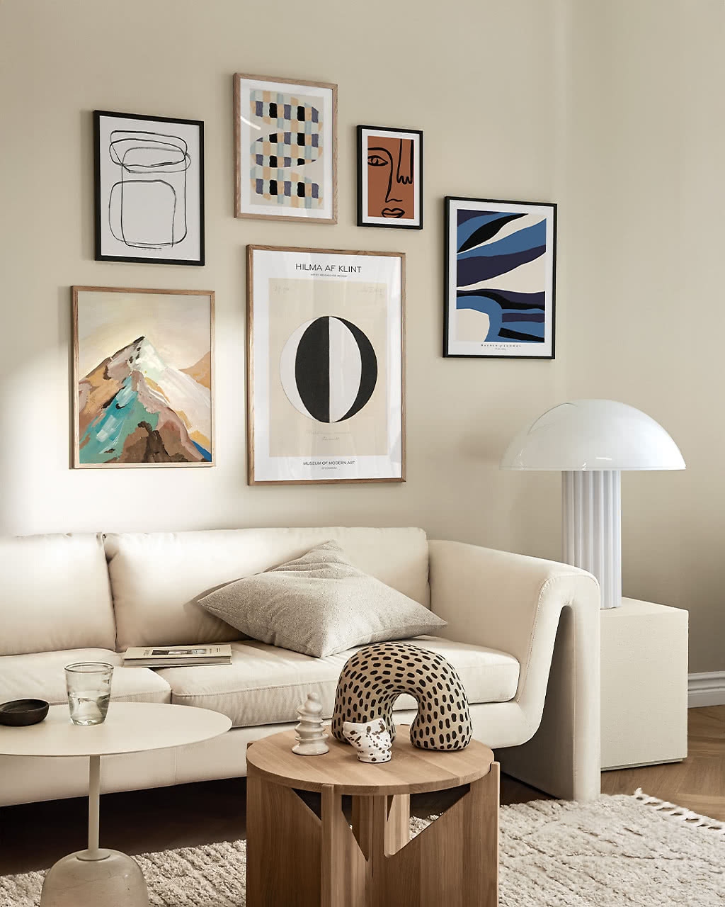
The sofa is usually the largest piece of furniture in the room, so the art above it is always seen together with it. The simplest way to match wall art to your sofa is to decide one thing first: should the wall be calm, or should it wake the sofa up?
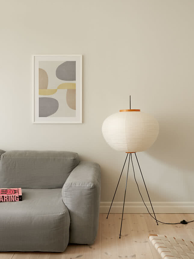
Grey and calm. Stay with grey, sand and soft white for a tone-on-tone look. A print that holds a little grey of its own ties sofa and wall together.
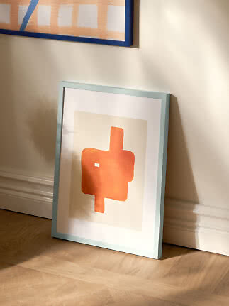
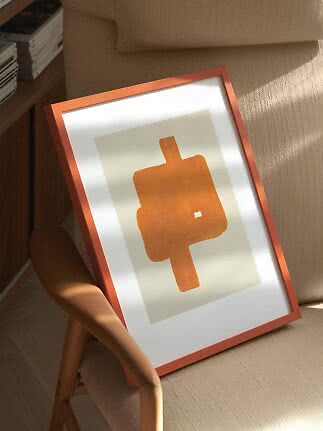
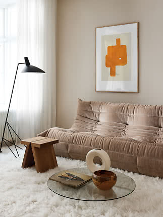
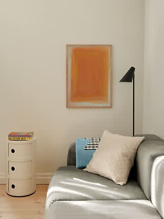
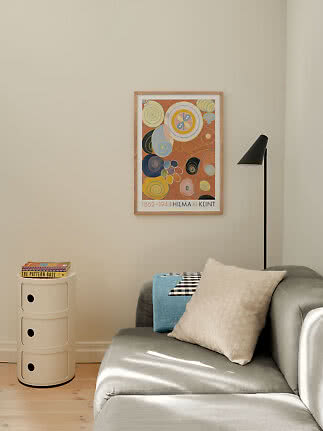
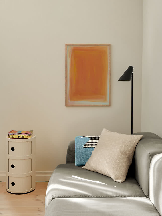
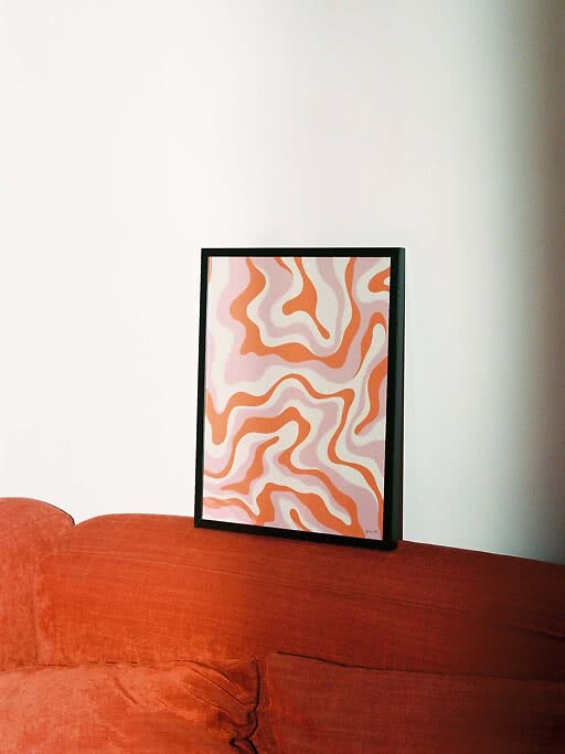
Grey and warm. Grey is a cool colour, so warm ones do it good. Terracotta, orange, mustard yellow and pink all make a grey sofa more inviting, while blue and green keep the room cool and fresh.
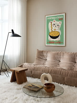
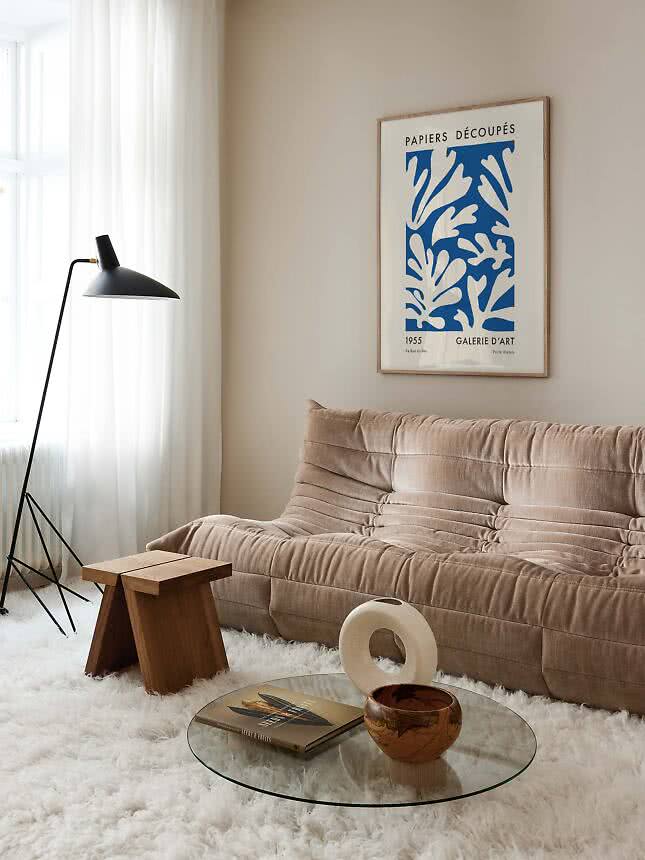
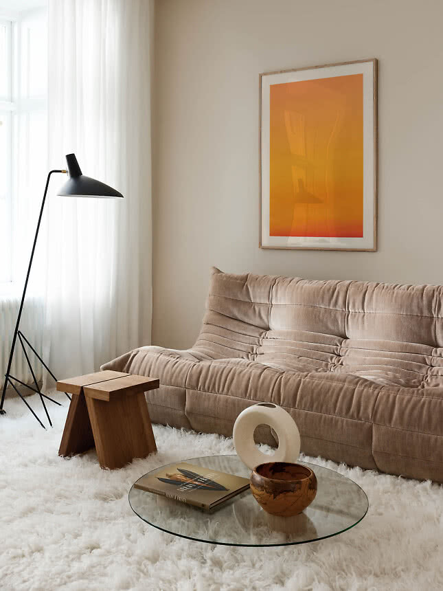
A beige sofa takes almost anything. Brown, rust and orange give a warm, gathered room. Clear blue or green gives contrast and a more modern look, and black-and-white graphics add a sharper edge.
A green sofa. Green is nature’s own background, so the colours of flowers suit it: pink, ochre and soft yellow. Cream and sand keep it calm. The pairing has an edit of its own in Pink and green.
A blue sofa. Orange and terracotta sit opposite blue on the colour wheel and make it glow, which is the whole idea behind Blue and orange. For a quieter room, choose sand, cream and white, or a paler blue than the sofa.
Brown leather. Cognac and chocolate leather are warm and a little rugged. Blue cools them down, green makes them feel natural, and cream or black and white gives a classic look. For brown on brown, see The Espresso Edit.
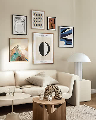
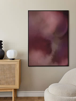
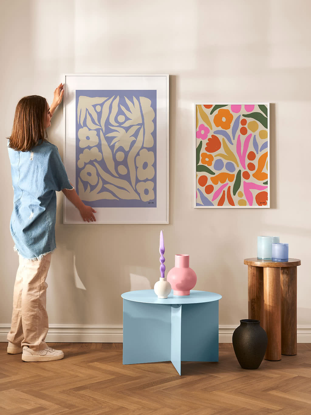
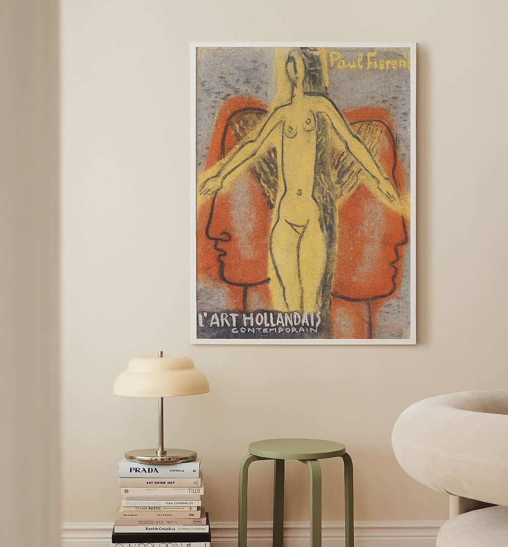
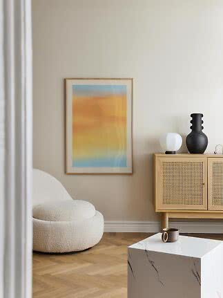
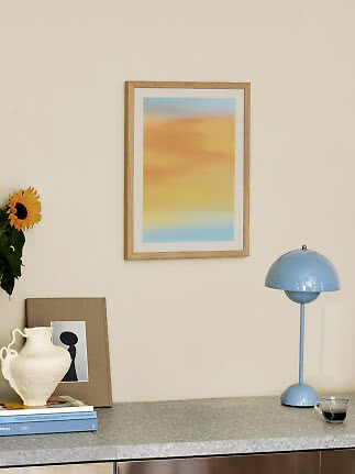
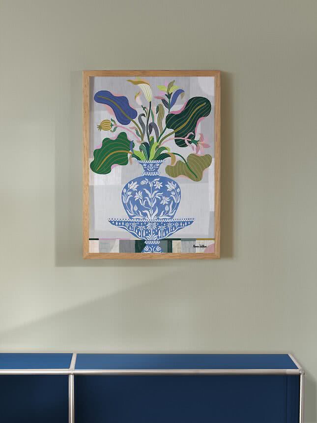
Warm colours for a cool sofa: terracotta dunes, a yellow sky above white peaks and a blush pink evening.
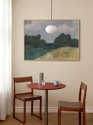
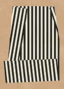
Clear colour and sharp contrast: one brushstroke in blue, one in leaf green and black stripes on sand.
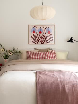
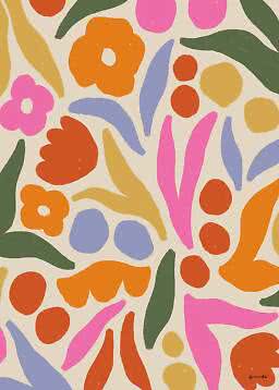
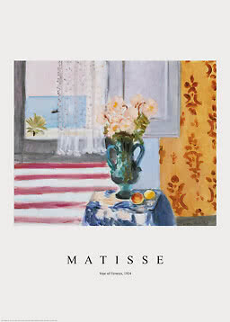
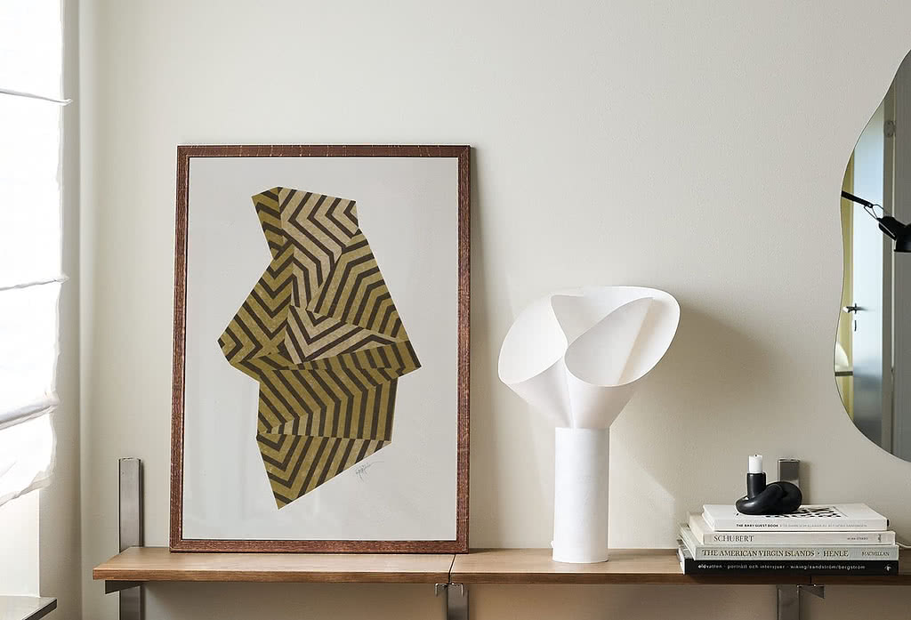
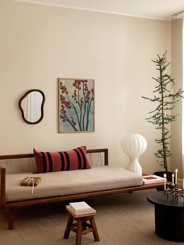
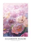
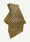
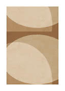
Flower colours and soft earth: painted pink blooms, folded stripes in ochre and rounded shapes in sand.
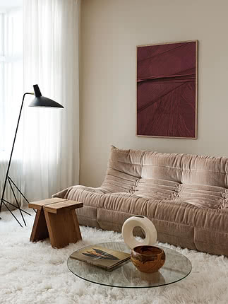
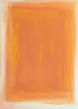
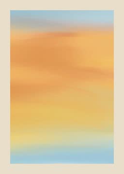
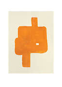
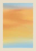
The opposites of blue and one calm neutral: an orange shape, a sky in orange and yellow and layers of pale paper tones.
Some colours simply bring out the best in each other. Colours opposite each other on the colour wheel strengthen each other, which is why blue with orange always looks alive. In its Colour Trends 2027, Wallsauce pairs blue with orange, pink with green, deep red with soft beige and forest green with warm yellow. Deep red has an edit of its own in The Burgundy Edit, and warm yellow in Butter yellow and stripes.
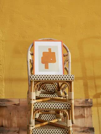
A frame is a line of colour around the motif, so choose it as carefully as the print. Oak adds warmth and suits wooden floors, black sharpens and gives contrast on light walls, and white lets the motif float. A coloured frame can pick up a colour from the motif or the sofa, or add the accent a neutral print lacks. Read more about decorating with coloured frames and about choosing the right frame.
Warm colours such as terracotta, orange, mustard yellow and pink make a grey sofa more inviting, while blue and green keep the room cool. For a calm look, choose grey, sand and soft white, tone on tone with the sofa.
Almost anything. Strong colour, deep black and large formats all stand out on white. Choose warm tones or an oak frame if the room feels cold, and black and white in a black frame for a crisp, graphic look.
Warm colours: pink, terracotta and yellow glow against sage and olive. Black-and-white graphics and botanical motifs in another green also work well, and an oak frame adds warmth.
It should relate to the sofa, not copy it. Either stay in the same colour family, a little lighter or darker than the sofa, or choose a contrasting colour and let it return once more in a cushion or a vase.
Oak for warmth, black for contrast and white for a light, floating look. A coloured frame works when it picks up a colour from the motif or the room.
Colourful posters for the living room
New
New
New
More from the magazine
All articles →